CSS Grid Layout Automatic Placement
In his last post my mate Sergio explained the different syntax to position elements inside a grid. Now is time to talk about the automatic placement feature, how it works and show some examples of its potential. Auto-placement
The concept is defined in the specification:
Grid items that aren’t explicitly placed are automatically placed into an unoccupied space in the grid container.
So, let’s start with a simple example to show how it works. Imagine that you have the following 2×2 grid:
<div style="display: grid;">
    <div style="grid-row: 1; grid-column: 1 / span 2;">first</div>
    <div style="grid-row: 2; grid-column: 2;">second</div>
    <div>auto</div>
</div>
first item is using the 2 columns on the 1st row, second item is placed on the 2nd row 2nd column. That leaves an empty space on the 2nd row 1st column, where the auto item is placed.
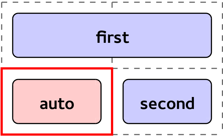 Simple example where the auto-positioned item is placed into the 2nd row 1st column
Of course you can do more complex things, like setting a specific position in one dimension (row or column) and left the other as auto, request more than one cell for the item, etc. as you can see in the following example of a 3×3 grid:
<div style="display: grid;">
    <div style="grid-column: span 2;">item 1</div>
    <div style="grid-column: 3;">item 2</div>
    <div style="grid-row: span 2;">item 3</div>
    <div style="grid-row: span 2; grid-column: span 2;">item 4</div>
    <div style="grid-row: 2;">item 5</div>
</div>
Example animation of how different auto-positioned items are placed in the grid
Let’s analyze why elements are positioned as you can see in the animation above:
- item 1: This is the first element placed, this item need 2 columns and it’s placed in the 1st row 1st-2nd columns, as they’re empty.
- item 2: This item is only specifying the column, so it’s placed in the 1st row 3rd column, as it’s the first empty cell in the 3rd column.
- item 3: In this case the items needs 2 rows and it’s placed in the 2nd-3rd rows and 1st column.
- item 4: Here the example needs 2 rows and 2 columns, we’re lucky as there’re some empty cells so it’s placed in the 2nd-3rd rows and 2nd-3rd columns.
- item 5: This item needs to be placed in the 2nd row, as there’s no empty cells in that row, it’ll be placed in a new column outside current grid, 2nd row 4th column. Imagine that this item is completely auto (we remove the “grid-row: 2;” style), then it’d be placed in a new row outside current grid, 4th row 1st column. Why in a new row and not in a new column? That’s managed by grid-auto-flow property that’ll be explained below.
grid-auto-flow property
Again from the spec:
The grid-auto-flow property controls the direction in which the search for unoccupied space takes place, and whether rows or columns are added as needed to accommodate the content.
The simpler (and easier to understand) values for this property are row (by default) and column. These values define the direction that the auto-placement algorithm should follow to place the auto-positioned items. For example if the value is row the algorithm will try to fill each row before jumping to the next one, adding new rows as necessary.
Also, this property allows to combine these values (row and column) with other keywords (that cannot not be used together):
- dense: By default auto-placement algorithm is sparse, that means that if placing an auto item has leave some empty cells in the grid (because of the item doesn’t fit) they won’t be used anymore. If dense is used, these holes will be used if smaller items come up later.
- stack: In this case the auto-placement algorithm looks for the first empty cell (like if it was adding a 1×1 item). Then it places all the auto-positioned items in that cell (independently of their size), stacked atop one another.
As usual it’s easier to understand with a HTML example:
<div style="display: grid;">
<div style="grid-row: 1; grid-column: 2;">item 1</div>
<div style="grid-column: span 2;">item 2</div>
<div>item 3</div>
</div>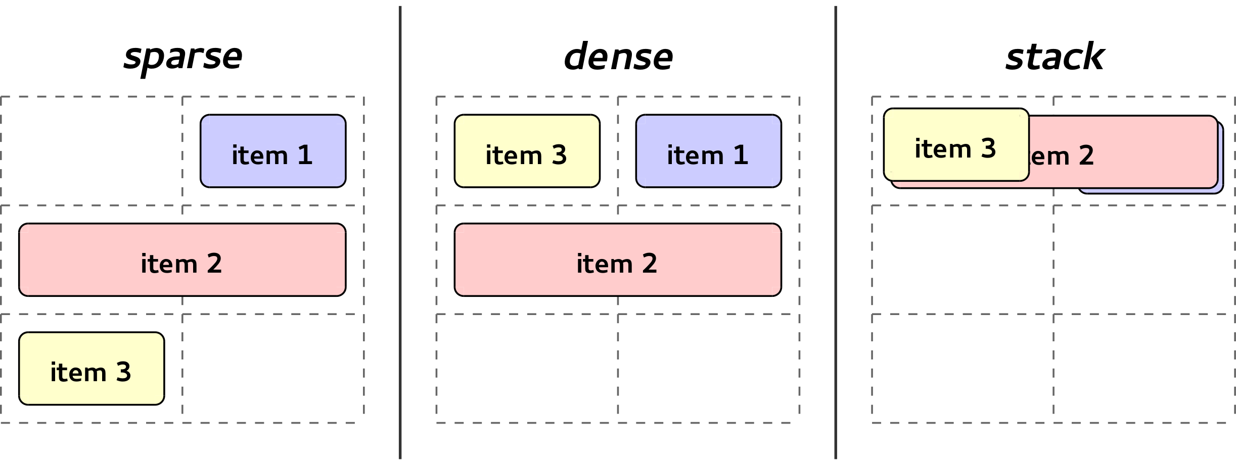 Example grid with different values for grid-auto-flow property
In the image you can check how the auto-positioned elements (item 2 and item 3) are placed depending on the different values of grid-auto-flow:
- sparse (grid-auto-flow: row;):
- item 2: It looks for an empty area of 2 columns, so it skips cell in 1st row 1st column levaing it as an empty space. The item is placed in the 2nd row 1st-2nd columns.
- item 3: It looks for the next empty space, and it adds the item in the 3rd row 1st column. This will leave a hole in the 1st row 1st column.
- dense (grid-auto-flow: row dense;):
- item 2: This is placed exactly the same than in the sparse case. The item is placed in the 2nd row 1st-2nd columns.
- item 3: It looks for an empty cell and it adds the item in the 1st row and 1st column as it’s still empty (item 2 didn’t use it before, because of it doesn’t fit there).
- stack (grid-auto-flow: stack row;):
- item 2: It looks for the first empty cell, and it finds the 1st row and 1st column. Then all the auto-positioned items will be placed there. So item 2 is placed in 1st row 1st-2nd column (even if it takes more than one cell, it’ll keep using as reference the first empty cell).
- item 3: Again this is added in the 1st row 1st column over item 2.
As you can imagine this brings a lot of power to the CSS Grid Layout spec. You won’t need to always place your items explicitly in a grid, you can simply pass the responsibility to find the best position to the grid itself.
The typical example is to think in a regular form:
<form>
    <label>Name</label><input type="text" />
    <label>Mail</label><input type="text" />
    <label>Comments</label><textarea></textarea>
    <label>Accept policy</label><input type="checkbox" />
    <div id="buttons">
        <button>Accept</button>
        <button>Cancel</button>
    </div>
</form>
You could just apply the following CSS and you’d have a formatted form “for free”:
form     { display: grid;           }
label    { grid-column: 1;          }
input    { grid-column: 2;          }
#buttons { grid-column: 1 / span 2; }
The result will be something like the following picture:
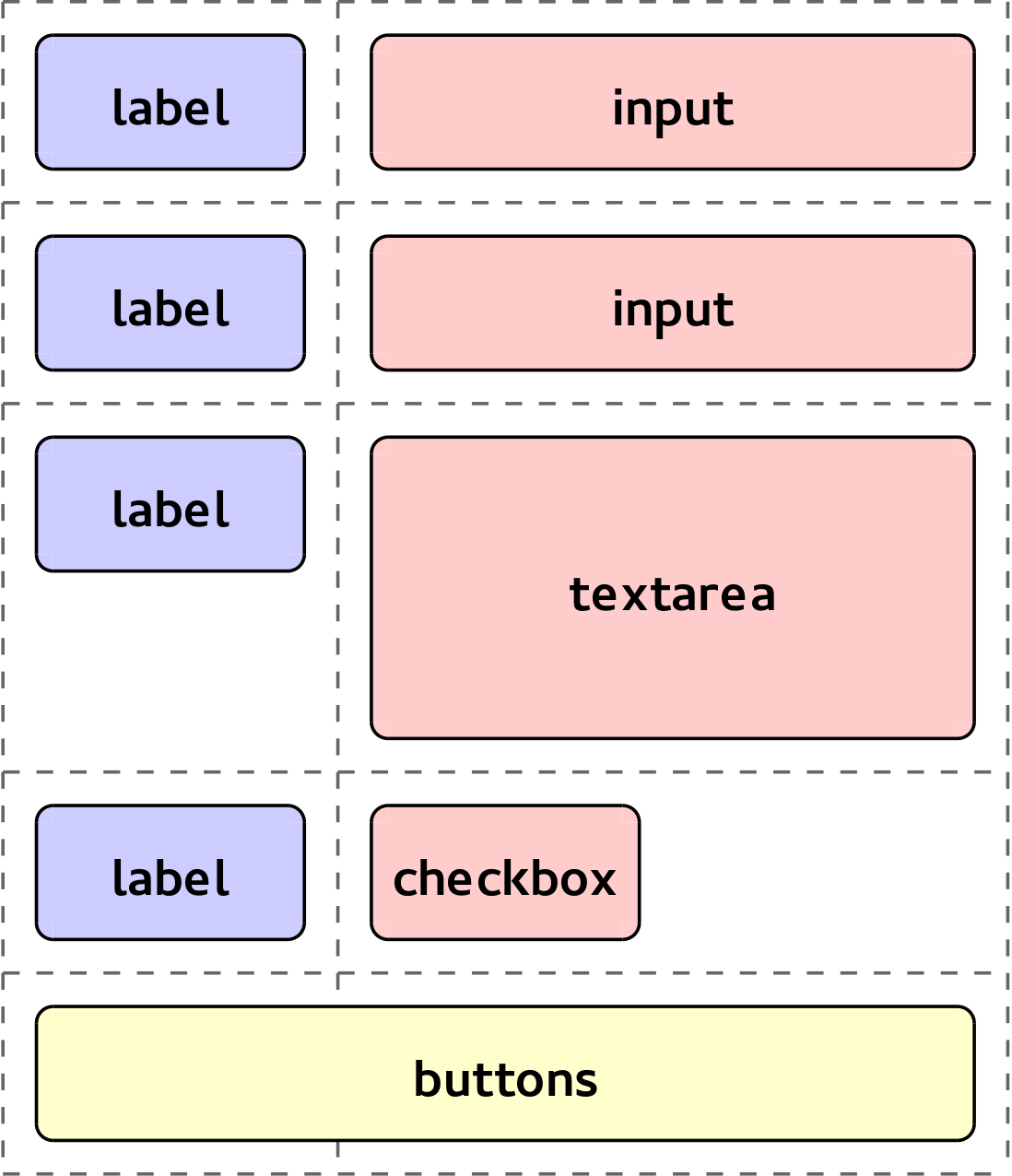 Formatting regular form using grid auto-placement feature
Wrap-up
We’ve created a small demo (as part of our grid examples repository) that will allow you to play with the auto-placement feature and understand it better:
http://igalia.github.io/css-grid-layout/autoplacement.html
As you could read during the post, the auto-placement algorithm has been mentioned several times. This algorithm and the implementations details will be explained in a subsequent post.
If you’re wondering about current support in Blink and WebKit, the basis of auto-placement feature is already working on both engines. In Blink span support in auto-positioned items has recently landed and in WebKit the patch is ready to be integrated. However, the new grid-auto-flow syntax (sparse, dense and stack) is still on the way (follow the Blink and WebKit bugs if you’re interested). As you can see, we’ve been working hard on implementing the missing bits of this feature and we hope it would be fully supported soon in both Blink and WebKit. :-)
Finally, we’d like to thank again Bloomberg for sponsoring our work around CSS Grid Layout.
- Previous: CSS Grid Layout at BlinkOn 2
- Next: Short 2014-06-19