Last week I attended the Web Engines Hackfest 2016, hosted by Igalia at the HQ premises in A Coruña. For those still unaware, it’s a unconference like event focused on pure hacking and technical discussions about the main Web Engines supporting the Web Platform.
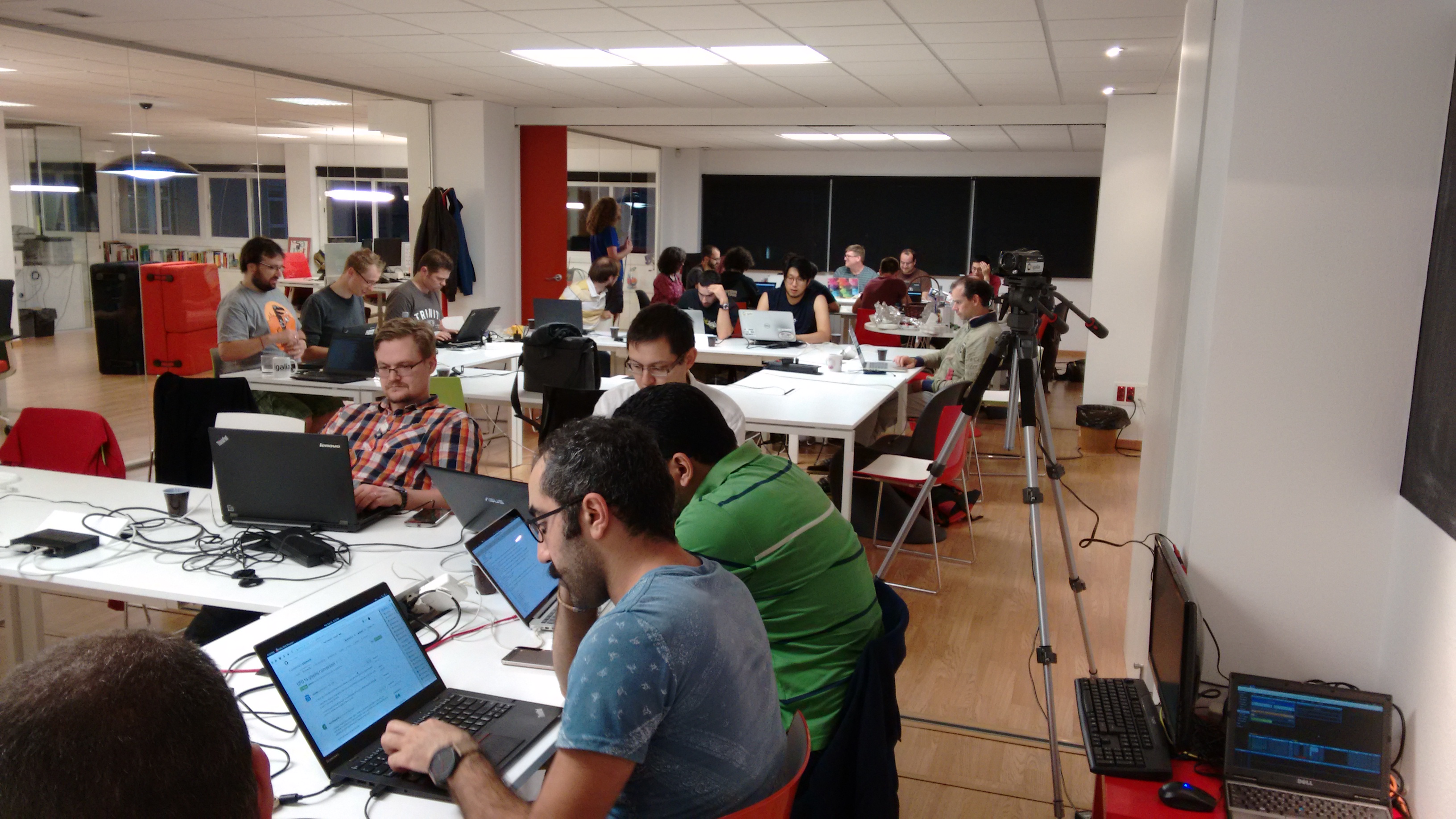
This year there were a very interesting group of hackers, representing most of the main web engines, like Mozilla’s Gecko and Servo, Google’s Blink, Apple’s WebKit and Igalia’s WebKitGTK+.
Hacking log
This year I was totally focused on hacking Blink web engine to solve some of the most complex issues of the CSS Grid Layout feature. I’d like to start giving thanks to Google to join the hackfest sending Christian Biesinger, specially thanks to him because of the long flight to attend. It was a pleasure to work work with him on-site and have the opportunity to discuss these complex issues face to face.
Day 1
During the weeks previous to the hackfest I’ve been working on fixing the bug 628565, reported several months ago but hitting me quite much recently. It’s a very ugly issue, since it shows an unpredictable behavior of Grid layout logic, so I decided that I might fix it once for all. I managed to provide 2 different approaches, which can be analyzed in the following code review issues: Issue 2361373002 and Issue 2333583002. Basically, the root cause of both issues is the same; grid’s container intrinsic size is not computed correctly when there are grid items with orthogonal flows.
There are 2 fundamental concepts that are key for understanding this problem:
- Intrinsic size computation must be done before layout.
- Orthogonal flow boxes need to be laid out in order to compute min-content contribution to their container’s intrinsic width.
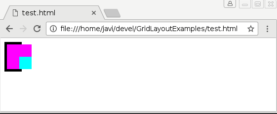
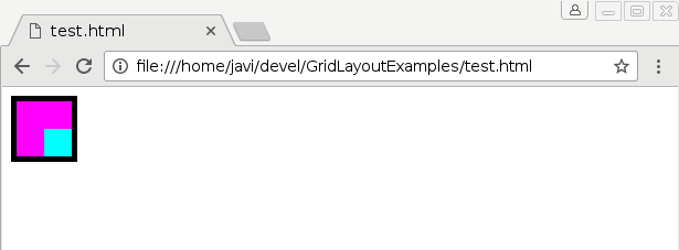
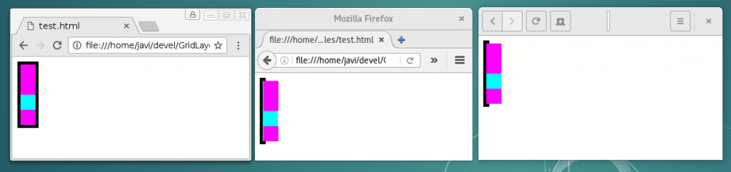
So, we had as single bug to fix for solving two different problems: unpredictable grid layout logic and incorrect grid’s intrinsic size computation. The first problem is the one reported in bug 628565. I’ll try to describe it here briefly, but further details can be obtained from the bug report. Let’s consider the following code:
<style> body { overflow: hidden; } </style> <div style="width: fit-content; display: grid; grid-template-rows: 50px; border: 5px solid; font: 25px/1 Ahem;"> <div style="writing-mode: vertical-lr; color: magenta; background: cyan;">XX X</div> </div> |
The following pictures illustrate the issue when loading the code above with Google Chrome 55.0.2859.0 (Official Build) dev (64-bit) Revision 3f63c614e8c4501b1bfa3f608e32a9d12618b0a0-refs/heads/master@{#418117} under Linux operating system:
Chrome BEFORE resizing
Chrome AFTER resizing
Christian and I analyzed carefully Blink’s layout code and how it deals with orthogonal boxes. It’s worth mentioning that there are important issues with orthogonal flows in almost every web engine, but Blink has made lately some improvements on this regard. See how a very basic example works in Blink, Gecko and WebKit engines:
<div style="float: left; border: 5px solid; font: font: 25px/1 Ahem;"></div> <div style="writing-mode: vertical-lr; color: magenta; background: cyan;">XX X</div> </div> |
Blink has implemented a kind of pre-layout logic which is executed for any orthogonal flow box even before doing the actual layout, when box’s intrinsic size computation takes place. This solution allows using a more precise info about an orthogonal box’s height when computing its container’s intrinsic width; otherwise zero width would be assumed, as it’s the case of WebKit and Gecko engines. However, this approach leads to an incorrect behavior when using Grid Layout as I’ll explain later.
My first approach to solve these two issues was to update grid container’s intrinsic size after its orthogonal children were laid out. Hence, we could use the actual size of the children to compute their container’s intrinsic size. However, this violates the first rule of the two assertions defined before: no layout should be done for intrinsic size computation.
Layout Breakout Session
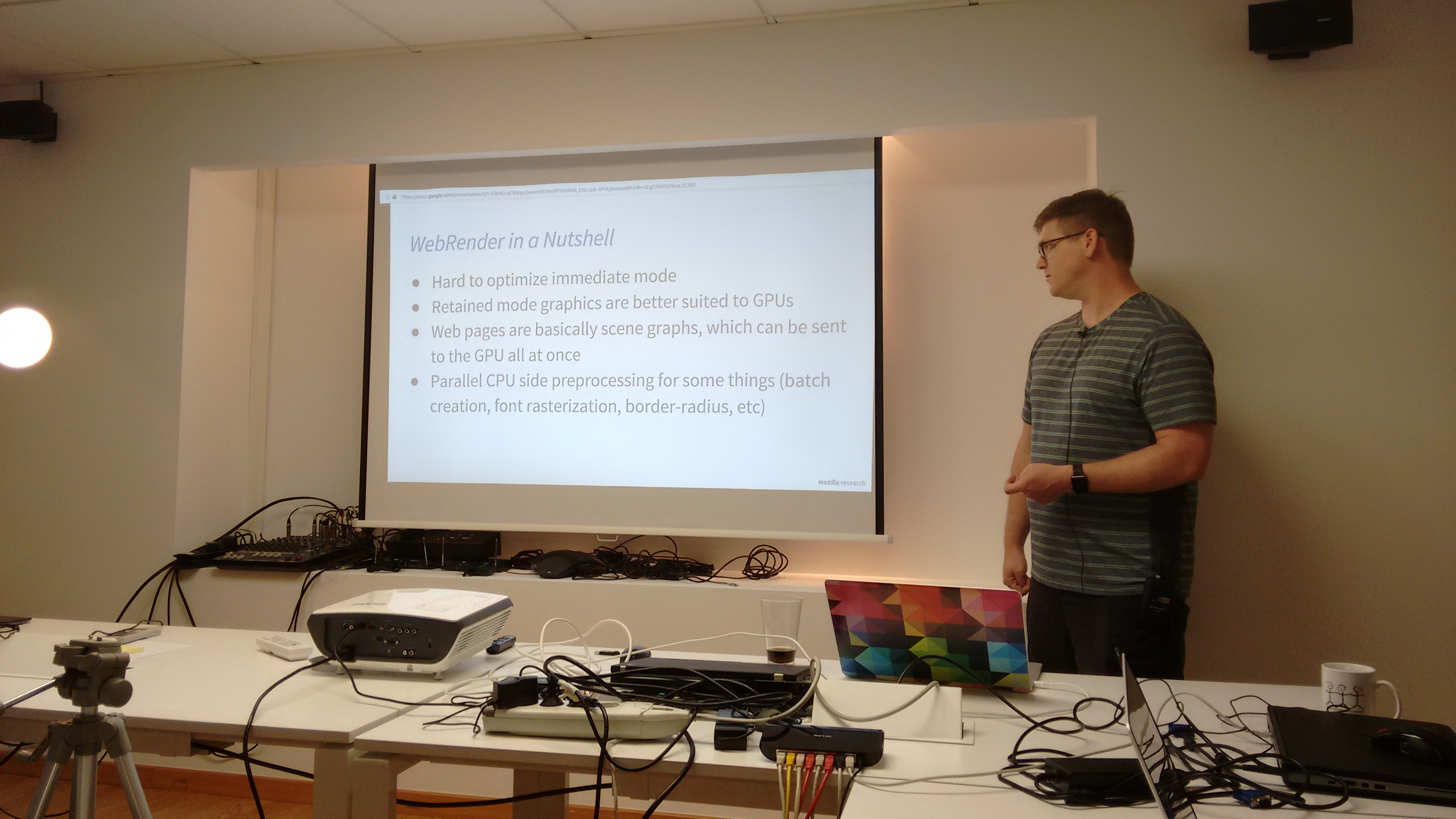
During the evening we held the Layout Breakout Session, where we had a nice discussion about the future of Layout in the different web engines. Christian Biesinger, one of the members of the Google’s Blink Layout team, talked about the new LayoutNG project; an experiment to implement a new Layout from scratch, cleaning up quite old code paths and solving some problems that were not possible to address with the current legacy code. This new LayoutNG idea is related to the new Layout API and the Houdini project, a new mechanism for defining new layout models without the requirement of a native support inside the browser. We had also some discussions about the current state of the Flexible Box specification in Blink and how WebKit’s implementation is quite abandoned and unmaintained nowadays.
In addition, we discussed about the current state of CSS Grid Layout implementation in the different engines. The implementation is almost complete in most of the main engines. Thanks to the collaboration between Igalia and Bloomberg we can confirm that WebKit and Blink’s implementations are almost completed. We have been evaluating Mozilla’s Gecko implementation of Grid and we verified it’s in a similar status. We talked about the recent news from TPAC, which Manuel Rego attended, about the CSS Grid Layout specification becoming Candidate Recommendation. Because of all these reasons, we have agreed with Christian that it’d be good to send the Blink intent-to-ship request as soon as possible; in case it’s accepted, it could be enabled by default in the next Chrome release.
Day 2
The day started with a meeting with Christian for evaluating the different approaches we implemented so far. We have discarded the ones requiring updating intrinsic size. We also decided to avoid solving the issue during the pre-layout of orthogonal items. This approach would have been the one with less impact on performance for grid layout and it would also solve the incorrect intrinsic size issue, however it would add penalties for cases not using grid at all.
Finally, Christian and I agreed on solving first the unpredictable behavior of grid layout logic. We would skip the issue of incorrect intrinsic size, overall because we think the Grid Layout specification is contradictory on this regard. For what is worth, I’ve created a new issue for the CSSWG in the W3C’s github. Even though we should wait for the issue to get clarified, we have already some possible approaches for getting what seems a more natural result for grid’s intrinsic size. The following example could help to understand the problem:
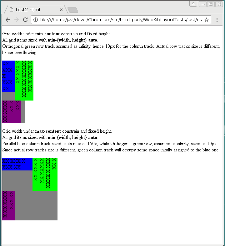
Both test cases were loaded using the same Chrome version commented before. They clearly show that neither min-content or max-content sizes are applied correctly to the grid container. The reason of this weird behavior is how content-sized tracks are handled by the Grid Tracks sizing algorithm in case of rendering grid items with orthogonal flow. From the last draft specification:
Then, if the min-content contribution of any grid items have changed based on the row sizes calculated in step 2, steps 1 and 2 are repeated with the new min-content contribution and max-content contribution (once only).
This, with the fact that orthogonal boxes pre-layout is performed before the tracks have been defined, causes that grid’s container intrinsic size is computed incorrectly. This problem is explained in detail in the W3C’s github issue mentioned before. So if anybody is interested on additional details or, even better, willing to participate in the ongoing discussion, just follow the link above.
Day 3
In addition to the orthogonal flow issues, Baseline Alignment was the other hot topic of my work during the hackfest. Baseline Alignment is the only feature still missing to complete the implementation of the CSS Box Alignment specification for Grid Layout. There is a preliminary approach in this code review issue, but it’s still not complete. The problem is that as it’s stated in the Alignment spec, Baseline Alignment may affect grid’s container intrinsic size:
When specified for align-self/justify-self, these values trigger baseline self-alignment, shifting the entire box within its container, which may affect the sizing of its container.
This fact implies that I should integrate Baseline offset computation inside the Grid Tracks sizing algorithm. Christian and I have been analyzing the sizing algorithm and we designed a possible approach, quite similar to what Flexbox implements in its layout logic.
Finally, we met again with Christian to discuss about the Minimum Implied size for Grid issues. Manuel had the chance to discuss it with the Grid spec editors at TPAC, but it seems there are still unresolved issues. There are an ongoing discussion at W3C’s github about this problem, you can get the details in issues 283 and 523. Christian suggested that he could add some feedback to the discussion, so we can clarify it as soon as possible. This is an important issue that may affect browser interoperability.
The hackfest
The Web Engines Hackfest is an event to share experiences between hackers of different web engines and brainstorming about the future of the Web Platform. This year there were hackers representing most of the main web engines, including Google’s Blink, Mozilla’s Gecko and Servo, Apple’s WebKit and Igalia’s WebKitGTK+.

There were scheduled talks from hackers of each engine so everybody could get an idea of their current state and future plans. In addition, some breakout sessions were scheduled during the kick-off session driven by my colleague Martin Robinson. We embraced everybody to propose new breakout sessions on the fly, every time an ongoing discussion needed a deeper debate or analysis.
I could attend most of the talks and breakout sessions, so I’ll give now my impressions about them. All the talks were recorded (will be available soon) and slides are available in the wiki, so I recommend to watch them if you haven’t already.
The first speaker in the schedule was Jack Moffitt (Mozilla) “Servo: Today & Tomorrow”. He gave a great overview of the progress they made on the new Servo rendering engine, emphasizing the multi-thread support and showing some performance metrics for different engine’s components, CSS parsing, scripting, layout, … He remarked the technical advantages of using Rust on the development of this new engine.
During Day 1 I attended two breakout sessions. The first one about the WebKitGTK+ engine was mainly focused on the recently published roadmap and specially about the new Threaded Compositor enabled by default. There was an interesting discussion about graphics support in WebKitGTK+ between the Collabora developers and Andrey Fedorov (Huawei).
The other breakout session I could attend during Day 1 was the one about the Servo engine. There was a nice discussion between Mozilla developers and Christian Biesinger about how both engines handle rendering in a different way. Servo hackers explained with more detail Servos’s threading model and its implication for layout.
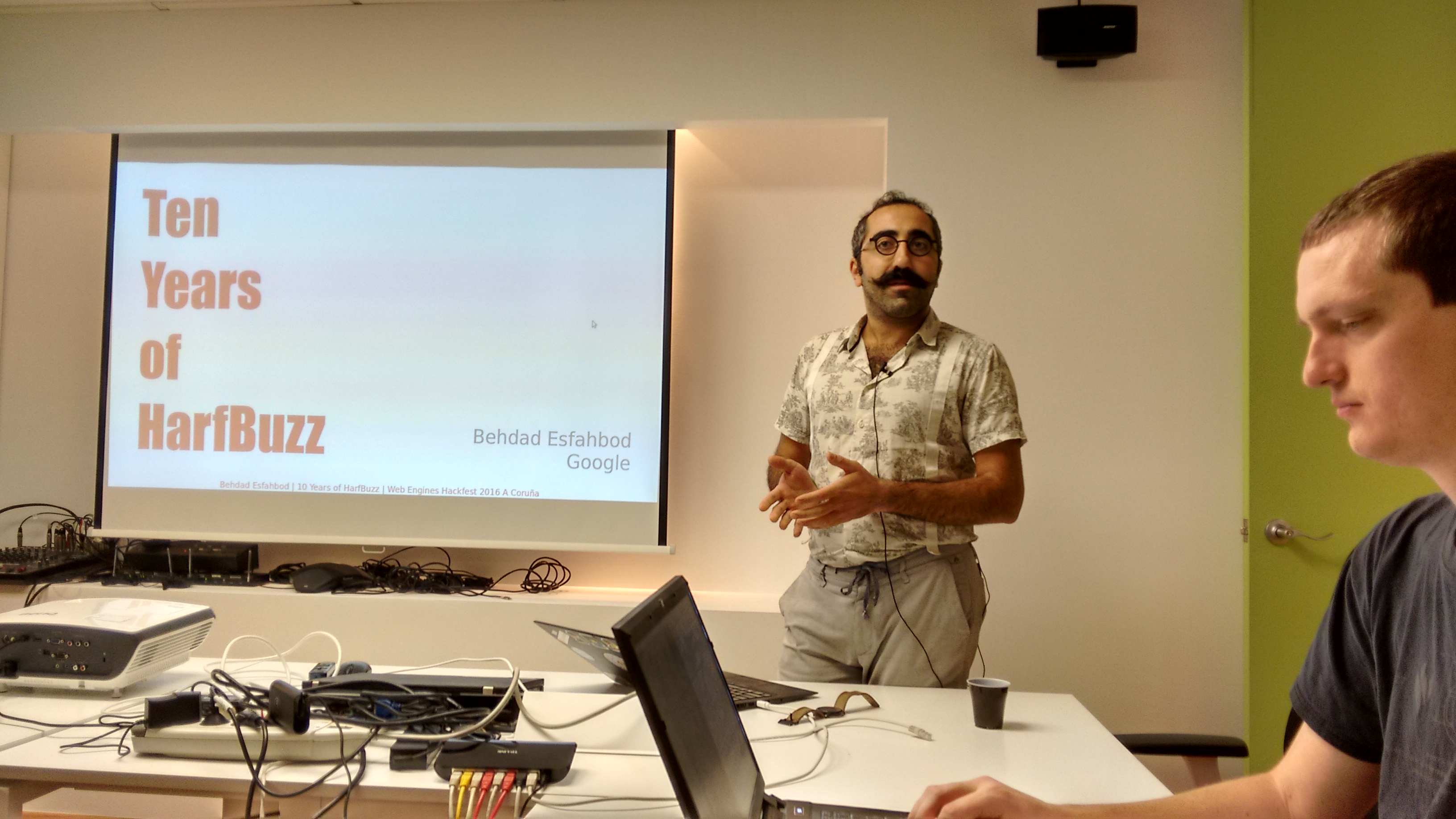
Day 2 started with the awesome talk by Behdad Esfahbod (Google) “HarfBuzz, the First Ten Years”. He gave an overview of the evolution of the HarfBuff library along the last years, including the past experiences in the Web Engines Hackfest and former events under previous name WebKitGTK+ Hackfest. Clearly, rendering fonts is a huge technical challenge. It was also awesome to have Behdad here to work closely with my colleague Fred Wang on the fonts support for MathML.
I attended the MathML breakout session, where the hot topic was Fred’s prototype implemented for the Blink engine. The result of this experiment was really promising, so we started to discuss its chances of getting back in Chrome, even behind an experimental flag. Both Christian and Behdad expressed doubts about that being possible nowadays. They suggested that it may be feasible to implement it through Houdini and the new Blink’s Layout API. We have confirmed that the refactoring we have done for WebKit applies perfectly in Blink, since both share a substantial portion of the layout codebase. In addition, after our work for removing the Flexbox dependency and further code clean up, we can be confident on the MathML independence in the layout logic. After some discussion, we have agreed on continue our experiments in Blink, independently of its chances to be integrated in Blink in the future, since I don’t think the Houdini approach makes sense for MathML, at least now.
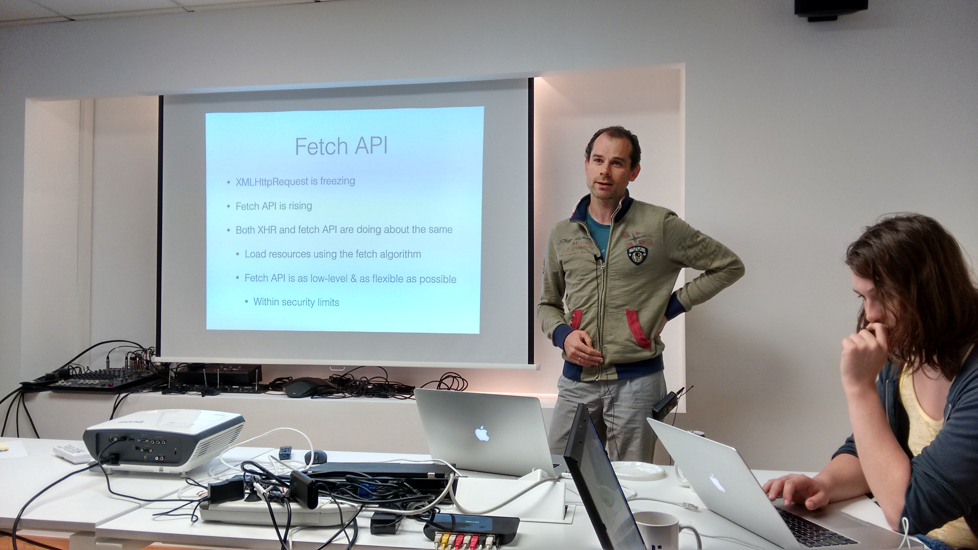
Later on Youenn Fabler (Apple) gave a talk about the Fetch API, “Fetching Bytes and Words on the Web”. He described the implementation of this specification in WebKit and its relation with the Streams API. The development is still ongoing and there are still quite much work to do.
I missed the talks of Day 3, so hopefully I’ll watch them as soon as the videos are available. It’s specially interesting the talk about WPE (aka WebKit For Wayland) , by my colleague Žan Doberšek. I’ve spent the day trying to get the most of having Christian Biesinger at our premises. As I commented before, we discussed about the Grid Layout’s Implied Minimum Size issue, one of the most complex problems we’ll have to solve in the short term.