In my last post I introduced the concept of Content Distribution alignment and how it affects Grid Layout implementation. At that time, it was possible to use all the <content-position> values to select grid tracks position inside a grid container, moving them across the available space. However, it wasn’t until recently that users can distribute grid tracks along such available space, literally adding gaps in between or even stretching them.
In this post I’ll describe how each <content-distribution> value affect tracks in a Grid Layout, their position and size, using different grid structures (eg. number of tracks, span).
Let’s start analyzing the new Content Distribution alignment syntax defined in the CSS Box Alignment specification:
auto | <baseline-position> | <content-distribution> || [ <overflow-position>? && <content-position> ]
In case of a <content-distribution> value can’t be applied, its associated fallback <content-distribution> value should be used instead. However, this CSS syntax allow users to specify a preferred fallback value:
If both a <content-distribution> and <content-position> are given, the <content-position> provides an explicit fallback alignment.
Before going into each value, I think it’s a good idea to refresh the concepts of alignment container and alignment subject and how they apply in the context of Grid Layout:
The alignment container is the grid container’s content box. The alignment subjects are the grid tracks.
The different <content-distribution> values that can be used for align-content and justify-content CSS properties are defined as follows:
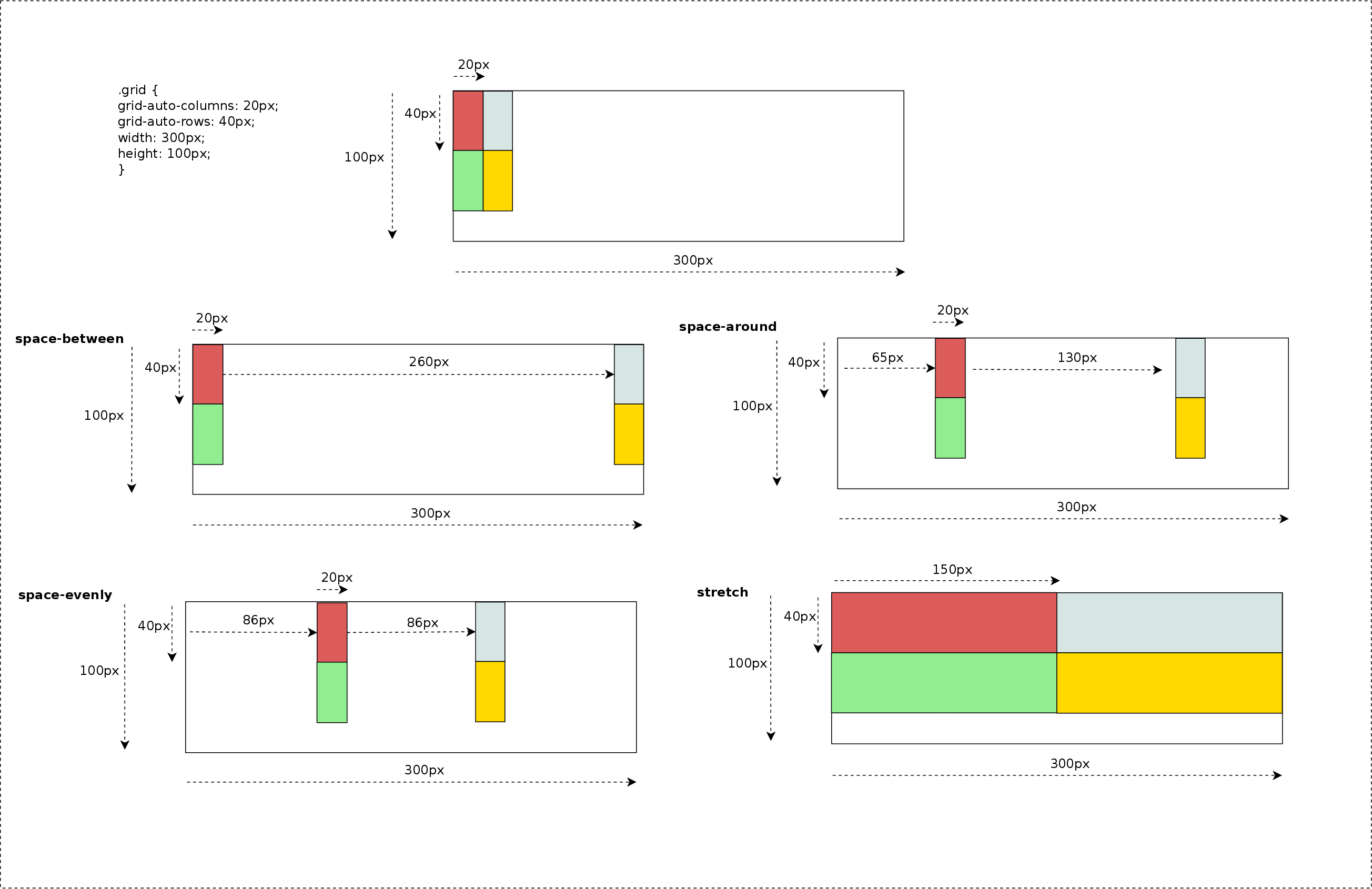
- space-between – The alignment subjects are evenly distributed in the alignment container. Default fallback: start.
- space-around – The alignment subjects are evenly distributed in the alignment container, with a half-size space on either end. Default fallback: center.
- space-evenly – The alignment subjects are evenly distributed in the alignment container, with a full-size space on either end. Default fallback: center.
- stretch – Any auto-sized alignment subjects have their size increased equally (not proportionally) so that the combined size exactly fills the alignment container. Default fallback: start.
Picture below describes how these values would behave depending on the number of grid tracks; for simplicity I only use justify-content property, so tracks are distributed along the inline (row) axis. In next examples we will see how both properties work together using more complex grid definitions.
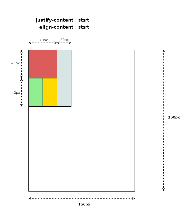
Previous examples were defined with grid items filling grid areas of just 1×1 tracks, which makes distribution pretty simple and easier to predict. But thanks to the flexibility of Grid Layout syntax we can define irregular grids, for instance, using the grid-template-areas property like in the next example.
Since Content Distribution alignment considers grid tracks as the alignment subject, distributing tracks along the available space may have the consequence of modifying the dimensions of grid-areas defined by more than one track. The following picture shows the result of the code above and provides and excellent example of how powerful is the Content Alignment effect on a Grid Layout.
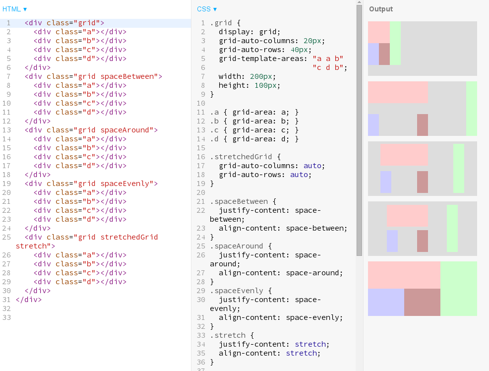
These use cases can be obtained from Igalia’s Grid Layout examples repository, so anybody can play with different grid designs and alignment values combinations. They are also available at our codepen repository.
Grid Layout behind the scene
Now I’d like to explain a bit what I had to implement in the browser’s webcore to get these new features done; just some small pieces of source code, the ones I considered better, to get an idea of what implementing new behavior in browsers implies.
As you might already know because of my previous posts, CSS Box Alignment specification was born to generalize Flexbox’s alignment behavior so that it can be used for grid and even regular blocks. Several new properties were added, like justify-items and justify-self, and CSS syntax has changed considerably. Specially noteworthy how Content Distribution alignment properties have changed from their initial Flexbox definition. They now support complex values like ‘space-between true’, ‘space-around start’, or even ‘stretch center safe’. This makes possible to express more info than using the previous simple keyword form, although it requires a new CSS parsing logic in Browsers.
More complex CSS parsing
Since both align-content and justify-content properties accept multiple optional keywords I needed to re-implement completely their parsing logic. I’m happy to announce that it recently landed WebKit’s trunk too, so now both web engines support the new CSS syntax.
Due to the complex values defined for theses CSS properties, a new CSSValue derived class was defined to hold all the Content Alignment data, named as CSSContentDistributionValue. This data is then converted to something meaningful for the style logic using the StyleBuilderConverter class. This is the preferred method in both WebKit and Blink engines, which it just needs to be declared in the CSSPropertyNames.in and CSSProperties.in template files, respectively.
align-content initial=initialContentAlignment, converter=convertContentAlignmentData
justify-content initial=initialContentAlignment, converter=convertContentAlignmentData
The StyleBuildConverter logic is pretty simple thanks to these 2 new data structures, as it can be appreciated in the following excerpt of source code:
StyleContentAlignmentData StyleBuilderConverter::convertContentAlignmentData(StyleResolverState&, CSSValue* value) { StyleContentAlignmentData alignmentData = ComputedStyle::initialContentAlignment(); CSSContentDistributionValue* contentValue = toCSSContentDistributionValue(value); if (contentValue->distribution()->getValueID() != CSSValueInvalid) alignmentData.setDistribution(*contentValue->;distribution()); if (contentValue->position()->getValueID() != CSSValueInvalid) alignmentData.setPosition(*contentValue->;position()); if (contentValue->overflow()->getValueID() != CSSValueInvalid) alignmentData.setOverflow(*contentValue->overflow()); return alignmentData; } |
The StyleContentAlignmentData class was defined to simplify how we manage these complex values, so that we can handle properties as they had an atomic value. This approach allows a more efficient and robust way of detecting and managing style changes in these properties.
New Layout operations
Once this new CSS syntax is correctly parsed and a LayoutStyle instance generated according to user defined CSS style rules, I needed to modify Flexbox’s layout code for adapting it to the new data structures, ensuring browser backward compatibility and passing all the Layout and Unit tests. I implemented from scratch this logic for Grid Layout so I had the opportunity to introduce several performance optimizations to avoid unnecessary layouts and repaints. This area is pretty interesting and I’ll talk about it soon in a new post.
One interesting aspect of Content Distribution alignment is that it might take part in the track sizing algorithm. As it was explained in my previous post about Self Alignment, stretch value increases alignment subject’s size to fill its alignment container’s available space. This is also the case of Content Alignment, but considering tracks as alignment subject. However, there is another case not so obvious where <content-distribution> values may influence in track sizing resolution, or perhaps better said, grid area sizing.
Let’s consider this example of grid where there are certain areas using more than one track:
grid-template-areas: "a a b" "c d b" grid-auto-columns: 20px; grid-auto-rows: 40px; width: 150px; height: 300px; |
The example above defines a grid with 3 column tracks of 20px and 2 row tracks of 40px, which would be laid out as it’s shown in the following diagram:
This fact has interesting implementation implications due to the fact that in certain cases, in order to determine grid item’s logical height we need its logical width to be resolved first. Track sizing algorithm uses children grid area size to determine grid cell’s logical height, hence given that alignment logic needs track sizes have been already resolved, it may imply a re-layout of the grid items which size could be affected by the used content-distribution value. The following source code shows how I handle this scenario:
LayoutUnit LayoutGrid::gridAreaBreadthForChild(const LayoutBox& child, GridTrackSizingDirection direction, const Vector& tracks) const { const GridCoordinate& coordinate = cachedGridCoordinate(child); const GridSpan& span = (direction == ForColumns) ? coordinate.columns : coordinate.rows; const Vector& trackPositions = (direction == ForColumns) ? m_columnPositions : m_rowPositions; if (span.resolvedFinalPosition.toInt() < trackPositions.size()) { LayoutUnit startOftrack = trackPositions[span.resolvedInitialPosition.toInt()]; LayoutUnit endOfTrack = trackPositions[span.resolvedFinalPosition.toInt()]; return endOfTrack - startOftrack + tracks[span.resolvedFinalPosition.toInt()].baseSize(); } LayoutUnit gridAreaBreadth = 0; for (GridSpan::iterator trackPosition = span.begin(); trackPosition != span.end(); ++trackPosition) gridAreaBreadth += tracks[trackPosition.toInt()].baseSize(); return gridAreaBreadth; |
The code above will return different results, in the cases mentioned before, depending on whether it’s run during track sizing alignment or after applying the alignment logic. This will likely make needed a new layout of the whole grid, or at least, the affected grid items, which it likely has a negative impact on performance.
Current status and next steps
I’d like to finish this post with a snapshot of current situation and challenges for the next months, as I’ve been regularly doing in my last posts.
Unlike last reports, this time I’ve got good news regarding reduction of implementation gaps between the two web engines we are focusing our efforts on, WebKit and Blink. The following table describes current situation:
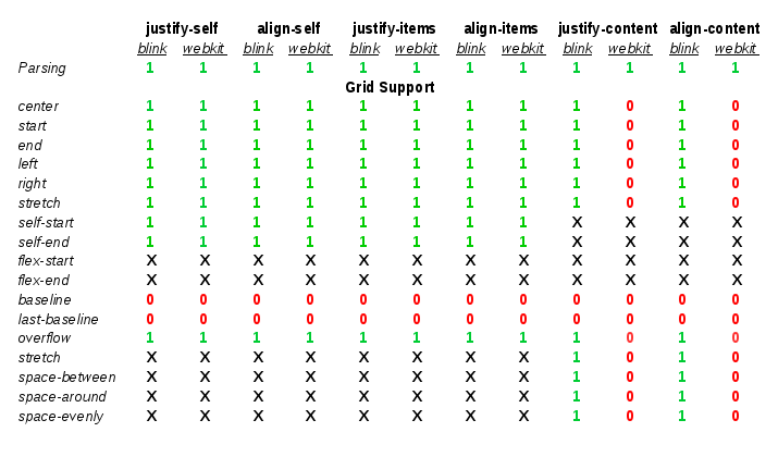
The table above indicates that several milestones were reached since the last report, although there are still some pending issues:
- I’ve completed the implementation in WebKit of the parsing logic for the new Box Alignment properties: align-items and align-self.
- As a side effect, I’ve also upgraded the ones already present because of Flexbox to the latest CSS3 Box Alignment specification.
- WebKit has now full support for Default and Self Alignment fro Grid Layout, including also overflow handling
- Blink has now full support for Content Distribution alignment, which missed <content-distrbuton> values.
- WebKit’s Grid Layout implementation still misses support for Content Distribution alignment.
- Baseline Alignment is still missing in both web engines
In addition to the above mentioned pending issues, our roadmap include the following tasks as part of my todo list for the next months:
- Even though there s support for different writing-modes and flow directions, there are still some issues with orthogonal flows. I’ve got already some promising patches but they still have to be reviewed by Blink and WebKit engineers.
- Optimizations of style and repaint invalidations triggered by changes on the alignment properties. As commented before, this is a very interesting topic involving, which I’ll elaborate further in next posts.
- Performance analysis of relevant Grid Layout use cases, which hopefully will lead to optimizations proposals.
All this work and many other contributions to Grid Layout for WebKit and Blink web engines are the result of the collaboration between Bloomberg and Igalia to implement this W3C specification.
