Motivation
Custom URL schemes have traditionally served as an integration bridge between the browser and external capabilities. Schemes such as mailto: and tel: allow navigation to trigger actions beyond ordinary HTTP resource retrieval. The HTML Standard formalizes this mechanism through the Custom Scheme Handlers API, which enables websites to register themselves as handlers for specific URL schemes.
While the Web API is appropriate for origin-scoped integrations, its security model imposes several structural constraints:
- Registration must be initiated from a visited website.
- It requires user activation.
- The handler URL must share the same origin as the registering site.
- Each registration is processed individually and requires explicit user approval.
These constraints are deliberate and necessary to prevent cross-origin abuse. However, they also limit legitimate integration scenarios that are better expressed outside the web-origin layer.
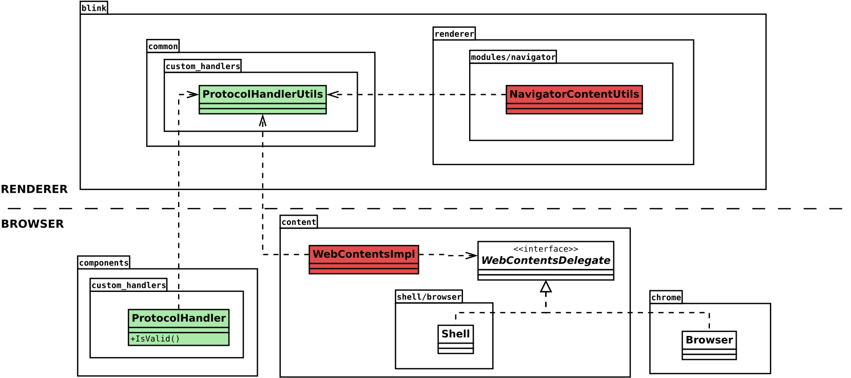
In collaboration with the Open Impact Foundation’s IPFS Implementations grants program, Igalia has implemented support for declaring protocol handlers directly in the Web Extension Manifest for Chromium-based browsers – achieving interoperability with Firefox. The goal is to make protocol registration a first-class extension capability, while preserving the security invariants established by the HTML Standard.
The proposal was discussed by the Web Extensions WICG back in 2023, with the support of Firefox (already implemented) and Chrome. Safari initially supported but finally changed to opposed.
This article introduces the motivation behind the feature, explains the design decisions that shaped it, and describes its internal security and lifecycle model.
The feature has been shipped behind an experimental flag in Chrome 146. To test it, just launch Chrome from the command line with this option:
--enable-features=ExtensionProtocolHandlersCase study: IPFS Companion
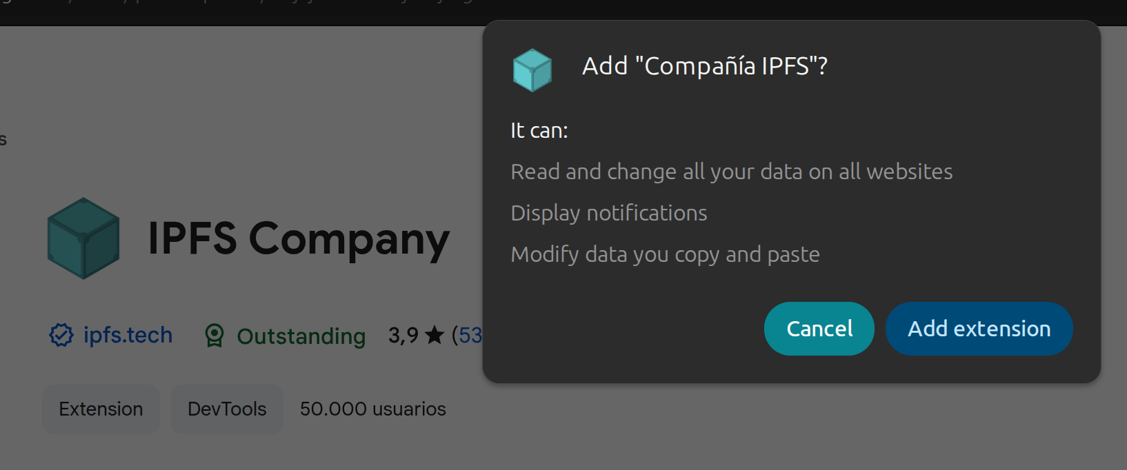
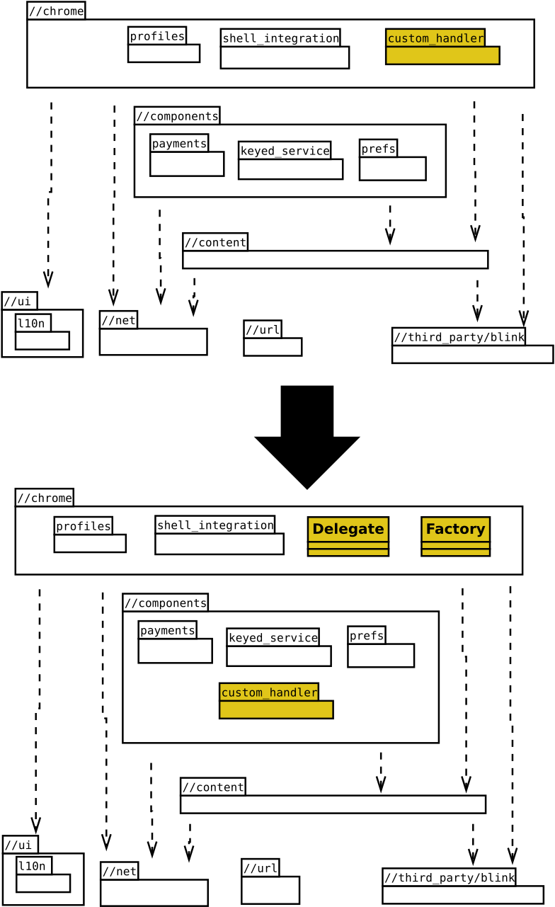
IPFS introduces schemes such as ipfs://, backed by a content-addressed data model rather than traditional origin-based addressing. In Chromium’s previous extension model, IPFS Companion must request declarativeNetRequest, webRequest, webNavigation, and <all_urls> host permissions — not because it wants to monitor all browsing activity, but because intercepting an unrecognized protocol requires inspecting every navigation and network request. The browser shows users a warning like “Read and change all your data on all websites”, which is disproportionate to what the extension actually does with those protocols. Users must decide whether to trust that warning based on the extension’s reputation alone.
These broad permissions also create friction with the Chrome Web Store review process. Extensions requesting webRequest and are flagged for in-depth review, adding days to every publish cycle and occasionally triggering outright rejections that require detailed justification of each permission.
In the absence of a native mechanism, IPFS Companion resorts to detecting when the browser converts an unrecognized ipfs:// URL into a search engine query, then intercepting and redirecting that query. This works, but it depends on browser-specific URL encoding behavior, breaks silently when search providers change their format, and may not work on all platforms due to security software interfering with such hijacking.
With manifest-declared protocol handlers, the extension can register IPFS directly. Navigation dispatch becomes declarative rather than interceptive. The permission model narrows, the architecture simplifies, and the integration aligns with the browser’s native routing mechanisms. These would be an example of the Extension Manifest:
  "protocol_handlers": [
    {
      "protocol": "ipns",
      "name": "IPFS Companion: IPNS Protocol Handler",
      "uriTemplate": "https://dweb.link/ipns/?uri=%s"
    },
    {
      "protocol": "ipfs",
      "name": "IPFS Companion: IPFS Protocol Handler",
      "uriTemplate": "https://dweb.link/ipfs/?uri=%s"
    }
  ]
This example illustrates the broader principle behind the feature: protocol handling should be expressed as a first-class navigation capability, not as a side effect of request rewriting.
Broader integration scenarios
Beyond decentralized networking use cases, manifest-declared protocol handlers enable enterprise and platform-level integrations. Organizations can define custom schemes that deep-link into internal systems, communication tools, authentication flows, or secure service endpoints. Extensions can manage these schemes centrally, update them through versioned deployments, and decouple protocol routing from web application modifications.
  "protocol_handlers": [
    {
      "protocol": "irc",
      "name": "Corporate IRC client",
      "uriTemplate": "https://mycompany.com/irc/?params=%s"
    },
    {
      "protocol": "mailto",
      "name": "Corporate Email client",
      "uriTemplate": "https://mycompany.com/webmail/?params=%s"
    },
    {
      "protocol": "webcal",
      "name": "Corporate Calendar client",
      "uriTemplate": "https://mycompany.com/calendar/?params=%s"
    },
    {
      "protocol": "web+plan",
      "name": "Corporate Planning client",
      "uriTemplate": "https://mycompany.com/planning/?params=%s"
    },
This establishes a structured integration surface between browser navigation and external systems while maintaining explicit user control and security guarantees.
The limits of existing mechanisms
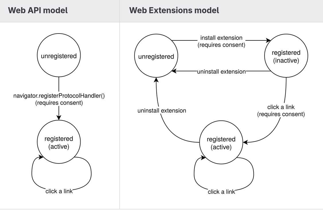
The HTML Standard’s navigator.registerProtocolHandler() API abides by the same-origin security model. A website may only register handlers that resolve within its own origin, and registration requires explicit user activation. This model works well when a web application intends to claim responsibility for a scheme that maps naturally to its own domain. However, extensions operate under a fundamentally different trust and lifecycle model.
Extensions are packaged artifacts installed by the user, subject to store review and explicit permission approval. Their integration surface extends beyond a single origin, and often spans navigation interception, network rewriting, operating system integration, and enterprise policy enforcement. Attempting to reuse the web-origin registration model for extension use cases introduces friction and architectural complexity.
As a result, extensions in Chromium-based browsers have historically relied on indirect mechanisms. For example, extensions such as IPFS Companion intercept navigation requests, detect custom schemes, and rewrite them into gateway-based HTTP URLs using APIs like declarativeNetRequest. Although functional, this approach moves protocol handling into request interception layers, rather than treating it as a native navigation routing concern. It increases implementation complexity, expands the required permission surface, and introduces maintenance overhead.
The absence of manifest-declared protocol handlers in Chromium created a gap between the capabilities of extensions and the needs of advanced integration scenarios.
A step forward: PWAs as “URL handlers”
Progressive Web Apps provided a partial evolution of the model by allowing protocol handlers to be declared via the Web App Manifest. This improved declarative configuration, but remained tightly coupled to the application’s origin and lifecycle. It did not address scenarios where the integration logic belongs to an extension rather than a web application.
Back in 2020, Chrome started prototyping a feature called PWAs as URL Handlers, allowing apps to register themselves as handlers for URLs matching a certain pattern. This feature has been abandoned in favor of Scoped Extensions for Web App Manifest, which precisely allows web apps to overcome some of the challenges that the same-origin policy imposes on this type of site architecture.
These lines of work did not address scenarios where the integration logic belongs to an extension rather than a web application. However, these initiatives inspired the work to implement similar capabilities in Web Extensions.
Manifest-declared protocol handlers
As a result of our work, Chromium now supports the protocol_handlers key directly in the Web Extension Manifest. This feature aligns protocol registration with the extension lifecycle instead of the web-origin lifecycle.
"protocol_handlers": [
  {
    "protocol": "ircs",
    "name": "IRC Mozilla Extension",
    "uriTemplate": "https://irccloud.mozilla.com/#!/%s"
  }
]
Handlers declared in the manifest are parsed and validated during extension installation. Registration occurs at that time, but activation is deferred: the handlers remain inactive until they are invoked by a navigation request and explicitly approved by the user.
This design introduces several important properties:
- Registration is declarative and tied to the extension artifact.
- Validation enforces HTML Standard constraints at parse time.
- Activation requires runtime user consent.
- Disabling or uninstalling the extension automatically removes its handlers.
By shifting protocol registration into the manifest, the browser gains a clearer separation between declaration, validation, and activation.
Security Model and Validation
Because protocol handlers influence navigation routing, the feature inherits strict validation rules from the HTML Standard. During manifest parsing, the browser verifies that declared schemes belong to a predefined safe list and that handler URLs use HTTP or HTTPS.
 "bitcoin", "cabal",  "dat",    "did",  "doi",  "dweb", "ethereum",
 "geo",     "hyper",  "im",     "ipfs", "ipns", "irc",  "ircs",
 "magnet",  "mailto", "matrix", "mms",  "news", "nntp", "openpgp4fpr",
 "sip",     "sms",    "smsto",  "ssb",  "ssh",  "tel",  "urn",
 "webcal",  "wtai",   "xmpp"
Given that the same-origin requirement is relaxed in this model, we need to validate explicitly that the target handler operates in a secure context. This ensures that the user doesn’t leave a trustworthy origin due to the redirection performed by the protocol handler.
The Web API model imposes a requirement of a mandatory User Activation to confirm the JavaScript registration request. The Extension API model, instead, proposes a declarative approach to perform the handler registration, so it happens silently without explicit user consent. However, this does not remove the user-gesture requirement from the security model; instead, it relocates it to the extension installation process.
Extension installation is an explicit user action that requires them to review the requested permissions and give their consent. Registration of manifest-declared protocol handlers occurs as part of this installation transaction. In this sense, the User Activation requirement is satisfied at the lifecycle level rather than at the API invocation level.
In addition, activation of a registered handler is deferred. When a matching navigation occurs, the browser prompts the user before allowing the handler to resolve the request. This introduces a second layer of consent, ensuring that protocol usage cannot occur silently.
The resulting model separates concerns:
- Installation authorizes registration.
- Runtime approval authorizes use.
This layered approach preserves the security intent of the HTML model while adapting it to the extension trust boundary.
Runtime permission flow
A key design decision was to avoid front-loading protocol permissions during installation. Modern WebExtensions APIs increasingly rely on runtime permission requests to reduce cognitive overload and improve user comprehension.
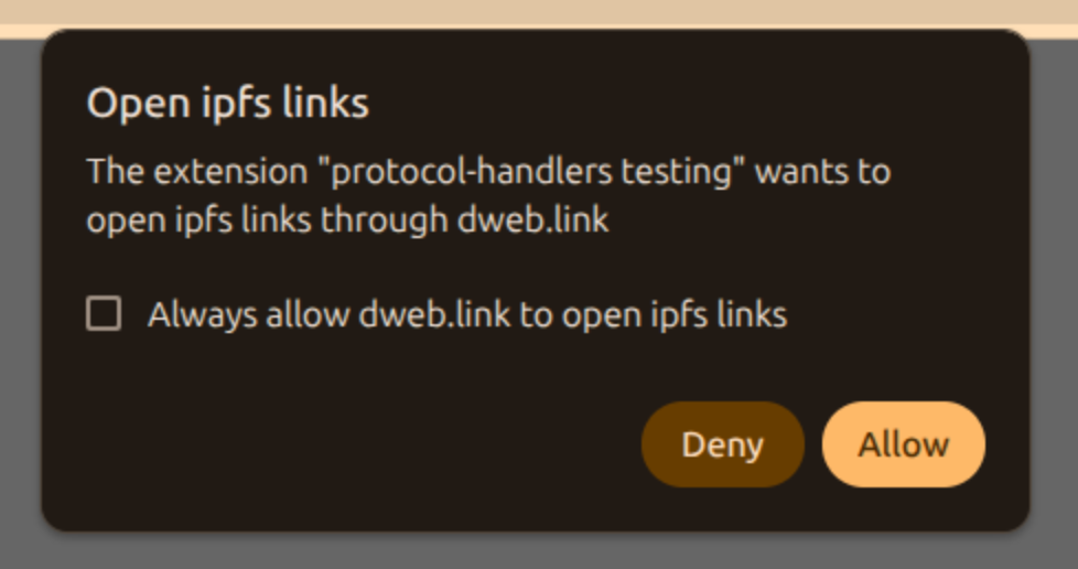
Accordingly, protocol handlers declared in the manifest remain dormant until a matching navigation occurs. When such a navigation is triggered, the browser presents a permission dialog identifying both the extension requesting activation and the destination to which navigation will be redirected. The user may approve the request once or choose to persist the decision.
This runtime gating model ensures transparency while preserving a smooth installation experience. It also aligns protocol handling with contemporary permission paradigms used across browser APIs.
Cross-origin considerations
The same-origin requirement in the HTML Standard’s Custom Scheme Handlers API is not incidental; it is central to its threat model. When a website registers itself as a handler, the specification requires that the handler URL share the same origin as the registering site. This prevents a malicious origin from silently redirecting navigation events to an unrelated third-party origin. In the Web API model, the origin boundary is the primary trust primitive.
The extension model operates under a different trust boundary. Extensions are not ephemeral web origins; they are packaged components, installed by the user, with declared permissions and a well-defined lifecycle. As a result, enforcing same-origin constraints in the extension context would artificially restrict legitimate scenarios, like the ones described in the previous sections, without materially improving security.
For example, consider decentralized protocols such as IPFS. Content addressing in IPFS does not map cleanly to traditional origin semantics. A handler may need to resolve a scheme into HTTP resources, via gateway mechanism, or local node endpoints or simply connect to the network itself; these targets do not share a single origin in the conventional sense. Imposing a strict same-origin requirement in this context would block valid architectures without offering additional protection.
Relaxing the same-origin requirement in the extension model does not eliminate safeguards. Instead, the security model shifts from origin isolation to layered controls managed by the user. These include:
- Extension store review and distribution controls.
- Explicit consent during the installation.
- Manifest-declared capabilities.
- Runtime approval before handler activation.
This layered approach ensures that a protocol handler cannot be silently introduced or activated. Even though a handler may redirect navigation to a different origin, that behavior is explicitly tied to an installed by the user from a trusted source, and subject to runtime confirmation.
It is also important to distinguish between cross-origin navigation and cross-origin data access. Protocol handler resolution affects the destination of a navigation request; it does not grant the extension arbitrary access to the target origin’s data. Standard web security boundaries—such as the Same-Origin Policy and CORS—remain fully enforced after navigation completes.
In this way, the extension model preserves the security intent of the HTML specification while adapting it to a broader integration surface. The trust anchor shifts from “origin that called the API” to “extension the user chose to install,” but the system continues to require explicit consent by the user before navigation control is delegated.
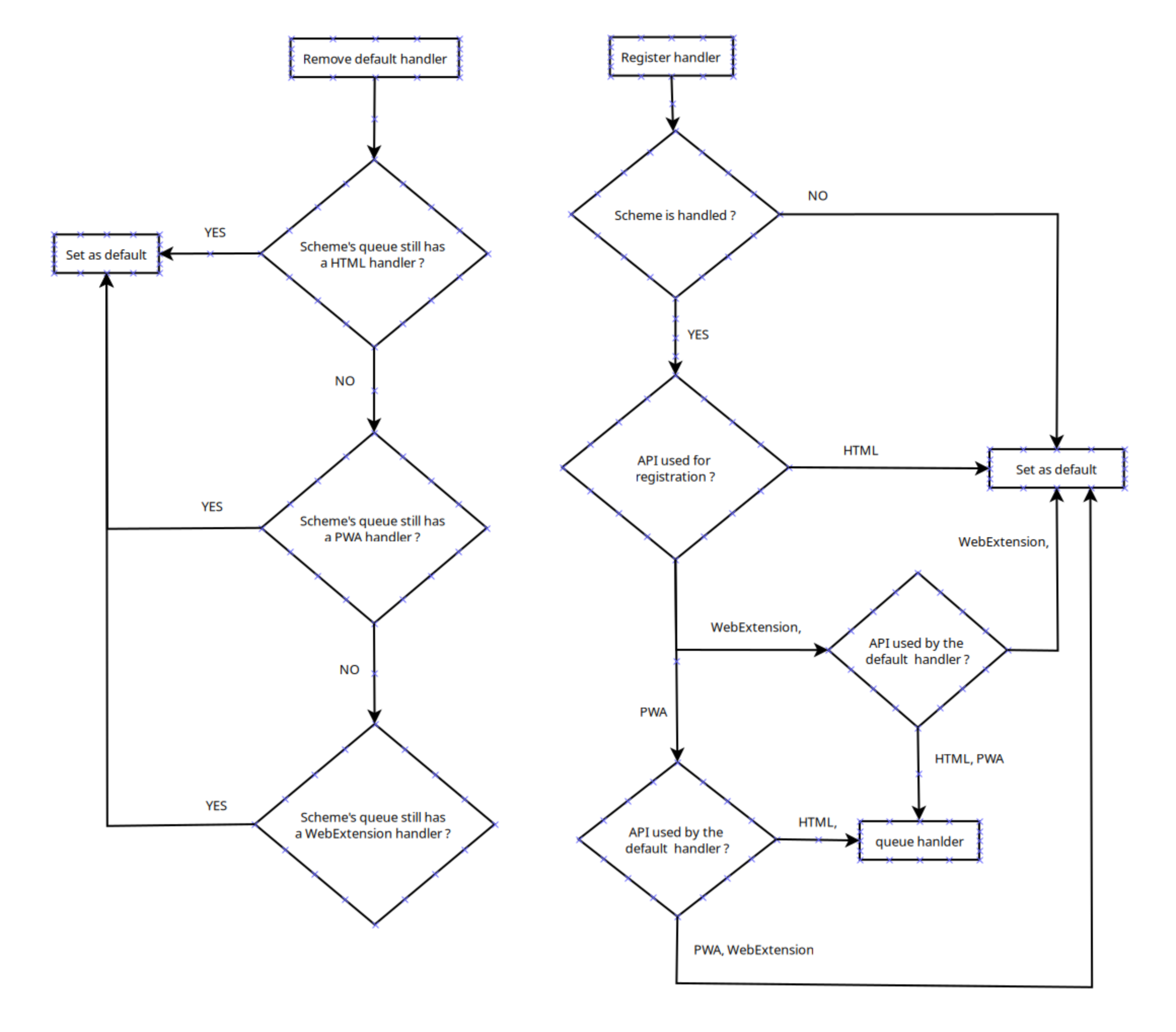
Conflict resolution across registration mechanisms
With protocol handlers now registrable through multiple mechanisms—the Web API, PWA manifests, and extension manifests—conflict resolution becomes necessary. The implementation preserves backward compatibility by prioritizing Web API registrations. If a handler has been registered via navigator.registerProtocolHandler(), it becomes the default for the corresponding scheme. PWA and extension handlers are considered lower priority and remain available if higher-priority registrations are removed.
This deterministic ordering ensures predictable behavior and avoids ambiguity when multiple registration surfaces coexist.
Why this feature matters
Adding manifest-declared protocol handlers to Chromium closes a long-standing capability gap with Firefox, which has offered such capability since 2017. This allows extension authors to ship a single manifest that works across both browsers, eliminating the need to maintain separate interception codepaths per engine.
Manifest-declared protocol_handlers replace all of this with a single, narrowly scoped declaration. The permissions surface shrink from “read and change all your data on all websites” to a runtime prompt scoped to the specific protocol: “Allow this extension to open IPFS links through dweb.link”.
The new API respects the validation rules of the HTML Standard while adapting them to the extension trust model. It aligns protocol handling with the extension lifecycle, integrates cleanly with modern runtime permission patterns, and provides deterministic conflict resolution across registration surfaces. Store reviewers can verify the declared intent directly in the manifest without auditing request interception logic.
For browser engineers, the feature introduces a cleaner architectural boundary between navigation routing and network interception. For web authors building advanced integrations, it enables robust, declarative protocol handling without relying on brittle implementation techniques. For extension developers, it means protocol handling can finally be expressed as what it is (a navigation capability) rather than being disguised as request rewriting.
With the Web Extensions CG moving toward WG status, this is a good opportunity to advance the standardization of the protocol_handlers key by proposing its inclusion in the Manifest Keys section of the Draft Community Group Report.


 Before


