Chrome 84 reached the stable channel a few weeks ago, and there are already several great posts describing the many important additions, interesting new features, security fixes and improvements in privacy policies (([1], [2], [3], [4]) it contains. However, there is a change that I worked on in this release which might have passed unnoticed by most, but I think is very valuable: A change regarding CSS Custom Properties (variables) performance.
The design of CSS, in general, takes great care in considering how features are designed with respect to making it possible for them to perform well. However, implementations may not perform as well as they could, and it takes a considerable amount of time to understand how authors use the features and which cases are more relevant for them.
CSS Custom Properties are an interesting example to look at here: They are a wonderful feature that provides a lot of advantages for web authors. For a whole lot of cases, all of the implementations of CSS Custom Properties perform well enough that most people won’t notice. However, we at Igalia have been analyzing several use cases and looking at some reports around their performance in different implementations.
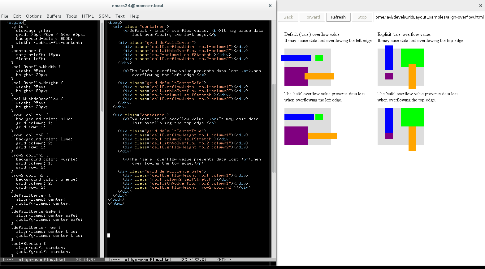
Let’s consider a fairly straightforward example in which an author sets a single property in a toggleable class in the body, and then uses that property several times deeper in the tree to change the foreground color of some text.
Only about 20% of those actually use this property, 5 elements deep into the tree, and only to change the foreground color.
To evaluate Chromium’s performance in a case like this we can define a new perf tests, using the perf tools the Chromium project has available for browser engineers. In this case, we want a huge tree so that we can evaluate better the impact of the different optimizations.
These are the results obtained runing the test in Chrome 83:
avg
median
stdev
min
max
163.74 ms
163.79 ms
3.69 ms
158.59 ms
163.74 ms
I admit that it’s difficult to evaluate the results, especially considering the number of nodes of such a huge DOM tree. Lets compare the results of the same test on Firefox, using different number of nodes.
Nodes
50K
20K
10K
5K
1K
500
Chrome 83
163.74 ms
55.05 ms
25.12 ms
14.18 ms
2.74 ms
1.50 ms
FF 78
28.35 ms
12.05 ms
6.10 ms
3.50 ms
1.15 ms
0.55 ms
1/6
1/5
1/4
1/4
1/2
1/3
As I commented before, the data are more accurate when the DOM tree has a lot of nodes; in any case, the difference is quite clear and shows there is plenty room for improvement. WebKit based browsers have results more similar to Chromium as well.
Performance tests like the one above can be added to browsers for tracking improvements and regressions over time, so we’ve added (r763335) that to Chromium’s tree: We’d like to see it get faster over time, and definitely cannot afford regressions (see Chrome Performance Dashboard and the ChangeStyleCustomPropertyDeclaration test for details) .
So… What can we do?
In Chrome 83 and lower, whenever the custom property declaration changed, the new declaration would be inherited by the whole tree. This inheritance implied executing the whole CSS cascade and recalculating the styles of all the nodes in the entire tree, since with this approach, all nodes may be affected.
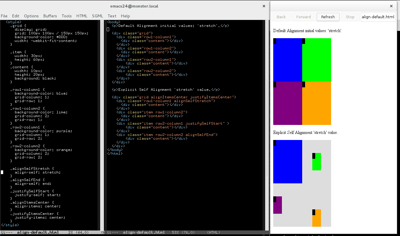
Chrome had already implemented an optimization on the CSS cascade implementation for regular CSS properties that don’t depend on any other to resolve their value. These subset of CSS properties are defined as Independent Properties in the Chromium codebase. The optimization mentioned before affects how the inheritance mechanism is implemented for these Independent properties. Whenever one of these properties changes, instead of recalculating the styles of the inherited properties, children can just copy the whole parent’s computed style. Blink’s style engine has a component known as Matched Properties Cache responsible of deciding when is possible to avoid the style resolution of an element and instead, performing an efficient copy of the matched computed style. I’ll get back to this concept in the last part of this post.
In the case of CSS Custom Properties, we could apply a similar approach as a good step. We can consider that the nodes with computed styles that don’t have references to custom properties declarations shouldn’t be affected by the new declaration, and we can implement the inheritance directly by copying the parent’s computed style. The patch with the optimization I’ve implemented in r765278 initially landed in Chrome 84.0.4137.0
Let’s look at the result of this one action in the Chrome Performance Dashboard:
That’s a really good improvement!
However, it’s also just a first step. It’s clear that Chrome still has a wide margin for improvement in this case, as well any WebKit based browser – Firefox is still, impressively, markedly faster as it’s been described in the bug report filed to track this issue. The following table shows the result of the different browsers together; even disabling the muti-thread capabilities of Firefox’s Stylo engine (STYLO_THREAD=1), FF is much faster than Chrome with the optimization applied.
Chrome 83
Chrome 84
FF 78
FF 78 th=1
avg median stdev min max
163.74 ms
163.79 ms
3.69 ms
158.59 ms
163.74 ms
117.37 ms
117.52 ms
1.98 ms
113.66 ms
120.87 ms
28.35 ms
28.50 ms
0.93 ms
26.00 ms
30.00 ms
38.25 ms
38.50 ms
1.86 ms
35.00 ms
41.00 ms
Before continue, I want get back to the Matched Properties Cache (MPC) concept, since it has an important role on these style optimizations. This cache is not a new concept in the Chrome’s engine; as a matter of fact, it’s also used in WebKit, since it was implemented long ago, before the fork that created the new blink engine. However, Google has been working a lot on this area in the last years and some of the most recent changes in the MPC have had an important impact on style resolution performance. As a result of this work, elements with independent and non-independent properties using CSS Variables might produce cache hits in the MPC. The results of the Performance Dashboard show a considerable improvement in the mentioned ChangeStyleCustomPropertyDeclaration test (avg: 108.06 ms)
Additionally, there are several other cases where the use of CSS Variables has a considerable impact on performance, compared with using regular CSS properties. Obviously, resolving CSS Variables has a cost, so it’s clear that we could apply additional optimizations that reduce the impact of the variable resolution, especially for handling specific style changes that might not affect to a substantial portion of the DOM tree. I’ve been experimenting with the MPC to explore the idea an independent CSS Custom Properties cache; nodes with variables referencing the same custom property will produce cache hits in the MPC, even though other properties don’t match. The preliminary approach I’ve been implementing consists on a new matching function, specific for custom properties, and a mechanism to transfer/copy the property’s data to avoid resolving the variable again, since the property’s declaration hasn’t change. We would need to apply the css cascade again, but at least we could save the cost of the variable resolution.
Of course, at the end of the day, improving performance has costs and challenges – and it’s hard to keep performance even once you get it. Bit if we really want performant CSS Custom Properties, this means that we have to decide to prioritize this work. Currently there is reluctance to explore the concept of a new Custom Properties specific cache – the challenge is big and the risks are not non-existent; cache invalidation can get complicated. But, the point is that we have to understand that we aren’t all going to agree what is important enough to warrant attention, or how much investment, or when. Web authors must convince vendors that these use cases are worth being optimized and that the cost and risks of such a complex challenges should be assumed by them.
This work has been sponsored by Bloomberg, which I consider one of the most important contributors of the Web Platform. After several years, the vision of this company and its responsibility as consumer of the platform has lead to many and important contributions that we all enjoy now. Although CSS Grid Layout might be the most remarkable one, there are may other not that big, like this work on CSS Custom Properties, or several other new features of the CSS Text specification. This is a perfect example of an company that tries to change priorities and adapt the web platform to its needs and the use cases they consider more aligned with their business strategy.
I understand that not every user of the web platform can do this kind of investment. This is why I believe that initiatives like Open Priorization could help to move the web platform in a positive direction. By providing a way for us to move past a lot of these conversation and focus on the needs that some web authors and users of the platform consider more important, or higher priority. Improving performance for CSS Custom Properties isn’t currently one of the projects we’ve listed, but perhaps it would be an interesting one we might try in the future if we are successful with these. If you haven’t already, have a look and see if there is something there that is interesting to you or your company – pledges of any size are good – ten thousand $1 donations are every bit as good as ten $1000 donations. Together, we can make a difference, and we all benefit.
Also, we would love to hear about your ideas. Is improving CSS Custom Properties performance important to you? What else is? Share your comments with us on Twitter, either me (@lajava77) or our developer advocate Brian Kardell (@briankardell), or email me at jfernandez@igalia.com. I’d be glad to answer any question about the Open Priorization experiment.
The CSS Text 3 specification defines a module for text manipulation and covers, among a few other features, the line breaking behavior of the browser, including white space handling. I’ve been working lately on some new features and bug fixing for this specification and I’d like to introduce in this posts the last one we made available for the Web Platform users. This is yet another contribution that came out the collaboration between Igalia and Bloomberg, which has been held for several years now and has produced many important new features for the Web, like CSS Grid Layout.
The feature
I guess everybody knows the white-space CSS property, which allows web authors to control two main aspects of the rendering of a text line: collapsing and wrapping. A new value break-spaces has been added to the ones available for this property, which allows web authors to emulate a terminal-like line breaking behavior. This new value operates basically like pre-wrap, but with two key differences:
any sequence of preserved white space characters takes up space, even at the end of the line.
a preserved white space sequence can be wrapped at any character, moving the rest of the sequence, intact, to the line bellow.
What does this new behavior actually mean ? I’ll try to explain it with a few examples. Lets start with a simple but quite illustrative demo which tries to emulate a meteorology monitoring system which shows relevant changes over time, where the gaps between subsequent changes must be preserved:
Another interesting use case for this feature could be a logging system which should preserve the text formatting of the logged information, considering different window sizes. The following demo tries to describe this such scenario:
In the demo shown before there are several cases that I think it’s worth to analyze in detail.
A breaking opportunity exists after any white space character
The main purpose of this feature is to preserve the white space sequences length even when it has to be wrapped into multiple lines. The following example tries to describe this basic use case:
The example above shows how the white space sequence with a length of 15 characters is preserved and wrapped along 3 different lines.
Single leading white space
Before the addition of the break-spaces value this scenario was only possible at the beginning of the line. In any other case, the trailing white spaces were either collapsed or hang, hence the next line couldn’t start with a sequence of white spaces. Lets consider the following example:
Like when using pre-wrap, the single leading space is preserved. Since break-spaces allows breaking opportunities after any white space character, we break after the first leading white space (” |XX XX”). The second line can be broken after the first preserved white space, creating another leading white space in the next line (” |XX | XX”).
However, lets consider now a case without such first single leading white space.
Again, it s not allowed to break before the first space, but in this case there isn’t any previous breaking opportunity, so the first space after the word XX should overflow (“XXX | XX”); the next white space character will be moved down to the next line as preserved leading space.
Breaking before the first white space
I mentioned before that the spec states clearly that the break-space feature allows breaking opportunities only after white space characters. However, it’d be possible to break the line just before the first white space character after a word if the feature is used in combination with other line breaking CSS properties, like word-break or overflow-wrap (and other properties too).
The two white spaces between the words are preserved due to the break-spaces feature, but the first space after the XXXX word would overflow. Hence, the overflow-wrap: break-word feature is applied to prevent the line to overflow and introduce an additional breaking opportunity just before the first space after the word. This behavior causes that the trailing spaces are moved down as a leading white space sequence in the next line.
We would get the same rendering if word-break: break-all is used instead overflow-wrap (or even in combination), but this is actualy an incorrect behavior, which has the corresponding bug reports in WebKit (197277) and Blink (952254) according to the discussion in the CSS WG (see issue #3701).
Consider previous breaking opportunities
In the previous example I described a combination of line breaking features that would allow breaking before the first space after a word. However, this should be avoided if there are previous breaking opportunities. The following example is one of the possible scenarios where this may happen:
In this case, we could break after the second word (“XX X| X”), since overflow-wrap: break-word would allow us to do that in order to avoid the line to overflow due to the following white space. However, white-space: break-spaces only allows breaking opportunities after a space character, hence, we shouldn’t break before if there are valid previous opportunities, like in this case in the space after the first word (“XX |X X”).
This preference for previous breaking opportunities before breaking the word, honoring the overflow-wrap property, is also part of the behavior defined for the white-space: pre-wrap feature; although in that case, there is no need to deal with the issue of breaking before the first space after a word since trailing space will just hang. The following example uses just the pre-wrap to show how previous opportunities are selected to avoid overflow or breaking a word (unless explicitly requested by word-break property).
In this case, break-all enables breaking opportunities that are not available otherwise (we can break a word at any letter), which can be used to prevent the line to overflow; hence, the overflow-wrap property doesn’t take any effect. The existence of previous opportunities is not considered now, since break-all mandates to produce the longer line as possible.
This new white-space: break-spaces feature implies a different behavior when used in combination with break-all. Even though the preference of previous opportunities should be ignored if we use the word-break: break-all, this may not be the case for the breaking before the first space after a word scenario. Lets consider the same example but using now the word-break: break-all feature:
The example above shows that using word-break: break-all doesn’t produce any effect. It’s debatable whether the use of break-all should force the selection of the breaking opportunity that produces the longest line, like it happened in the pre-wrap case described before. However, the spec states clearly that break-spaces should only allow breaking opportunities after white space characters. Hence, I considered that breaking before the first space should only happen if there is no other choice.
As a matter of fact, specifying break-all we shouldn’t considering only previous white spaces, to avoid breaking before the first white space after a word; the break-all feature creates additional breaking opportunities, indeed, since it allows to break the word at any character. Since break-all is intended to produce the longest line as possible, this new breaking opportunity should be chosen over any previous white space. See the following test case to get a clearer idea of this scenario:
Bear in mind that the expected rendering in the above example may not be obtained if your browser’s version is still affected by the bugs 197277(Safari/WebKit) and 952254(Chrome/Blink). In this case, the word is broken despite the opportunity in the previous white space, and also avoiding breaking after the ‘XX’ word, just before the white space.
There is an exception to the rule of avoiding breaking before the first white space after a word if there are previous opportunities, and it’s precisely the behavior the line-break: anywhere feature would provide. As I said, all these assumptions were not, in my opinion, clearly defined in the current spec, so that’s why I filed an issue for the CSS WG so that we can clarify when it’s allowed to break before the first space.
Current status and support
The intent-to-ship request for Chrome has been approved recently, so I’m confident the feature will be enabled by default in Chrome 76. However, it’s possible to try the feature in older versions by enabling the Experimental Web Platform Features flag. More details in the corresponding Chrome Status entry. I want to highlight that I also implemented the feature for LayoutNG, the new layout engine that Chrome will eventually ship; this achievement is very important to ensure the stability of the feature in future versions of Chrome.
In the case of Safari, the patch with the implementation of the feature landed in the WebKit’s trunk in r244036, but since Apple doesn’t announce publicly when a new release of Safari will happen or which features it’ll ship, it’s hard to guess when the break-spaces feature will be available for the web authors using such browser. Meanwhile, It’s possible to try the feature in the Safari Technology Preview 80.
Finally, while I haven’t see any signal of active development in Firefox, some of the Mozilla developers working on this area of the Gecko engine have shown public support for the feature.
The following table summarizes the support of the break-spaces feature in the 3 main browsers:
At Igalia we believe that the Web Platform Tests project is a key piece to ensure the compatibility and interoperability of any development on the Web Platform. That’s why a substantial part of my work to implement this relatively small feature was the definition of enough tests to cover the new functionality and basic use cases of the feature.
During the implementation of a browser feature, even a small one like this, it’s quite usual to find out bugs and interoperability issues. Even though this may slow down the implementation of the feature, it’s also a source of additional Web Platform tests and it may contribute to the robustness of the feature itself and the related CSS properties and values. That’s why I decided to implement the feature in parallel for WebKit (Safari) and Blink (Chrome) engines, which I think it helped to ensure interoperability and code maturity. This approach also helped to get a deeper understanding of the line breaking logic and its design and implementation in different web engines.
I think it’s worth mentioning some of these code architectural differences, to get a better understanding of the work and challenges this feature required until it reached web author’s browser.
Chrome/Blink engine
Lets start with Chrome/Blink, which was especially challenging due to the fact that Blink is implementing a new layout engine (LayoutNG). The implementation for the legacy layout engine was the first step, since it ensures the feature will arrive earlier, even behind an experimental runtime flag.
The legacy layout relies on the BreakingContext class to implement the line breaking logic for the inline layout operations. It has the main characteristic of handling the white space breaking opportunities by its own, instead of using the TextBreakIterator (based on ICU libraries), as it does for determining breaking opportunities between letters and/or symbols. This design implies too much complexity to do even small changes like this, especially because is very sensible in terms of performance impact. In the following diagram I try to show a simplified view of the classes involved and the interactions implemented by this line breaking logic.
The LayoutNG line breaking logic is based on a new concept of fragments, mainly handled by the NGLineBreaker class. This new design simplifies the line breaking logic considerably and it’s highly optimized and adapted to get the most of the TextBreakIterator classes and the ICU features. I tried to show a simplified view of this new design with the following diagram:
Although as time passes this is less probable, WebKit and Blink still share some of the layout logic from the ages prior to the fork. Although Blink engineers have applied important changes to the inline layout logic, both code refactoring and optimizations, there are common design patterns that made relatively easy porting to WebKit the patches that implemented the feature for the Blink’s legacy layout. In WebKit, the line breaking logic is also implemented by the BreakingContext class and it has a similar architecture, as it’s described, in a quite simplified way, in the class diagram above (it uses different class names for the render/layout objects, though) .
However, Safari supports for the mac and iOS platforms a different code path for the line breaking logic, implemented in the SimpleLineLayout class. This class provides a different design for the line breaking logic, and, similar to what Blink implements in LayoutNG, is based on a concept of text fragments. It also relies as much as possible into the TextBreakIterator, instead of implementing complex rules to handle white spaces and breaking opportunities. The following diagrams show this alternate design to implement the line breaking process.
This SimpleLineLayout code path in not supported by other WebKit ports (like WebKitGtk+ or WPE) and it’s not available either when using some CSS Text features or specific fonts. There are other limitations to use this SimpleLineLayout codepath, which may lead to render the text using the BreakingContext class.
I hope that at this point these 2 facts are clear now:
The white-space: break-spaces feature is a very simple but powerful feature that provides a new line breaking behavior, based on unix-terminal systems.
Although it’s a simple feature, on the paper (spec), it implies a considerable amount of work so that it reaches the browser and it’s available for web authors.
In this post I tried to explain in a simple way the main purpose of this new feature and also some interesting corner cases and combinations with other Line Breaking features. The demos I used shown 2 different use cases of this feature, but there are may more. I’m sure the creativity of web authors will push the feature to the limits; by then, I’ll be happy to answer doubts, about the spec or the implementation for the web engines, and of course fix the bugs that may appear once the feature is more used.
Igalia and Bloomberg working together to build a better web
Finally, I want to thank Bloomberg for supporting the work to implement this feature. It’s another example of how non-browser vendors can influence the Web Platform and contribute with actual features that will be eventually available for web authors. This is the kind of vision that we need if we want to keep a healthy, open and independent Web Platform.
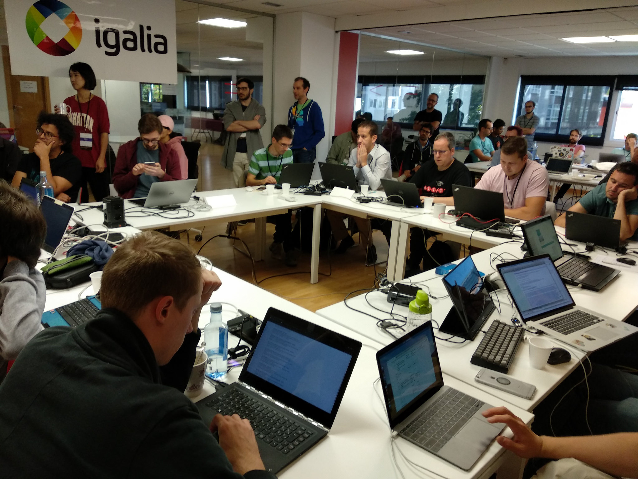
I had the pleasure to attend the Web Engines Hackfest last week, hosted and organized by Igalia in its HQ in A Coruña. I’m really proud of what we are achieving with this event, thank so much to everybody involved in the organization but, specially, to the people attending. This year we had a lot of talent in a single place, hacking and sharing their expertise on the Web Platform; I really think we all have pushed the Web Platform forward during these days.
As you may already know, I’m part of the Web Platform team at Igalia working on the implementation of the CSS Grid Layout feature for Blink and WebKit web engines. This work has been sponsored by Bloomberg, as part of the collaboration we started several years ago to improve the Web Platform in many areas, from JS (V8, JSC and even ChakraCore) to different modules of the layout engine (eg. CSS features, editing/selection).
Since the day I received the invitation to attend the hackfest I knew that one of the tasks I wanted to hack on was the implementation of the CSS Grid feature in the new Chromium’s layout engine (still experimental), known as LayoutNG. Having Chistinan Biesinger, one of the Google engineers working on LayoutNG, here during 3 days was so good to let pass by the oportunity to, at least, start this task. I asked him to give a lighting talk during the layout breakout session about the current status of the LayoutNG project, a brief explanation of some of the most relevant details of its logic and its advantages with the current layout.
Layout Breakout Session
A small group of people interested on layout met to discuss about the future of layout in different web engines. I attended with some folks representing Igalia, and other people from Mozilla, Google, WebKit and ARM.
Christian described the key parts of the new LayoutNG, which provides a simpler code and generally better performance (although results are still preliminary since its under development phase). The concept of fragments gained relevance in this new layout model and currently, inline and block layout is basically complete; the multicolumn layout is quite advanced while Flexbox is still in the early stages (although a substantial portion of the layout tests are passing now).
We discussed about the different strategies that Firefox, Chrome and Safari are following to redesign the layout logic, which has a huge legacy codebase required to support the old web along the last years. However, browsers need to adapt to the new layout models that a modern Web Platform requires. Chrome with LayoutNG implies a clear bet, with a big team and strong determination; it seems it’ll be ready to ship in the first months of 2019. Firefox is also starting to implement a new layout design with Servo, although I couldn’t get details about its current status and plans. Finally, WebKit started a few months ago a new project called Next-Generation layout which tries to implement a new Layout Formatting Context (LFC) logic from scratch, getting rid f the huge technical debt acquired during the last years; although I couldn’t get confirmation, my opinion is that it’s still an experimental project.
We also had time to talk about the effort ARM is doing towards a better parallelization of the CSS parsing and style recalc logic, following a similar approach to Mozilla’s Sylo in Servo. It’s a very intresting initiative, but still quite experimental. There is some progress on specific codepahts, but still dealing with Oilpan (Blink’s Garbage Collector) which is the root cause of several issues that prevents to obtain an effective parallelization.
Hacking, hacking, hacking, ….
As I commented, this event is designed precisely to gather together some of the most brilliant minds in the Web Platform to discuss, analyze and hack on complex topics that are usually very difficult to handle when working remotely. I had a clear hacking task this time, so that’s why I decided to focus a bit more on coding. Although I already had assumed that implementing CSS Grid in LayoutNG would be a huge challenge, I decided to take it and at least start the task. I took as reference the Flexible Box implementation, which is under development right now and something Christian was partially involved on.
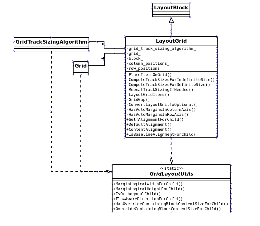
As it happened with the Flexbible Box implementation, the first step was to redesign the logic so that we can get rid of the dependency of the old Layout Tree, in this case, the LayoutGrid class. This has ben a complex and long task, which took me a quite big part of my time during the hackfest. The following diagrams show the redesign effort achieved, which I’d admit is still a preliminary approach that needs to be refined:
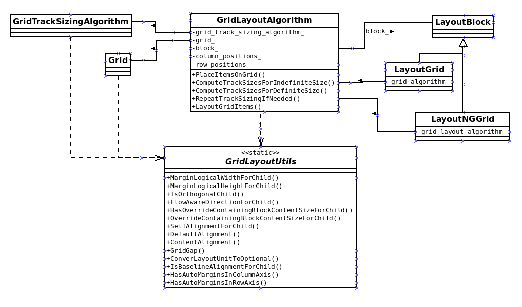
The next step was to implement an skeleton of the new layout-ng grid algorithm. Thanks to Christian’s direction, I quickly figure out how to do it and it looks like something like this:
Finally, I tried to implement the Grid layout’s algorithm, according to the CSS Grid Layout feature’s specification, using the new LayoutNG APIs. This is the more complex tasks, since I still have to learn how sizing and positioning functions are used on the new layout logic, specially how to use the new Fragments and ContainerBuilder concepts.
I submitted a WIP CL so that anybody can take a look, give suggestions or continue with the work. My plan is to devote some time to this challenge, every now and then, but I can’t set specifc goals or schedule for the time being. If anybody wants to speed up this task, perhaps it’d be possible to fund a project, which Igalia would be happy to participate.
Other Web Engines Hackfest stories
I also tried to attend some of the talks give during the hackfest and participate in a few breakout sessions. I’ll give now my impression of some of the ones I liked more.
I enjoyed a lot the one given by Camille Lamy, Colin Blundell and Robert Kroeger (Google) about the Chrome’s Servicification project. The new services design they are implementing is awesome and it will improve for sure Chrome modularity and codebase maintenance.
I participated in the MathML breakout session, which has somehow related to LayoutNG. Igalia launched a crowfunding campaign to implement the MathML specification in Chrome, using the new LayoutNG APIs. We thin that MathML could be a great success case for the new LayoutNG APIs, which has the goal of provide a stable API to implement new and complex layout models. This model will provide flexibility to the web engine, proving an easier way to implement new layout models without depending too much on the Chrome development cycle. In a way, this development model could be similar to a polyfill, but it’s integrated in the browser as native code instead of via external libraries.
As a member of the Igalia\’s team implementing the CSS Grid Layout feature for Blink and WebKit rendering engines, I\’m very proud of what we\’ve achieved from our collaboration with Bloomberg. I think Grid is a very interesting feature for the Web Platform and we still can\’t see all its potential.
One of my main assignments on this project is to implement the CSS Box Alignment spec for Grid. It\’s obvious that alignment is an important feature for many cases in web development, but I consider it a key for a layout model like the one Grid provides.
We recently announced that the patch implementing the self-baseline alignment landed in Blink. This was the last alignment functionality pending to implement, so now we can consider that the spec is complete for Grid. However, implementing a feature like CSS Box Alignment has an additional complexity in the form of interoperability issues.
Interoperability is always a challenge when implementing any new specification, but I think it\’s specially problematic for a feature like this for several reasons:
The feature applies to several layout models.
The CSS Flexible Box specification already defined some of the CSS properties and values.
Once a new layout model implements the new specification, Flexbox is forced to follow it as well.
I admit that the editors of this new specification document made a huge effort to keep backward compatibility with the Flexbox spec (which caused not so few implementation challenges). However, the current Flexbox implementation of the CSS properties and values that both specs have in common would become a Partial Implementation regarding the new spec.
Recently Florian Rivoal found out that this partial implementation of the CSS Box Alignment feature prevents the use of cascade or @support for providing customized fallbacks for the unimplemented Alignment properties.
What does Partial Implementation actually mean ?
As anybody can imagine, implementing a fancy web feature takes a considerable amount of time. During this period, the feature passes through several phases with different exposure to the end users. It\’s precisely due to the importance of end user\’s feedback that these new web features are shipped under experimental flags. This workflow is specially useful no only for browser devs but for the spec editors as well.
For this reason, the W3C CSS Working Group defines a general policy to manage Partial Implementations, which can be summarized as follows:
So that authors can exploit the forward-compatible parsing rules to assign fallback values, CSS renderers must treat as invalid (and ignore as appropriate) any at-rules, properties, property values, keywords, and other syntactic constructs for which they have no usable level of support. In particular, user agents must not selectively ignore unsupported property values and honor supported values in a single multi-value property declaration: if any value is considered invalid (as unsupported values must be), CSS requires that the entire declaration be ignored.
This policy is added to every spec as part of its Conformance appendix, so it is in the case of the CSS Box Alignment specification document. However, the interpretation of the Partial Implementation policy is far from trivial, specially for a feature like CSS Box Alignment. The most restrictive interpretation would imply the following facts:
Any new CSS property of the new spec should be declared invalid until is supported by all the layout models it applies to.
Any of the already existent CSS properties with new values defined in the new spec should be declared invalid until all these new values are implemented in all the layout models such property applies to.
Browsers shouldn\’t ship (without experimental flags) any CSS property or value until it\’s implemented in all the layout model it applies to.
When we discussed about this at Igalia we applied a less restrictive interpretation, based on the assumption that the spec actually defined several features which could be implemented and shipped independently, obviously avoiding any browsers interoperability issues. As it\’s been always in the nature of the specification, keeping backward compatibility with Flexbox implementations has been a must, since its spec already defines some of the CSS properties now present in the new spec.
The issue filed by Florian was discussed during the Tokyo F2F Apr 19-21 2017 meeting, where it was agreed to add a new section in the CSS Box Alignment spec to clarify how implementors of this feature should manage Partial Implementations:
Since it is expected that support for the features in this module will be deployed in stages corresponding to the various layout models affected, it is hereby clarified that the rules for partial implementations that require treating as invalid any unsupported feature apply to any alignment keyword which is not supported across all layout modules to which it applies for layout models in which the implementation supports the property in general.
The new text added makes the Partial Implementation policy less restrictive and, even it contradicts our interpretation of independent alignment features per layout model, it affects only to models which already implement any of the CSS properties defined in the new spec. In this case, only Flexbox has to be updated to implement the new values defined for its alignment related CSS properties: align-content, justify-content and align-self.
Analysis of the implementation and shipment status
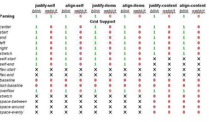
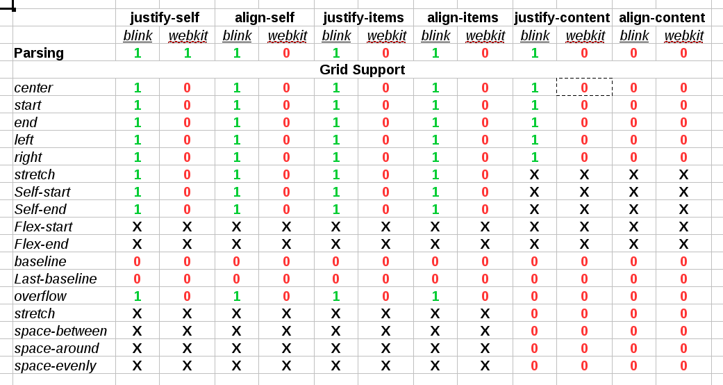
Before thinking on how to address the Partial Implementation issues, I decided to analyze what\’s the status of the CSS Box Alignment feature in the different browsers. If you are interested in the full analysis, it\’s available here. The following table shows the implementation status of the new spec in the Safary, Chrome and Firefox browsers, using a color code like unimplemented, only grid or both (flex and grid):
If you can try out some examples of these Partial Implementation issues, just try flexbox vs grid cases with some of these alignment values: align-items: center, align-self: left; align-content: start or justify-content: end.
The 3 major browsers analyzed have shipped most, if not all, the CSS Box Alignment spec implemented for CSS Grid Layout (since Chrome 57, Safari 10.1, Firefox 52). Firefox is the browser which implemented and shipped a wider support for CSS Flexible Box.
We can extract the following conclusions:
The 3 browsers analyzed have shipped Partial Implementations of the CSS Box Alignment specification, although Firefox is almost complete.
The 3 browsers have shipped a Grid feature that supports completely the new CSS Box Alignment spec, although Safari still misses the self-baseline values.
The 3 implementations of the new CSS Box Alignment specification are backward compatible with the CSS Flexible Box specification, even though it implements for some properties a lower level of the spec (e.g. self-baseline keywords)
Work in progress
Although we are still evaluating the problem together with the Blink and WebKit communities, at Igalia we are already working on improving the situation. We all agree on the damage to the Web Platform that these Partial Implementation issues are causing, as Florian pointed out initially, so that\’s a good starting point. There are bug reports on both WebKit and Blink and we are already providing patches for some of them.
We are still discussing about the best approach, but our bet would be to request an intent-to-implement-and-ship for a CSS Box Alignment (for flexbox layout) feature. This approach fits naturally in our initial plans of implementing several independent features from the alignment specification. It seems that it\’s what Firefox is doing, which already announced the implementation of CSS Box Alignment (for block layout)
Thanks to Bloomberg for sponsoring this work, as part of the efforts that Igalia has been doing all these years pursuing a better and more open web.
Last week I attended the Web Engines Hackfest 2016, hosted by Igalia at the HQ premises in A Coruña. For those still unaware, it’s a unconference like event focused on pure hacking and technical discussions about the main Web Engines supporting the Web Platform.
This year there were a very interesting group of hackers, representing most of the main web engines, like Mozilla’s Gecko and Servo, Google’s Blink, Apple’s WebKit and Igalia’s WebKitGTK+.
Hacking log
This year I was totally focused on hacking Blink web engine to solve some of the most complex issues of the CSS Grid Layout feature. I’d like to start giving thanks to Google to join the hackfest sending Christian Biesinger, specially thanks to him because of the long flight to attend. It was a pleasure to work work with him on-site and have the opportunity to discuss these complex issues face to face.
Day 1
During the weeks previous to the hackfest I’ve been working on fixing the bug 628565, reported several months ago but hitting me quite much recently. It’s a very ugly issue, since it shows an unpredictable behavior of Grid layout logic, so I decided that I might fix it once for all. I managed to provide 2 different approaches, which can be analyzed in the following code review issues: Issue 2361373002 and Issue 2333583002. Basically, the root cause of both issues is the same; grid’s container intrinsic size is not computed correctly when there are grid items with orthogonal flows.
There are 2 fundamental concepts that are key for understanding this problem:
Intrinsic size computation must be done before layout.
Orthogonal flow boxes need to be laid out in order to compute min-content contribution to their container’s intrinsic width.
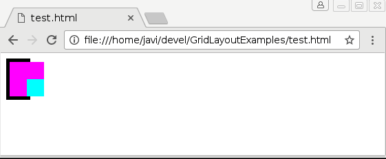
So, we had as single bug to fix for solving two different problems: unpredictable grid layout logic and incorrect grid’s intrinsic size computation. The first problem is the one reported in bug 628565. I’ll try to describe it here briefly, but further details can be obtained from the bug report. Let’s consider the following code:
The following pictures illustrate the issue when loading the code above with Google Chrome 55.0.2859.0 (Official Build) dev (64-bit) Revision 3f63c614e8c4501b1bfa3f608e32a9d12618b0a0-refs/heads/master@{#418117} under Linux operating system:
Chrome BEFORE resizing
Chrome AFTER resizing
Christian and I analyzed carefully Blink’s layout code and how it deals with orthogonal boxes. It’s worth mentioning that there are important issues with orthogonal flows in almost every web engine, but Blink has made lately some improvements on this regard. See how a very basic example works in Blink, Gecko and WebKit engines:
Blink has implemented a kind of pre-layout logic which is executed for any orthogonal flow box even before doing the actual layout, when box’s intrinsic size computation takes place. This solution allows using a more precise info about an orthogonal box’s height when computing its container’s intrinsic width; otherwise zero width would be assumed, as it’s the case of WebKit and Gecko engines. However, this approach leads to an incorrect behavior when using Grid Layout as I’ll explain later.
My first approach to solve these two issues was to update grid container’s intrinsic size after its orthogonal children were laid out. Hence, we could use the actual size of the children to compute their container’s intrinsic size. However, this violates the first rule of the two assertions defined before: no layout should be done for intrinsic size computation.
Layout Breakout Session
During the evening we held the Layout Breakout Session, where we had a nice discussion about the future of Layout in the different web engines. Christian Biesinger, one of the members of the Google’s Blink Layout team, talked about the new LayoutNG project; an experiment to implement a new Layout from scratch, cleaning up quite old code paths and solving some problems that were not possible to address with the current legacy code. This new LayoutNG idea is related to the new Layout API and the Houdini project, a new mechanism for defining new layout models without the requirement of a native support inside the browser. We had also some discussions about the current state of the Flexible Box specification in Blink and how WebKit’s implementation is quite abandoned and unmaintained nowadays.
In addition, we discussed about the current state of CSS Grid Layout implementation in the different engines. The implementation is almost complete in most of the main engines. Thanks to the collaboration between Igalia and Bloomberg we can confirm that WebKit and Blink’s implementations are almost completed. We have been evaluating Mozilla’s Gecko implementation of Grid and we verified it’s in a similar status. We talked about the recent news from TPAC, which Manuel Rego attended, about the CSS Grid Layout specification becoming Candidate Recommendation. Because of all these reasons, we have agreed with Christian that it’d be good to send the Blink intent-to-ship request as soon as possible; in case it’s accepted, it could be enabled by default in the next Chrome release.
Day 2
The day started with a meeting with Christian for evaluating the different approaches we implemented so far. We have discarded the ones requiring updating intrinsic size. We also decided to avoid solving the issue during the pre-layout of orthogonal items. This approach would have been the one with less impact on performance for grid layout and it would also solve the incorrect intrinsic size issue, however it would add penalties for cases not using grid at all.
Finally, Christian and I agreed on solving first the unpredictable behavior of grid layout logic. We would skip the issue of incorrect intrinsic size, overall because we think the Grid Layout specification is contradictory on this regard. For what is worth, I’ve created a new issue for the CSSWG in the W3C’s github. Even though we should wait for the issue to get clarified, we have already some possible approaches for getting what seems a more natural result for grid’s intrinsic size. The following example could help to understand the problem:
Both test cases were loaded using the same Chrome version commented before. They clearly show that neither min-content or max-content sizes are applied correctly to the grid container. The reason of this weird behavior is how content-sized tracks are handled by the Grid Tracks sizing algorithm in case of rendering grid items with orthogonal flow. From the last draft specification:
Then, if the min-content contribution of any grid items have changed based on the row sizes calculated in step 2, steps 1 and 2 are repeated with the new min-content contribution and max-content contribution (once only).
This, with the fact that orthogonal boxes pre-layout is performed before the tracks have been defined, causes that grid’s container intrinsic size is computed incorrectly. This problem is explained in detail in the W3C’s github issue mentioned before. So if anybody is interested on additional details or, even better, willing to participate in the ongoing discussion, just follow the link above.
Day 3
In addition to the orthogonal flow issues, Baseline Alignment was the other hot topic of my work during the hackfest. Baseline Alignment is the only feature still missing to complete the implementation of the CSS Box Alignment specification for Grid Layout. There is a preliminary approach in this code review issue, but it’s still not complete. The problem is that as it’s stated in the Alignment spec, Baseline Alignment may affect grid’s container intrinsic size:
When specified for align-self/justify-self, these values trigger baseline self-alignment, shifting the entire box within its container, which may affect the sizing of its container.
This fact implies that I should integrate Baseline offset computation inside the Grid Tracks sizing algorithm. Christian and I have been analyzing the sizing algorithm and we designed a possible approach, quite similar to what Flexbox implements in its layout logic.
Finally, we met again with Christian to discuss about the Minimum Implied size for Grid issues. Manuel had the chance to discuss it with the Grid spec editors at TPAC, but it seems there are still unresolved issues. There are an ongoing discussion at W3C’s github about this problem, you can get the details in issues 283 and 523. Christian suggested that he could add some feedback to the discussion, so we can clarify it as soon as possible. This is an important issue that may affect browser interoperability.
The hackfest
The Web Engines Hackfest is an event to share experiences between hackers of different web engines and brainstorming about the future of the Web Platform. This year there were hackers representing most of the main web engines, including Google’s Blink, Mozilla’s Gecko and Servo, Apple’s WebKit and Igalia’s WebKitGTK+.
There were scheduled talks from hackers of each engine so everybody could get an idea of their current state and future plans. In addition, some breakout sessions were scheduled during the kick-off session driven by my colleague Martin Robinson. We embraced everybody to propose new breakout sessions on the fly, every time an ongoing discussion needed a deeper debate or analysis.
I could attend most of the talks and breakout sessions, so I’ll give now my impressions about them. All the talks were recorded (will be available soon) and slides are available in the wiki, so I recommend to watch them if you haven’t already.
The first speaker in the schedule was Jack Moffitt (Mozilla) “Servo: Today & Tomorrow”. He gave a great overview of the progress they made on the new Servo rendering engine, emphasizing the multi-thread support and showing some performance metrics for different engine’s components, CSS parsing, scripting, layout, … He remarked the technical advantages of using Rust on the development of this new engine.
During Day 1 I attended two breakout sessions. The first one about the WebKitGTK+ engine was mainly focused on the recently published roadmap and specially about the new Threaded Compositor enabled by default. There was an interesting discussion about graphics support in WebKitGTK+ between the Collabora developers and Andrey Fedorov (Huawei).
The other breakout session I could attend during Day 1 was the one about the Servo engine. There was a nice discussion between Mozilla developers and Christian Biesinger about how both engines handle rendering in a different way. Servo hackers explained with more detail Servos’s threading model and its implication for layout.
Day 2 started with the awesome talk by Behdad Esfahbod (Google) “HarfBuzz, the First Ten Years”. He gave an overview of the evolution of the HarfBuff library along the last years, including the past experiences in the Web Engines Hackfest and former events under previous name WebKitGTK+ Hackfest. Clearly, rendering fonts is a huge technical challenge. It was also awesome to have Behdad here to work closely with my colleague Fred Wang on the fonts support for MathML.
I attended the MathML breakout session, where the hot topic was Fred’s prototype implemented for the Blink engine. The result of this experiment was really promising, so we started to discuss its chances of getting back in Chrome, even behind an experimental flag. Both Christian and Behdad expressed doubts about that being possible nowadays. They suggested that it may be feasible to implement it through Houdini and the new Blink’s Layout API. We have confirmed that the refactoring we have done for WebKit applies perfectly in Blink, since both share a substantial portion of the layout codebase. In addition, after our work for removing the Flexbox dependency and further code clean up, we can be confident on the MathML independence in the layout logic. After some discussion, we have agreed on continue our experiments in Blink, independently of its chances to be integrated in Blink in the future, since I don’t think the Houdini approach makes sense for MathML, at least now.
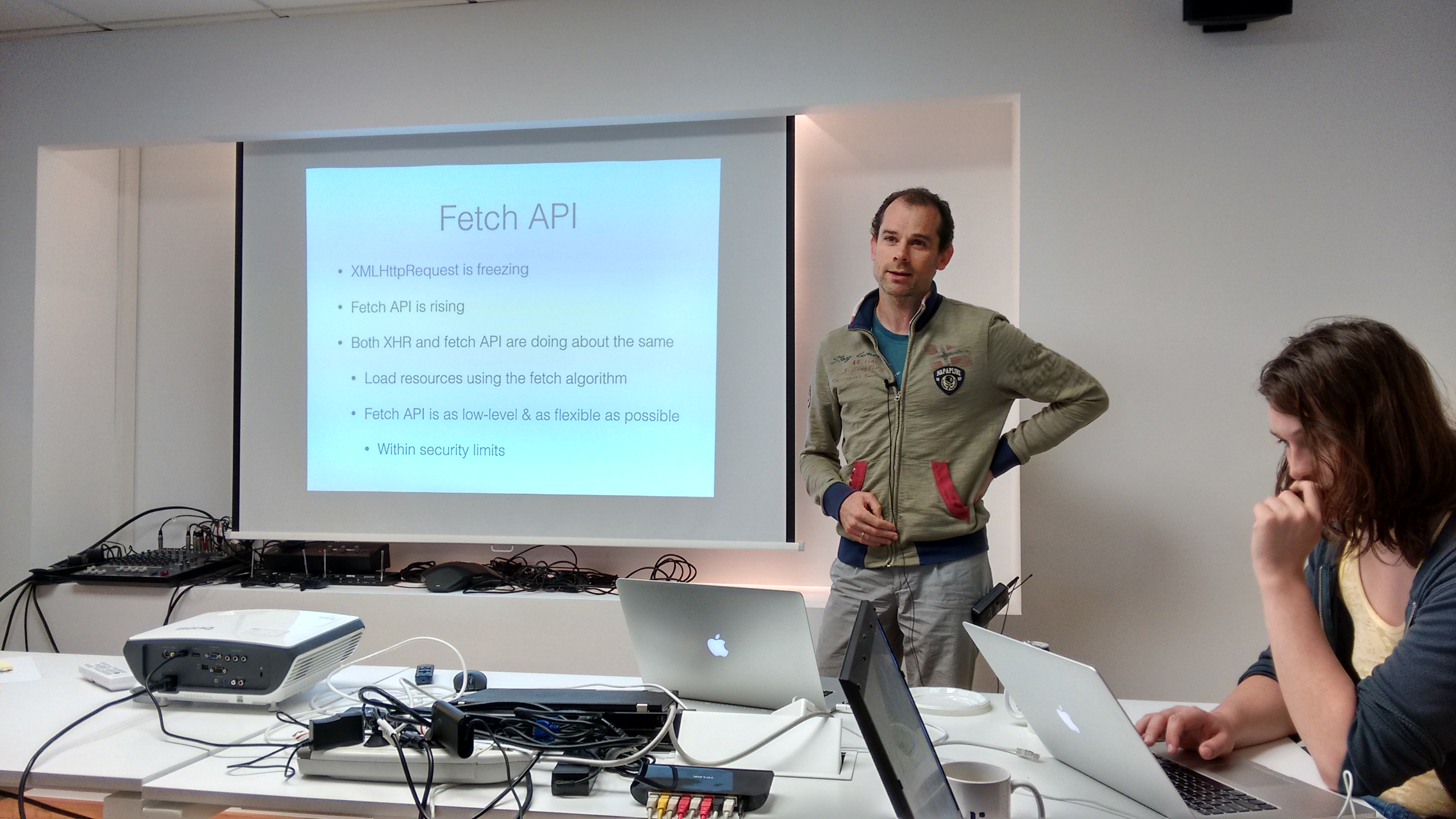
Later on Youenn Fabler (Apple) gave a talk about the Fetch API, “Fetching Bytes and Words on the Web”. He described the implementation of this specification in WebKit and its relation with the Streams API. The development is still ongoing and there are still quite much work to do.
I missed the talks of Day 3, so hopefully I’ll watch them as soon as the videos are available. It’s specially interesting the talk about WPE (aka WebKit For Wayland) , by my colleague Žan Doberšek. I’ve spent the day trying to get the most of having Christian Biesinger at our premises. As I commented before, we discussed about the Grid Layout’s Implied Minimum Size issue, one of the most complex problems we’ll have to solve in the short term.
Now that we have a quite complete implementation of CSS Grid Layout specification it’s time to take care of performance analysis and optimizations. In this essay, which is the first of a series of posts about performance, I’ll first introduce briefly how to use Blink (Chrome) and WebKit (Safari) performance analysis tools, some of the most interesting cases I’ve seen during my work on the implementation of this spec and, finally, a basic case to compare Flexbox and Grid layout models, which I’d like to evolve and analyze further in the coming months.
Performance analysis tools
Both WebKit and Blink projects provide several useful and easy to use scrips (python) to run a set of test cases and take different measurements and early analysis. They were written before the fork, that’s why related documentation can be found at WebKit’s track, but both engines still uses them, for the time being.
There are a wide set of performance tests under PerformanceTest folder, at Blink’s/WebKit’s root directory, but even though both engines share a substantial number of tests, there are some differences.
Chromium project has introduced a new performance tool, called Telemetry, which in addition of running the above mentioned tests, it’s designed to execute more complex cases like running specific PageSets or doing benchmarking to compare results with a preset recording (WebPageRelay). It’s also possible to send patches to performance try bots, directly from gclient or git (depot_tools) command line. There are quite much information available in the following links:
Regarding profiling tools, it’s possible both in Webkit and Blink to use the –profiler option when running the performance tests so we can collect profiling data. However, while WebKit recommends perf for linux, Google’s Blink engine provides some alternatives.
CSS Grid Layout performance tests and current status
While implementing a new browser feature is not easy to measure performance while code evolves so much and quickly and, what it’s worst, be aware of regressions introduced by new logic. When the feature’s syntax changes or there are missing or incomplete functionality, it’s not always possible to establish a well defined baseline for performance. It’s also a though decision to determine which use cases we might care about; obviously the faster the better, but adding performance optimizations usually complicates code, it may affect its robustness and it could lead to unexpected, and even worst, hard to find bugs.
At the time of this writing, we had 3 basic performance tests:
Why we have selected those uses cases to measure and keep track of performance regression ? First of all, note that auto-sizing one of the most expensive branches inside the grid track sizing algorithm, so we are really interested on both, improving it and keeping track of regressions on this code path.
body {display: grid;grid-template-rows:repeat(100,auto);grid-template-columns:repeat(20,auto);}.gridItem{height:200px;width:200px;}
On the other hand, fixed-sized is the easiest/fastest path of the algorithm, so besides the importance of avoiding regressions (when possible), it’s also a good case to compare with auto-sized.
body {display: grid;grid-template-rows:repeat(100,200px);grid-template-columns:repeat(20,200px);}.gridItem{height:200px;width:200px;}
Finally, a stretching use cases was added because it’s the default alignment value for grid items and the two test cases already described use fixed size items, hence no stretch (even though items fill the whole grid cell area). Given that I implemented CSS Box Alignment support for grid I was conscious of how expensive the stretching logic is, so I considered it an important use case to analyze and optimize as much as possible. Actually, I’ve already introduced several optimizations because the early implementation was quite slow, around 40% slower than using any other basic alignment (start, end, center). We will talk more about this later when we analyze a case to compare Flexbox and Grid performance in layout.
body {display: grid;grid-template-rows:repeat(100,200px);grid-template-columns:repeat(20,200px);}.gridItem{height:auto;width:auto;}
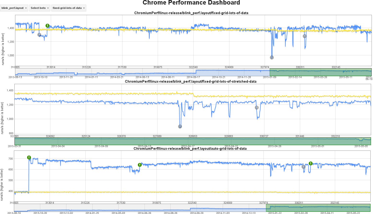
The basic HTML body of these 3 tests is quite simple because we want to analyze performance of very specific parts of the Grid Layout logic, in order to detect regressions in sensible code paths. We’d like to have eventually some real use cases to analyze and create many more performance tests, but chrome performance platform it’s definitively not the place to do so. The following graphs show performance evolution during 2015 for the 3 tests we have defined so far.
Note that yellow trace shows data taken from a reference build, so we can discount temporary glitches on the machine running the performance tests of target build, which are shown in the blue trace; this reference trace is also useful to detect invalid regression alerts.
Why performance is so different for these cases ?
The 3 tests we have for Grid Layout use runs/second values as a way to measure performance; this is the preferred method for both WebKit and Blink engines because we can detect regressions with relatively small tests. It’s possible, though, to do other kind of measurements. Looking at the graphs above we can extract the following data:
auto-sized grid: around 650 runs/sec
fixed-sized grid: around 1400 runs/sec
fixed-sized stretched grid: around 1250 runs/sec
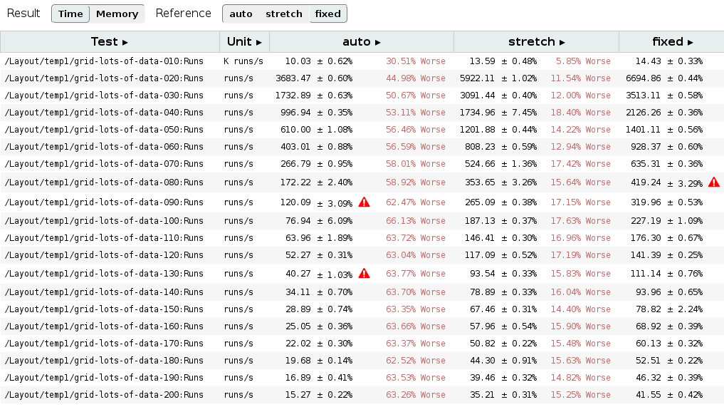
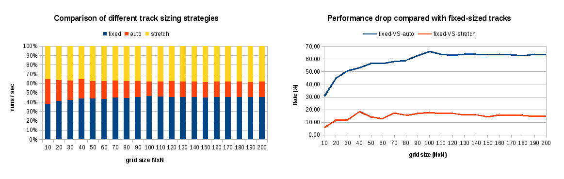
Before analyzing possible causes of performance drop for each case, I’ve defined some additional tests to stress even more these 3 cases, so we can realize how grid size affect to the obtained results. I defined 20 tests for these cases, each one with different grid items; from 10×10 up to 200×200 grids. I run those tests in my own laptop, so let’s take the absolute numbers of each case with a grain of salt; although differences between each of these 3 scenarios should be coherent. The table below shows some numeric results of this experiment.
First of all, recall that these 3 tests produce the same web visualization, consisting of grids with NxN items of 100px each one. The only difference is the grid layout strategy used to produce such result: auto-sizing, fixed-sizing and stretching. So now, focusing on previous table’s data we can evaluate the cost, in terms of layout performance, of using auto-sized tracks for defining the grid (which may be the only solution for certain cases). Performance drop is even growing with the number of grid items, but we can conclude that it’s stabilized around 60%. On the other hand stretching is also slower but, unlike auto-sized, in this case performance drop does not show a high dependency of grid size, more or less constant around 15%.
Impact of auto-sized tracks in layout performance
Basically, the track sizing algorithm can be described in the following 4 steps:
1- Initialize per Grid track variables.
2- Resolve content-based TrackSizingFunctions.
3- Grow all Grid tracks in GridTracks from their baseSize up to their growthLimit value until freeSpace is exhausted.
4- Grow all Grid tracks having a fraction as the MaxTrackSizingFunction.
These steps will be executed twice, first cycle for determining column tracks’s size and another cycle to set row tracks’s size which it may depend on grid’s width. When using just fixed-sized tracks in the very simple case we are testing, the only computation required to determine grid’s size is completing step 1 and determining free available space based on the specified fixed-size values of each track.
// 2. Resolve content-based TrackSizingFunctions.
if (!sizingData.contentSizedTracksIndex.isEmpty())
    resolveContentBasedTrackSizingFunctions(direction, sizingData);
I didn’t add source code of resolveContentBasedTrackSizingFunctions because it’s quite complex, but basically it implies a cost proportional to the number of grid tracks (minimum of 2x), in order to determine minContent and maxContent values for each grid item. It might imply additional computation overhead when using spanning items; it would require to sort them based on their spanning value and iterate over them again to resolve their content-sized functions.
Some issues may be interesting to analyze in the future:
How much each content-sized track costs ?
What is the impact on performance of using flexible-sized tracks ? Would it be the worst case scenario ? Considering it will require to follow the four steps of track sizing algorithm, it likely will.
Which are the performance implications of using spanning items ?
Why stretching is so performance drain ?
This is an interesting issue, given that stretch is the default value for both Grid and Flexbox items. Actually, it’s the root cause of why Grid beats Flexbox in terms of layout performance for the cases when stretch alignment is used. As I’ll explain later, Flexbox doesn’t have the optimizations I’ve implemented for Grid Layout.
Stretching logic takes place during the grid container layout operations, after all tracks have their size precisely determined and we have properly computed all grid track’s positions relatively to the grid container. It happens before the alignment logic is executed because stretching may imply changing some grid item’s size, hence they will be marked for layout (if they wasn’t already).
Obviously, stretching only takes place when the corresponding Self Alignment properties (align-self, justify-self) have either auto or stretch as value, but there are other conditions that must be fulfilled to trigger this operation:
box’s computed width/height (as appropriate to the axis) is auto.
neither of its margins (in the appropriate axis) are auto
still respecting the constraints imposed by min-height/min-width/max-height/max-width
In that scenario, stretching logic implies the following operations:
LayoutUnit stretchedLogicalHeight = availableAlignmentSpaceForChildBeforeStretching(gridAreaBreadthForChild, child);
LayoutUnit desiredLogicalHeight = child.constrainLogicalHeightByMinMax(stretchedLogicalHeight,-1);
bool childNeedsRelayout = desiredLogicalHeight != child.logicalHeight();if(childNeedsRelayout ||!child.hasOverrideLogicalContentHeight())
child.setOverrideLogicalContentHeight(desiredLogicalHeight - child.borderAndPaddingLogicalHeight());if(childNeedsRelayout){
child.setLogicalHeight(0);
child.setNeedsLayout();}
LayoutUnit LayoutGrid::availableAlignmentSpaceForChildBeforeStretching(LayoutUnit gridAreaBreadthForChild,const LayoutBox& child)const{
LayoutUnit childMarginLogicalHeight = marginLogicalHeightForChild(child);// Because we want to avoid multiple layouts, stretching logic might be performed before// children are laid out, so we can't use the child cached values. Hence, we need to// compute margins in order to determine the available height before stretching.if(childMarginLogicalHeight ==0)
childMarginLogicalHeight = computeMarginLogicalHeightForChild(child);return gridAreaBreadthForChild - childMarginLogicalHeight;}
LayoutUnit stretchedLogicalHeight = availableAlignmentSpaceForChildBeforeStretching(gridAreaBreadthForChild, child);
LayoutUnit desiredLogicalHeight = child.constrainLogicalHeightByMinMax(stretchedLogicalHeight, -1);

bool childNeedsRelayout = desiredLogicalHeight != child.logicalHeight();
if (childNeedsRelayout || !child.hasOverrideLogicalContentHeight())
    child.setOverrideLogicalContentHeight(desiredLogicalHeight - child.borderAndPaddingLogicalHeight());
if (childNeedsRelayout) {
    child.setLogicalHeight(0);
    child.setNeedsLayout();
}

LayoutUnit LayoutGrid::availableAlignmentSpaceForChildBeforeStretching(LayoutUnit gridAreaBreadthForChild, const LayoutBox& child) const
{
    LayoutUnit childMarginLogicalHeight = marginLogicalHeightForChild(child);

    // Because we want to avoid multiple layouts, stretching logic might be performed before
    // children are laid out, so we can't use the child cached values. Hence, we need to
    // compute margins in order to determine the available height before stretching.
    if (childMarginLogicalHeight == 0)
        childMarginLogicalHeight = computeMarginLogicalHeightForChild(child);

    return gridAreaBreadthForChild - childMarginLogicalHeight;
}
In addition to the extra layout required for changing grid item’s size, computing the available space for stretching adds an additional overhead, overall if we have to compute grid item’s margins because some layout operations are still incomplete.
Given that grid container relies on generic block’s layout operations to determine the stretched width, this specific logic is only executed for determining the stretched height. Hence performance drop is alleviated, compared with the auto-sized tracks scenario.
Grid VS Flexbox layout performance
One of the main goals of CSS Grid Layout specification is to complement Flexbox layout model for 2 dimensions. It’s expectable that creating grid designs with Flexbox will be more inefficient than using a layout model specifically designed for these cases, not only regarding CSS syntax, but also regarding layout performance.
However, I think it’s interesting to measure Grid Layout performance in 1-dimensional cases, usually managed using Flexbox, so we can have comparable scenarios to evaluate both models. In this post I’ll start with such cases, using a very simple one in this occasion. I’d like to get more complex examples in future posts, the ones more usual in Flexbox based designs.
So, let’s consider the following simple test case:
<div class="className">
   <div class="i1">Item 1</div>
   <div class="i2">Lorem ipsum dolor sit amet, consectetur adipiscing elit, sed do eiusmod tempor incididunt ut labore et dolore magna aliqua.</div>
   <div class="i3">Item 3 longer</div>
</div>
<div class="className">
<div class="i1">Item 1</div>
<div class="i2">Lorem ipsum dolor sit amet, consectetur adipiscing elit, sed do eiusmod tempor incididunt ut labore et dolore magna aliqua.</div>
<div class="i3">Item 3 longer</div>
</div>
I evaluated the simple HTML example above with both Flexbox and Grid layouts to measure performance. I used a CPU profiler to figure out where the bottlenecks are for each model, trying to explain where differences came from. So, I defined 2 CSS classes for each layout model, as follows:
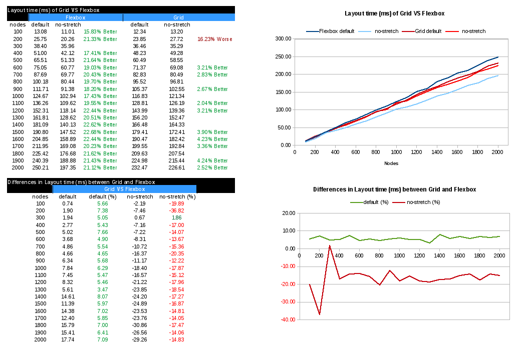
Given that there is not concept of row in Flexbox, I evaluated performance of 100 up to 2000 grid or flex containers, creating 20 tests to be run inside the chrome performance framework, described at the beginning of this post. You can check out resources and a script to generate them at our github examples repo.
When comparing both layout models targeting layout times, we see clearly that Grid Layout beats Flexbox using the default values for CSS properties controlling layout itself and alignment, which is stretch for these containers. As it was explained before, the stretching logic adds an important computation overhead, which as we can see now in the numeric table above, has more weight for Flexbox than Grid.
Looking at the plot about differences in layout time, we see that for the default case, Grid performance improvement is stabilized around 7%. However, when we avoid the stretching logic, for instance by using any other alignment value, layout performance it’s considerable worse than Flexbox, for this test case, around 15% slower. This is something sensible, as this test case is the idea for Flexbox, while a bit artificial for Grid; using a single Grid with N rows improves performance considerably, getting much better numbers than Flexbox, but we will see these cases in future analysis.
Grid layout better results for the default case (stretch) are explained because I implemented several optimizations for Grid. Probably Flexbox should do the same, as it’s the default value and it could affect many sites using this layout model in their designs.
Thanks to Bloomberg for sponsoring this work, as part of the efforts that Igalia has been doing all these years pursuing a better and more open web.
In my last post I introduced the concept of Content Distribution alignment and how it affects Grid Layout implementation. At that time, it was possible to use all the <content-position> values to select grid tracks position inside a grid container, moving them across the available space. However, it wasn’t until recently that users can distribute grid tracks along such available space, literally adding gaps in between or even stretching them.
In this post I’ll describe how each <content-distribution> value affect tracks in a Grid Layout, their position and size, using different grid structures (eg. number of tracks, span).
Let’s start analyzing the new Content Distribution alignment syntax defined in the CSS Box Alignment specification:
In case of a <content-distribution> value can’t be applied, its associated fallback <content-distribution> value should be used instead. However, this CSS syntax allow users to specify a preferred fallback value:
If both a <content-distribution> and <content-position> are given, the <content-position> provides an explicit fallback alignment.
Before going into each value, I think it’s a good idea to refresh the concepts of alignment container and alignment subject and how they apply in the context of Grid Layout:
The alignment container is the grid container’s content box. The alignment subjects are the grid tracks.
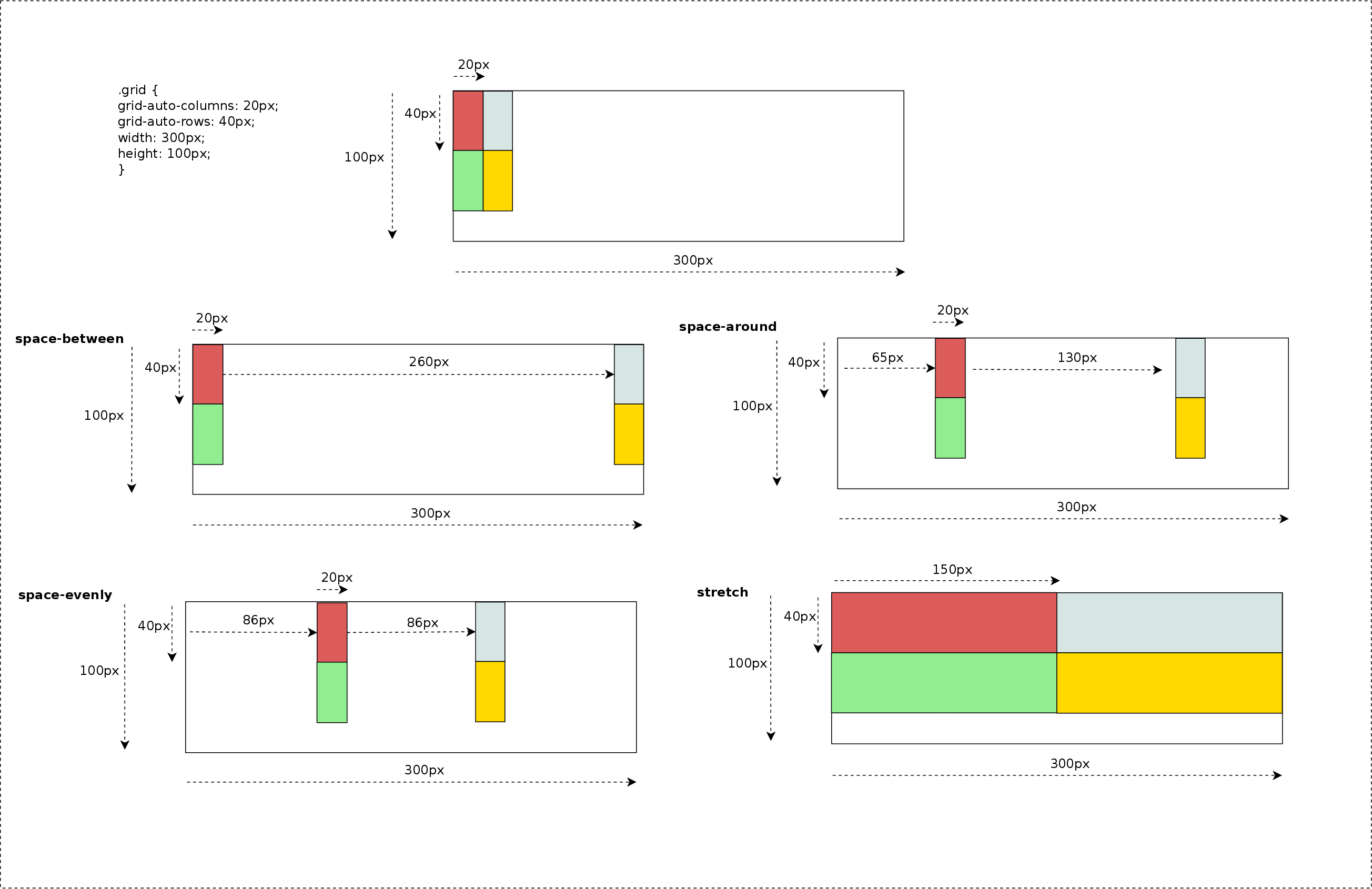
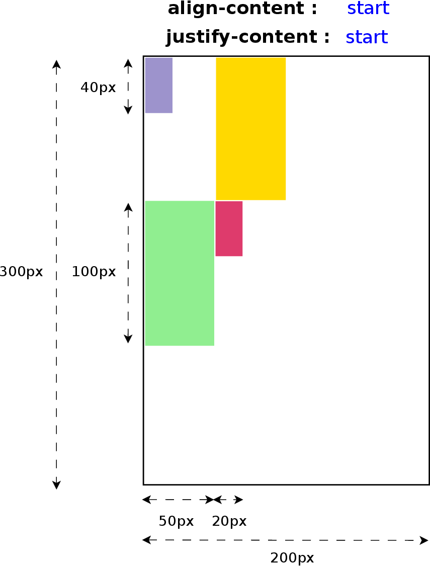
The different <content-distribution> values that can be used for align-content and justify-content CSS properties are defined as follows:
space-between – The alignment subjects are evenly distributed in the alignment container. Default fallback: start.
space-around – The alignment subjects are evenly distributed in the alignment container, with a half-size space on either end. Default fallback: center.
space-evenly – The alignment subjects are evenly distributed in the alignment container, with a full-size space on either end. Default fallback: center.
stretch – Any auto-sized alignment subjects have their size increased equally (not proportionally) so that the combined size exactly fills the alignment container. Default fallback: start.
Picture below describes how these values would behave depending on the number of grid tracks; for simplicity I only use justify-content property, so tracks are distributed along the inline (row) axis. In next examples we will see how both properties work together using more complex grid definitions.
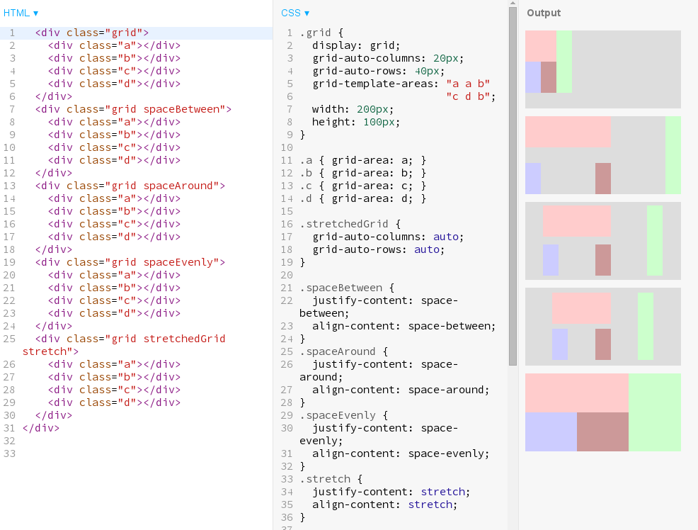
Effect of different Content Distribution values on Grid Layout. Click on the Image to evaluate the behavior when using different number of tracks.
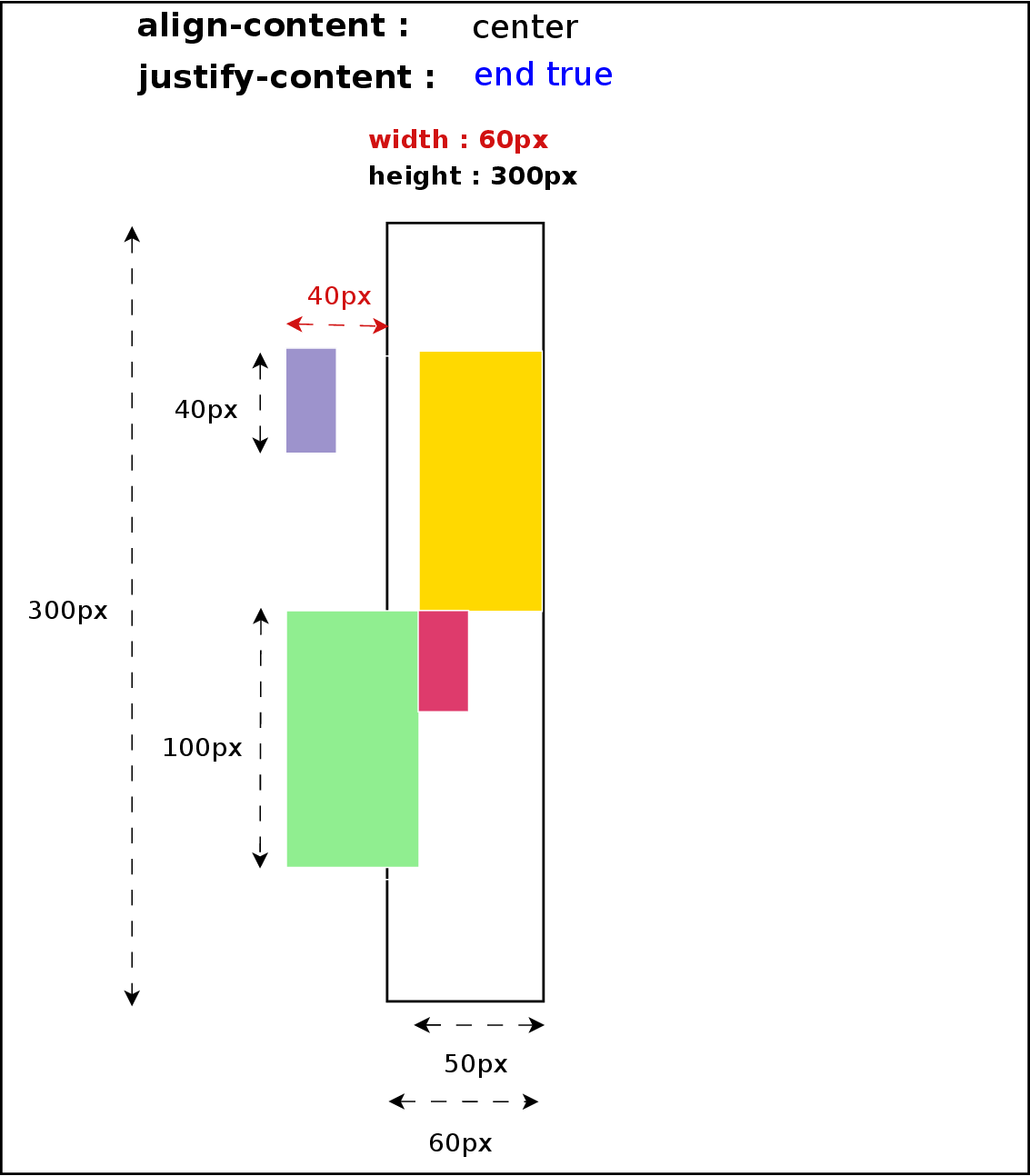
Previous examples were defined with grid items filling grid areas of just 1×1 tracks, which makes distribution pretty simple and easier to predict. But thanks to the flexibility of Grid Layout syntax we can define irregular grids, for instance, using the grid-template-areas property like in the next example.
Basic example of how to apply the different values and its effect on irregular grid design.
Since Content Distribution alignment considers grid tracks as the alignment subject, distributing tracks along the available space may have the consequence of modifying the dimensions of grid-areas defined by more than one track. The following picture shows the result of the code above and provides and excellent example of how powerful is the Content Alignment effect on a Grid Layout.
These use cases can be obtained from Igalia’s Grid Layout examples repository, so anybody can play with different grid designs and alignment values combinations. They are also available at our codepen repository.
Grid Layout behind the scene
Now I’d like to explain a bit what I had to implement in the browser’s webcore to get these new features done; just some small pieces of source code, the ones I considered better, to get an idea of what implementing new behavior in browsers implies.
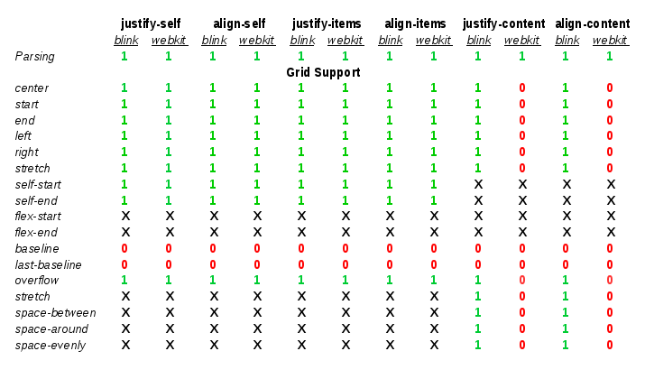
As you might already know because of my previous posts, CSS Box Alignment specification was born to generalize Flexbox’s alignment behavior so that it can be used for grid and even regular blocks. Several new properties were added, like justify-items and justify-self, and CSS syntax has changed considerably. Specially noteworthy how Content Distribution alignment properties have changed from their initial Flexbox definition. They now support complex values like ‘space-between true’, ‘space-around start’, or even ‘stretch center safe’. This makes possible to express more info than using the previous simple keyword form, although it requires a new CSS parsing logic in Browsers.
More complex CSS parsing
Since both align-content and justify-content properties accept multiple optional keywords I needed to re-implement completely their parsing logic. I’m happy to announce that it recently landed WebKit’s trunk too, so now both web engines support the new CSS syntax.
Due to the complex values defined for theses CSS properties, a new CSSValue derived class was defined to hold all the Content Alignment data, named as CSSContentDistributionValue. This data is then converted to something meaningful for the style logic using the StyleBuilderConverter class. This is the preferred method in both WebKit and Blink engines, which it just needs to be declared in the CSSPropertyNames.in and CSSProperties.in template files, respectively.
The StyleBuildConverter logic is pretty simple thanks to these 2 new data structures, as it can be appreciated in the following excerpt of source code:
The StyleContentAlignmentData class was defined to simplify how we manage these complex values, so that we can handle properties as they had an atomic value. This approach allows a more efficient and robust way of detecting and managing style changes in these properties.
New Layout operations
Once this new CSS syntax is correctly parsed and a LayoutStyle instance generated according to user defined CSS style rules, I needed to modify Flexbox’s layout code for adapting it to the new data structures, ensuring browser backward compatibility and passing all the Layout and Unit tests. I implemented from scratch this logic for Grid Layout so I had the opportunity to introduce several performance optimizations to avoid unnecessary layouts and repaints. This area is pretty interesting and I’ll talk about it soon in a new post.
One interesting aspect of Content Distribution alignment is that it might take part in the track sizing algorithm. As it was explained in my previous post about Self Alignment, stretch value increases alignment subject’s size to fill its alignment container’s available space. This is also the case of Content Alignment, but considering tracks as alignment subject. However, there is another case not so obvious where <content-distribution> values may influence in track sizing resolution, or perhaps better said, grid area sizing.
Let’s consider this example of grid where there are certain areas using more than one track:
grid-template-areas:"a a b""c d b"grid-auto-columns:20px;grid-auto-rows:40px;width:150px;height:300px;
grid-template-areas: "a a b"
                     "c d b"
grid-auto-columns: 20px;
grid-auto-rows: 40px;
width: 150px;
height: 300px;
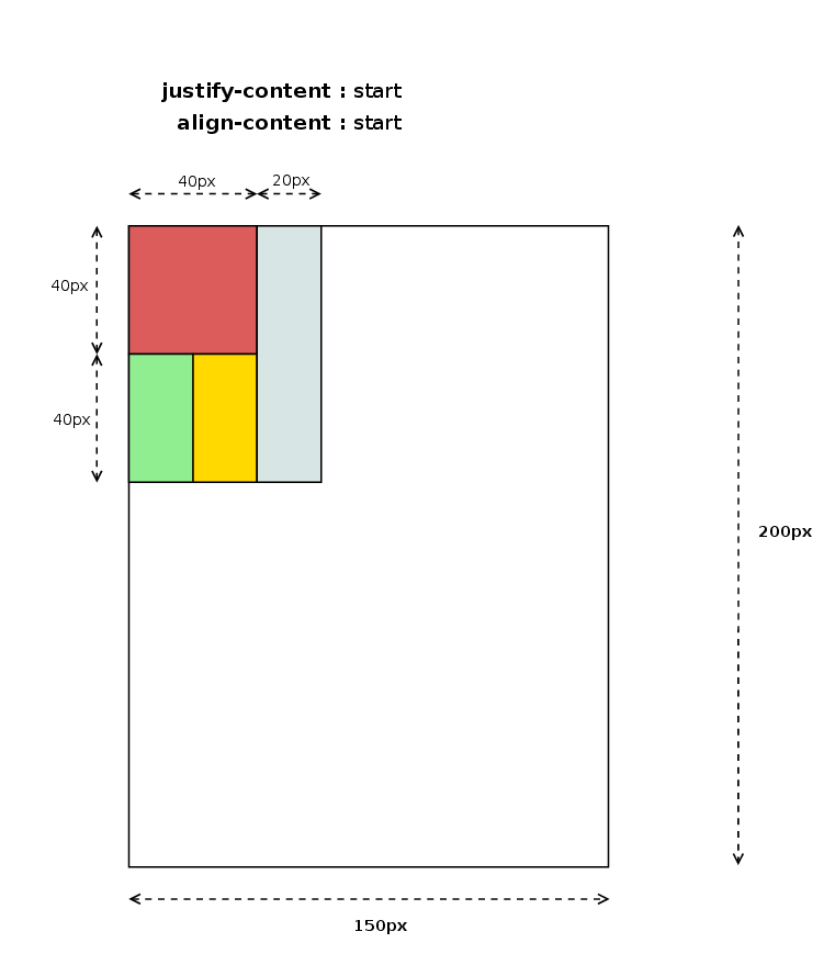
The example above defines a grid with 3 column tracks of 20px and 2 row tracks of 40px, which would be laid out as it’s shown in the following diagram:
Grid Layout with areas filing more than one track. Click on the picture to evaluate the effect of each value on the grid area size.
This fact has interesting implementation implications due to the fact that in certain cases, in order to determine grid item’s logical height we need its logical width to be resolved first. Track sizing algorithm uses children grid area size to determine grid cell’s logical height, hence given that alignment logic needs track sizes have been already resolved, it may imply a re-layout of the grid items which size could be affected by the used content-distribution value. The following source code shows how I handle this scenario:
The code above will return different results, in the cases mentioned before, depending on whether it’s run during track sizing alignment or after applying the alignment logic. This will likely make needed a new layout of the whole grid, or at least, the affected grid items, which it likely has a negative impact on performance.
Current status and next steps
I’d like to finish this post with a snapshot of current situation and challenges for the next months, as I’ve been regularly doing in my last posts.
Unlike last reports, this time I’ve got good news regarding reduction of implementation gaps between the two web engines we are focusing our efforts on, WebKit and Blink. The following table describes current situation:
The table above indicates that several milestones were reached since the last report, although there are still some pending issues:
I’ve completed the implementation in WebKit of the parsing logic for the new Box Alignment properties: align-items and align-self.
As a side effect, I’ve also upgraded the ones already present because of Flexbox to the latest CSS3 Box Alignment specification.
WebKit has now full support for Default and Self Alignment fro Grid Layout, including also overflow handling
Blink has now full support for Content Distribution alignment, which missed <content-distrbuton> values.
WebKit’s Grid Layout implementation still misses support for Content Distribution alignment.
Baseline Alignment is still missing in both web engines
In addition to the above mentioned pending issues, our roadmap include the following tasks as part of my todo list for the next months:
Even though there s support for different writing-modes and flow directions, there are still some issues with orthogonal flows. I’ve got already some promising patches but they still have to be reviewed by Blink and WebKit engineers.
Optimizations of style and repaint invalidations triggered by changes on the alignment properties. As commented before, this is a very interesting topic involving, which I’ll elaborate further in next posts.
Performance analysis of relevant Grid Layout use cases, which hopefully will lead to optimizations proposals.
All this work and many other contributions to Grid Layout for WebKit and Blink web engines are the result of the collaboration between Bloomberg and Igalia to implement this W3C specification.
It’s been a while since Igalia and Bloomberg started to implement the Box Alignment specification for the CSS Grid Layout model. Some weeks ago we accomplished an important milestone of our roadmap landing in Blink trunk the last patches implementing the Content Distribution properties: align-content and justify-content.
Quoting the CSS Box Alignment document, the content distribution properties are defined as follows:
Aligns the contents of the box as a whole along the box’s inline/row/main axis.
The alignment container is the grid container’s content box. The alignment subjects are the grid tracks.
The CSS syntax of these recently added properties gives an idea of how powerful and flexible they are for grid layout definitions, allowing every possible alignment values combination:
It’s worth mentioning that Baseline Alignment is still not implemented, as well as the <content-distribution> values for Distribution Alignment. However, in the latter case I’ve got already a quite promising draft implementation which, eventually, has been very useful to activate a discussion inside the W3C community to allow these alignment values for grid. In previous versions of the specification it was stated that all <content-distribution> values should use their <content-position> fallback values for grid containers. I’m glad that such decision was finally made, because I think that <content-distribution> values are really useful for defining fancier grid layouts. I’ll talk about this soon in a new post, as I consider it deserves a detailed description with the proper examples.
Last, but not least, as it happens with Self Alignment it allows using overflow keywords to define how we want to handle grid’s content overflow. It works in the same way for Content Distribution as we’ll see later with some examples.
Aligning the grid
When there is available space in the grid container block, it’s always useful to have a way to control how we want to use such space and how we want our grid to behave on it. It might happen that container’s size changes (fullscreen mode) or we could have to deal with a content sized grid modifying its content’s size. There are quite many possibilities, so I’ll leave this issue for user/designer’s imagination and I’ll focus on very simple examples to illustrate the concept.
For now, let’s consider this case to understand what you can do with the different <content-alignment> values in a grid layout.
We are defining a 2×2 grid with 50×100 pixels cells where we are going to place 4 items, one in each cell. Notice that items at (1,1) and (2,2) have a fixed size of 20×40 pixels, while the other 2 are auto-sized so they will be stretched to fill their corresponding grid cell (if you don’t know why, a reading of previous post might help). Also, bear in mind that both align-content and justify-content properties have start as the initial value for grids.
Controlling the grid overflow
When grid content’s size exceeds its container dimensions there is the risk of data loss. Some examples of this scenario are center or end alignment from the viewport’s edges; all the content overflowing the viewport’s area can’t be reached, hence we lose such data. In order to prevent this issue Box Alignment specification defines the safe overflow mode, which basically forces a start alignment value for the property handling the dimension where the overflow is detected.
Using the same CSS and HTML code in the example above, we can easily define cases where this data loss issue (red colored arrows) is clearly noticeable just modifying the height or width to cause top or left overflow respectively.
There are other situations where Content Alignment and Overflow interact in a different way, using margins, padding or/and borders and even combining different writing-modes and flow directions. The effect of the alignment values varies considerably depending on those factors but I think you have now a clear idea of how to use these new properties in a grid layout.
Current status and next steps
With the grid support for the align-content and justify-content CSS properties in Blink we’ve got most of the Box Alignment specification covered. As it was commented before, just Base Alignment is still pending to be implemented in Chromium browsers. I have to admit that there are also some bugs and wrong behavior using certain CSS combinations, specially regarding orthogonal flows, but we are working on it right now and I hope to integrate the patches soon in trunk.
For the time being, let’s consider the following table as the current implementation status of the Box Alignment specification for the Grid Layout model in WebKit (Safari/Epiphany) and Blink (Chrome/Chromium/Opera) based browsers:
The lack of progress in the implementation of the Box Alignment specification in the WebKit web engine is disappointing. I’ve been stuck for quite a lot of time trying to upgrade the CSS properties to the last version of the spec, mainly due design and performance issues. I’ll discuss with the WebKit hackers the best approach to solve this issue so I can put the Grid Layout implementation at the same level than in Blink web engine.
Igalia and Bloomberg will continue working on the implementation of the CSS Grid Layout specification and among my short/mid term challenges are completing the Box Alignment support. These goals include the following tasks:
Fixing bugs and completing the orthogonal flows support.
Implementing the Base Alignment features
Completing the Content Distribution Alignment with the <content-distribution> values
Implementing the Box Alignment spec in WebKit
Igalia and Bloomberg working to build a better web platform
Some time has passed since my first post about the Box Alignment spec implementation status for Blink and WebKit web engines. I’ll do an update in this post and, since the gap between both web engines has grown considerably (I’ll do my best to reduce it as soon as possible), I’ll remark the differences between both engines.
What’s new ?
The ‘stretch’ value is now implemented for align-{self, items} and justify-{self, items} CSS properties. This behavior is quite important because it’s the default for these four properties in Flexible Box and Grid layouts. According to the specification, the ‘stretch’ value is defined as follows:
If the width or height (as appropriate) of the alignment subject is auto, its used value is the length necessary to make the alignment subject’s outer size as close to the size of the alignment container as possible, while still respecting the constraints imposed by min-height/max-width/etc. Otherwise, this is equivalent to start.
When defining the alignment properties in a grid layout it’s very important to consider how we want to manage item’s overflow. It’s allowed to specify an overflow alignment value for both Content and Item Alignment definition, but so far it’s implemented only for the Item Alignment properties. The Overflow Alignment concept is defined in the specification as follows:
To help combat undesirable data loss, an overflow alignment mode can be explicitly specified. “True” alignment honors the specified alignment mode in overflow situations, even if it causes data loss, while “safe” alignment changes the alignment mode in overflow situations in an attempt to avoid data loss.
The ‘stretch’ value in Grid Layout
This value applies to the Self Alignment properties {align, justify}-self, and obviously their corresponding Default Alignment ones {align, justify}-items. For grids, these properties consider that the alignment container is the grid cell, while the alignment subject is the grid item’s margin box.
The Box Alignment specification states that Default Alignment ‘auto’ values should be resolved to ‘stretch’ in case of Grid containers; this value will be used as the resolved value for ‘auto’ Self Alignment values.
So by default, or when explicitly defined as ‘stretch’, the grid item’s margin box will be stretched to fill its grid cell breadth. Let’s see it with a basic example:
All the examples available at http://igalia.github.io/css-grid-layout/
This change affected only the layout codebase of the web engine, since the value was already introduced in the style parsing logic. The Grid Layout rendering logic uses an interesting abstraction to override the grid item’s block container. This abstraction allows us to use Grid Cells as block containers when computing the logical height and width.
Overflow Alignment in Grid Layout
The Overflow Alignment value used when defining a grid layout could be particularly useful, specially for fixed sized grids. The potential data lost may happen not only at the left and top box edges, but between adjoining grid cells. Overflow Alignment is defined via the ‘safe’ and ‘true’ keywords. They were already introduced in the Blink core’s style parsing logic as part of the CSS3 upgrade of the alignment properties (justify-self, align-self) used in the FlexBox implementation. The new CSS syntax is described by the following expression:
According to the current Box Alignment specification draft, the Overflow Alignment keywords have the following meaning:
safe: If the size of the alignment subject overflows the alignment container, the alignment subject is instead aligned as if the alignment mode were start.
true: Regardless of the relative sizes of the alignment subject and alignment container, the given alignment value is honored.
I’ll proceed now to show how Overflow Alignment is applied in the Grid Layout specification with an example:
All the examples available at http://igalia.github.io/css-grid-layout/
The new syntax to allow the Overflow Alignment keywords required to modify the style builder and parsing logic, as it was mentioned before. The alignment properties became a CSSValueList instance instead of simple keyword IDs; both Blink and WebKit provides Style Builder code generation directives (CSSPropertyNames.in) for simple properties, but this was not the case for these properties anymore.
The Style Builder is more complex now because it has to deal with the conditional overflow keyword, which can be specified before or after the <item-position> keyword. Blink provides a function template scheme for groups of properties sharing the same logic, which is the case of most of the CSS Box Alignment properties (align-self, align-items and justify-self; justify-items is slightly different so it needs custom functions). WebKit is currently defining the new style builder and it does not follow this approach yet, but I’d say it will, eventually, since it makes a lot of sense.
Even though style building and parsing is shared among all the layout models using the Box Alignment properties, like Flexible Box and Grid so far, Overflow Alignment is only supported so far by the CSS Grid Layout implementation. The Overflow Alignment logic affects how the grid items are positioned during the layout phase.
The Overflow Alignment keywords are also valid in the Content Distribution syntax, which I’m working on now with quite good progress. The first patches landed already in trunk, providing an implementation of the justify-content property in Grid Layout. I’ll talk about it soon, hopefully, once the implementation is completed and the discussion in the www-style mailing list conclude with some agreement regarding the Distributed Alignment for grids.
Current implementation status
The Box Alignment specification is quite complete now in Blink, unfortunately that’s not the case of WebKit. I’ll summarize now the current implementation status in browsers based on each web engine, which are basically Chrome/Chromium vs Safari; I’ll also try to outline the roadmap for the next weeks.
The flex-start, and flex-end values are used only in Flexible Box layouts, so they don’t apply to this analysis of the Grid support of the Box Alignment spec. The Distributed Alignment values apply only to the Content Distribution properties (align-content and justify-content). Finally, ‘stretch‘ is a valid value for both, Positional and Distributed Alignment, so it’s not redundant but a different interpretation of the same value depending on the property it’s applied to.
Some conclusions we can extract from the table above:
Default and Self Alignment support is almost complete in Blink; only Baseline Alignment is pending to be implemented.
Content Distribution support for justify-content in Blink. Only <content-position> values are implemented, since current spec draft states that all the <content-distibution> values will fallback in Grid Layout; spec authors are still evaluating changes on this issue, though.
WebKit fails to provide CSS3 parsing for all the properties except justify-self, although there are some patches pending of review to improve this situation.
There is no Grid support at all in WebKit for any of the Box Alignment properties.
Igalia and Bloomberg working to build a better web platform
An awesome week is coming to the end and I’d like to thanks the sponsors for helping us to make possible that such an amazing group of hackers could work together to improve the web. We focused on some of the consolidated web engines but also about the most promising ones and, of course, hacking on them producing a good amount of patches.
The talks were great, and even better the breakout sessions about many hot topics for the future of the web engines.
Because of the work I’ve been doing lately, I was specially involved in the CSS Features session, which among other things, it complemented the talk Sergio Villar gave us about the Grid Layout implementation we are doing at Igalia in collaboration with Bloomberg. I introduced as well the work I’ve been doing on the implementation of the Box Alignment specification in both Blink and WebKit web engines; we evaluated how it would impact other layout models, like MathML, CSS Regions, CSS Flexible Box, to ease the logic of blocks and content alignment. We also discussed about the future of CSS regarding new layout models, which is a bit uncertain; there is actually an interesting discussion inside the W3C about this topic, so we will see how it evolves. We talked about graphics and CSS and the SVG specification (the 2.0 version is being defined) which will have an important role in the future, as I could personally notice during the last CSSConfEU conference in Berlin; it was also an important topic in other conferences along this year.
This week was a nice opportunity to discuss with other web core hackers the issues I’ve found to properly implement the CSS Box Alignment specification in WebKit, see discussion in the bugzilla for details. We have concluded that is not an easy problem that should be discussed in the mailing list, as it would imply assuming a performance overhead in CSS parsing. The ‘auto’ value defined by the spec for all the Box Alignment properties, to be resolved during the cascade depending on the type of elements, is affecting the current implementation of Flexible Box and MathML so we will have to find a solution.
I also produced a bunch of patches for WebKit to improve the way we were managing margins and float elements, properly identifying the elements creating a new formatting context and applying some refactoring to make the code clearer; these improvements fixed several issues in Grid Layout as well. Besides, borders, margin and padding was finally adapted in Grid Layout to the different writing-modes, which was a patch I’ve been working for some weeks already and had the opportunity to complete during this hackfest.
I think that’s all for now, hope to see you all in the next Web Engines Hackfest 2015.
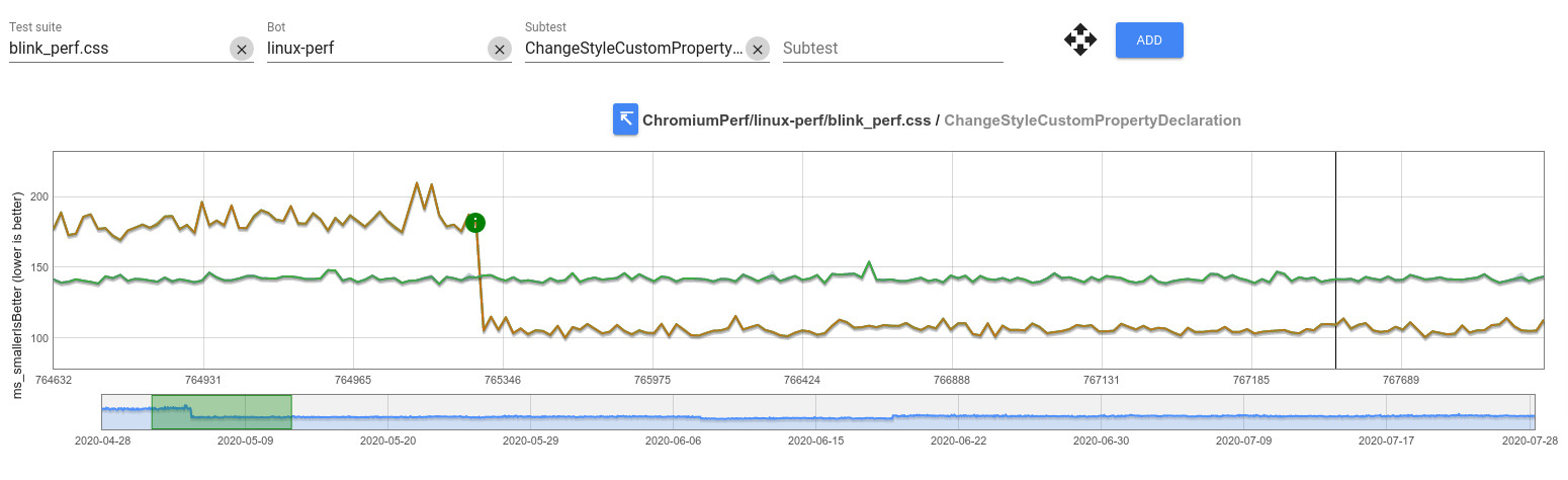


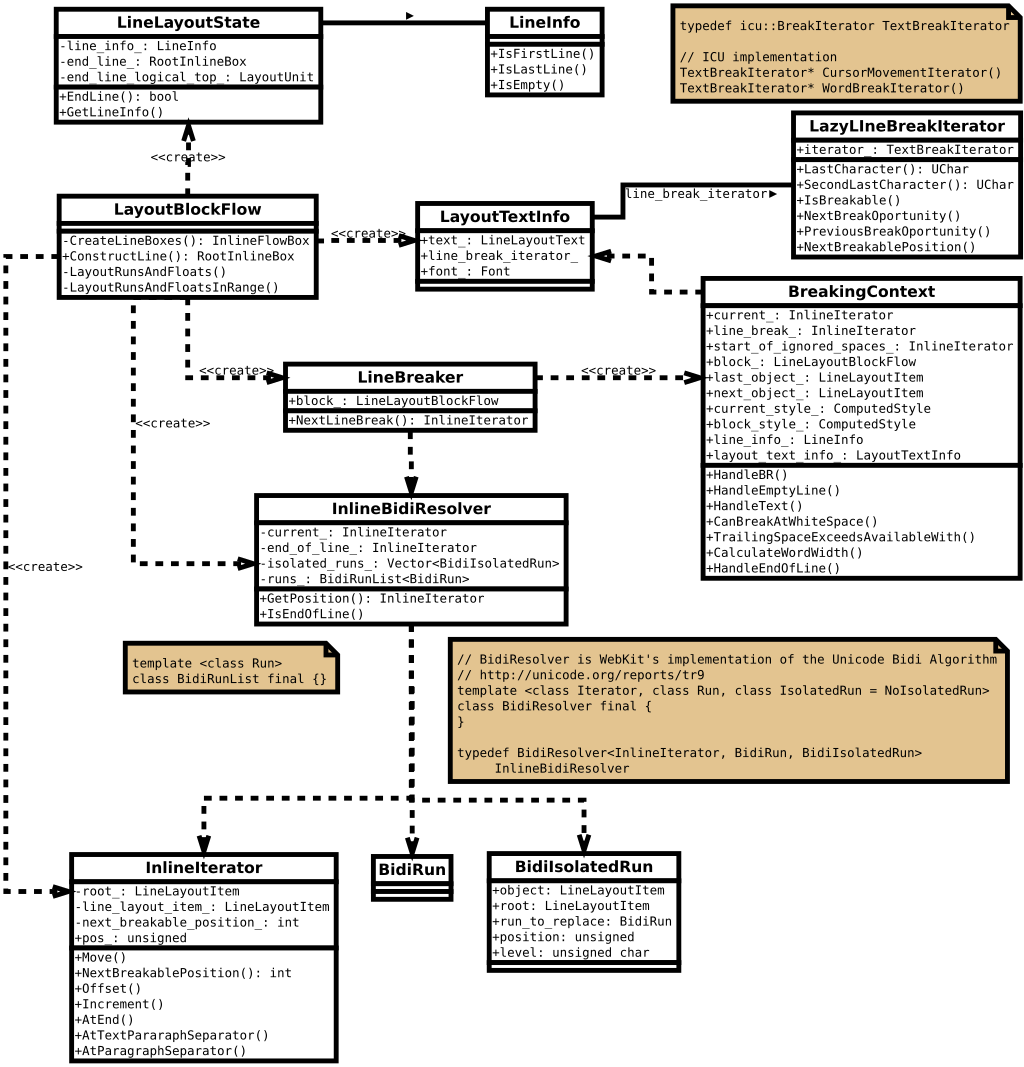

