As some of my readers already know, Igalia and Bloomberg are collaborating in the implementation of the Grid Layout specification for the Blink/Chromium and WebKit web engines. As part of this assignment, I had the opportunity to review and contirbute to the implementaiton of another feature I consider quite useful for the web: CSS Box Alignment Module (level 3).
The Box Alignment specification was designed to generalize the behavior of boxes alignment within their containers, which is nowadays defined across multiple specifications. Several layout models are affected by this new specification: block, table, flex and grid. This post is about how it affects to the Grid Layout implementation.
I think is a good idea to begin my exposition with a brief introduction of some concepts related to alignment and CSS Writing Modes, which I consider quite relevant to understand the implications of this specification for the Grid Layout implementation and, more important, to realize about its potential.
Examples are mandatory when analyzing W3C specifications; personally, I can’t see all the angles and implications of a feature described in a specification without the proper examples, both visual and source code.
Finally, I’d like to conclude my article with a development angle describing some interesting implementation details and technical challenges I faced while working on both Blink and WebKit web engines. Also, which perhaps is more interesting, the ones I couldn’t solve yet and I’m still working on. As always comments and feedback are really welcome.
Introduction to Box Alignment and Writing-Modes
From the CSS Box Alignment specification:
features of CSS relating to the alignment of boxes within their containers in the various CSS box layout models: block layout, table layout, flex layout, and grid layout.
From the CSS Writing Modes specification:
CSS features to support for various international writing modes, such as left-to-right (e.g. Latin or Indic), right-to-left (e.g. Hebrew or Arabic), bidirectional (e.g. mixed Latin and Arabic) and vertical (e.g. Asian scripts).
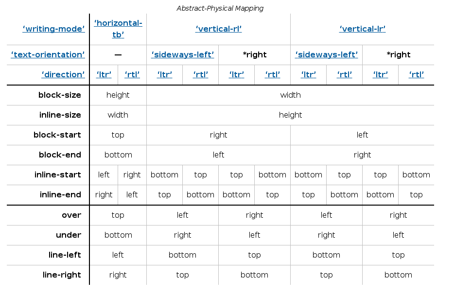
In order to get a better understanding of alignment some abstract dimensional and directional terms should be explained and taken into account. I’m going to briefly describe some of them, the ones I consider more relevant for my exposition; a more detailed definition can be obtained from the Abstract Box Terminology section of the specification.
There are three sets of directional terms in CSS:
- physical – Interpreted relative to the page, independent of writing mode. The physical directions are left, right, top, and bottom
- flow-relative – Interpreted relative to the flow of content. The flow-relative directions are start and end, or block-start, block-end, inline-start, and inline-end if the dimension is also ambiguous.
- line-relative – Interpreted relative to the orientation of the line box. The line-relative directions are line-left, line-right, line-over, and line-under.
The abstract dimensions are defined below:
- block dimension – The dimension perpendicular to the flow of text within a line, i.e. the vertical dimension in horizontal writing modes, and the horizontal dimension in vertical writing modes.
- inline dimension – The dimension parallel to the flow of text within a line, i.e. the horizontal dimension in horizontal writing modes, and the vertical dimension in vertical writing modes.
- block axis – The axis in the block dimension, i.e. the vertical axis in horizontal writing modes and the horizontal axis in vertical writing modes.
- inline axis – The axis in the inline dimension, i.e. the horizontal axis in horizontal writing modes and the vertical axis in vertical writing modes.
- extent or logical height – A measurement in the block dimension: refers to the physical height (vertical dimension) in horizontal writing modes, and to the physical width (horizontal dimension) in vertical writing modes.
- measure or logical width – A measurement in the inline dimension: refers to the physical width (horizontal dimension) in horizontal writing modes, and to the physical height (vertical dimension) in vertical writing modes. (The term measure derives from its use in typography.)
Then, there are flow-relative and line-relative directions. For the time being, I’ll consider only flow-relative directions terms since they are more relevant for discussing alignment issues.
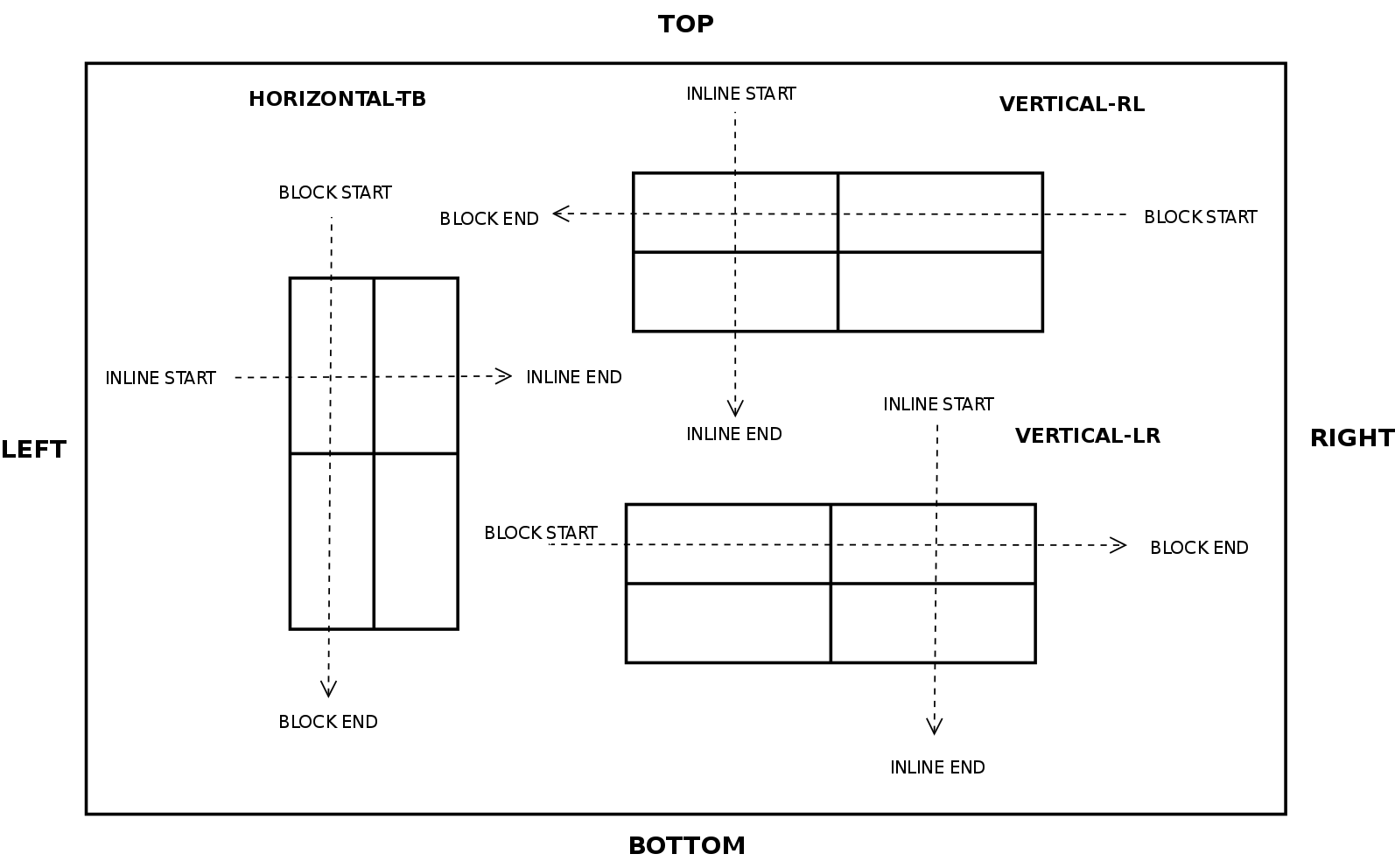
- block-start – The side that comes earlier in the block progression, as determined by the writing-mode property: the physical top in horizontal-tb mode, the right in vertical-rl, and the left in vertical-lr.
- block-end – The side opposite block-start.
- inline-start – The side from which text of the inline base direction would start. For boxes with a used direction value of ltr, this means the line-left side. For boxes with a used direction value of rtl, this means the line-right side.
- inline-end – The side opposite start.
So now that we have defined the box edges and flow direction concepts we can review how they are used when defining the alignment
properties and values inside a Grid Layout, which can be defined along two axes:
- which dimension they apply to (inline vs. stacking)
- whether they control the position of the box within its parent, or the box’s content within itself.
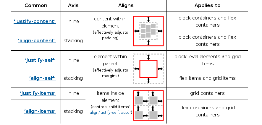
Regarding the alignment values, there are two concepts that are important to understand:
- alignment subject – The alignment subject is the thing or things being aligned by the property. For justify-self and align-self, the alignment subject is the margin box of the box the property is set on. For justify-content and align-content, the alignment subject is defined by the layout mode.
- alignment container – The alignment container is the rectangle that the alignment subject is aligned within. This is defined by the layout mode, but is usually the alignment subject’s containing block.
Also, there are several kind of alignment behaviors:
- Positional Alignment – specify a position for an alignment subject with respect to its alignment container.
- Baseline Alignment – form of positional alignment that aligns multiple alignment subjects within a shared alignment context (such as cells within a row or column) by matching up their alignment baselines.
- Distributed Alignment – used by justify-content and align-content to distribute the items in the alignment subject evenly between the start and end edges of the alignment container.
- Overflow Alignment – when the alignment subject is larger than the alignment container, it will overflow. To help combat this problem, an overflow alignment mode can be explicitly specified.
At the time of this writing, only Positional Alignment is implemented so I’ll focus on those values in the rest of the article. I’m still working on implementing the specification, though, so there will be time to talk about the other values in future posts.
- center – Centers the alignment subject within its alignment container.
- start – Aligns the alignment subject to be flush with the alignment container’s start edge.
- end – Aligns the alignment subject to be flush with the alignment container’s end edge.
- self-start – Aligns the alignment subject to be flush with the edge of the alignment container corresponding to the alignment subject’s start side. If the writing modes of the alignment subject and the alignment container are orthogonal, this value computes to start.
- self-end – Aligns the alignment subject to be flush with the edge of the alignment container corresponding to the alignment subject’s end side. If the writing modes of the alignment subject and the alignment container are orthogonal, this value computes to end.
- left – Aligns the alignment subject to be flush with the alignment container’s line-left edge. If the property’s axis is not parallel with the inline axis, this value computes to start.
- right – Aligns the alignment subject to be flush with the alignment container’s line-right edge. If the property’s axis is not parallel with the inline axis, this value computes to start.
So, after this introduction and with all these concepts in mind, it’s now time to get hands on the Grid Layout implementation of the Box Alignment specification. As it was commented before, I’ll try to use as many examples as possible.
Aligning items inside a Grid Layout
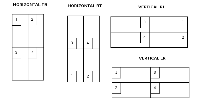
Before entering in details with source code and examples, I’d like to summarize most of the concepts described below with some pretty simple diagrams:
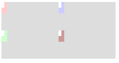
2×2 Grid Layout (LTR)
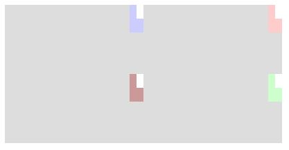
2×2 Grid Layout (RTL)

The diagram below illustrates how items are placed inside the grid using different writing modes:
At this point, some real examples would help to understand how the CSS alignment properties work on Grid Layout and why they are so important to get all the potential behind this new layout model.
Let’s consider this basic stylesheet which will be used in the examples from now on:
<style> .grid { grid-auto-columns: 100px; grid-auto-rows: 200px; width: -webkit-fit-content; margin-bottom: 20px; } .item { width: 20px; height: 40px; } .content { width: 10px; height: 20px; background: white; } .verticalRL { -webkit-writing-mode: vertical-rl; } .verticalLR { -webkit-writing-mode: vertical-lr; } .horizontalBT { -webkit-writing-mode: horizontal-bt; } .directionRTL { direction: rtl; } </style> |
The item style will be used for the grid items, while the content will be the style of the elements to be placed inside each grid item. There are as well writing-mode related styles, which will be useful later to experiment with different flow and text directions.
In the first example we will center all the cells content so we can have a fully aligned grid, which is particularly interesting for many web applications.
|
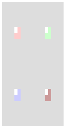
|
In the next example we will illustrate how to use all the Positional Alignment values so we can place nine items in the same grid cell.
|
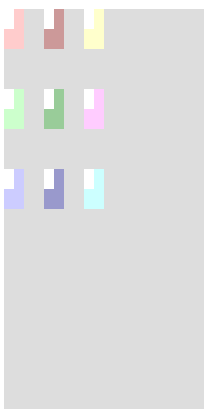
|
Let’s start playing with inline and block-flow direction and see how it affects to the different Positional Alignment values. I’ll start with the inline direction, which affects only to the justify-xxx set of CSS properties.
|
||
| Direction LTR | Direction RTL | |
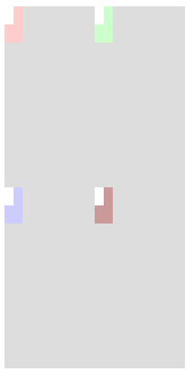
|
|
|
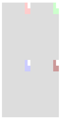
The writing-mode CSS Property applies to the block-flow direction, hence it’s the align-xxx properties the ones affected. In this case, orthogonal writing-modes can be specified in the HTML source code; however, these use cases are not yet fully supported by the current implementation of Grid Layout.
|
|
|
| Vertical LR | Vertical RL | |
|
|
Technical challenges, accomplished and to be faced
Implementing the Box Alignment specification has been a long task and there is still quite much work ahead for both, WebKit and Blink/Chromium web engines. Perhaps one of the most tedious issue was the definition of a couple of new CSS properties: justify-self and justify-items, which required to touch several Core components, from the CSS parser, the style builder and resolver and finally the rendering.
Another important technical challenge comes from the fact that the Box Alignment properties already present in both web engines were implemented as part of the Flexible Box specification. As it was commented before in this post, the Box Alignment specification aims to generalize the alignment behavior for several layout models, hence these properties were not tied to the Flexible Box implementation anymore; this lead to many technical issue, as I’ll explain later.
The patch implemented for issue 333423005 is a good example of the files to touch and logic to be added in order to implement a new CSS property in Blink/Chromium. There is a similar work to be done in the WebKit web engine; at the time of this writing the similarities are still big, even though some parts changed considerably, like the CSS parsing and style builder logic. As an example, the patch implemented in bug 134419
The following code is quite descriptive of the nature of the CSS Box Alignment properties and how they are applied during the style cascade:
void StyleAdjuster::adjustStyleForAlignment(RenderStyle& style, const RenderStyle& parentStyle) { bool isFlexOrGrid = style.isDisplayFlexibleOrGridBox(); bool absolutePositioned = style.position() == AbsolutePosition; // If the inherited value of justify-items includes the legacy keyword, 'auto' // computes to the the inherited value. // Otherwise, auto computes to: // - 'stretch' for flex containers and grid containers. // - 'start' for everything else. if (style.justifyItems() == ItemPositionAuto) { if (parentStyle.justifyItemsPositionType() == LegacyPosition) { style.setJustifyItems(parentStyle.justifyItems()); style.setJustifyItemsPositionType(parentStyle.justifyItemsPositionType()); } else { style.setJustifyItems(isFlexOrGrid ? ItemPositionStretch : ItemPositionStart); } } // The 'auto' keyword computes to 'stretch' on absolutely-positioned elements, // and to the computed value of justify-items on the parent (minus // any 'legacy' keywords) on all other boxes (to be resolved during the layout). if ((style.justifySelf() == ItemPositionAuto) && absolutePositioned) style.setJustifySelf(ItemPositionStretch); // The 'auto' keyword computes to: // - 'stretch' for flex containers and grid containers, // - 'start' for everything else. if (style.alignItems() == ItemPositionAuto) style.setAlignItems(isFlexOrGrid ? ItemPositionStretch : ItemPositionStart); // The 'auto' keyword computes to 'stretch' on absolutely-positioned elements, // and to the computed value of align-items on the parent (minus // any 'legacy' keywords) on all other boxes (to be resolved during the layout). if ((style.alignSelf() == ItemPositionAuto) && absolutePositioned) style.setAlignSelf(ItemPositionStretch); } |
The WebKit web engine implements the same logic in the StyleResolver class; the StyleAdjuster class is just a helper class defined in the blink/Chromium engine to assist the StyleReslolver logic during the style cascade in order to make some final adjustmetns.
The issue 297483005 implements the align-self CSS property support in Grid Layout; the follwong code extrated from that patch is a good example of how alingment interacts with the grid tracks.
LayoutUnit RenderGrid::rowPositionForChild(const RenderBox* child) const { bool hasOrthogonalWritingMode = child->isHorizontalWritingMode() != isHorizontalWritingMode(); ItemPosition alignSelf = resolveAlignment(style(), child->style()); switch (alignSelf) { case ItemPositionSelfStart: // If orthogonal writing-modes, this computes to 'Start'. // FIXME: grid track sizing and positioning does not support orthogonal modes yet. if (hasOrthogonalWritingMode) return startOfRowForChild(child); // self-start is based on the child's block axis direction. That's why we need to check against the grid container's block flow. if (child->style()->writingMode() != style()->writingMode()) return endOfRowForChild(child); return startOfRowForChild(child); case ItemPositionSelfEnd: // If orthogonal writing-modes, this computes to 'End'. // FIXME: grid track sizing and positioning does not support orthogonal modes yet. if (hasOrthogonalWritingMode) return endOfRowForChild(child); // self-end is based on the child's block axis direction. That's why we need to check against the grid container's block flow. if (child->style()->writingMode() != style()->writingMode()) return startOfRowForChild(child); return endOfRowForChild(child); case ItemPositionLeft: // orthogonal modes make property and inline axes to be parallel, but in any case // this is always equivalent to 'Start'. // // self-align's axis is never parallel to the inline axis, except in orthogonal // writing-mode, so this is equivalent to 'Start’. return startOfRowForChild(child); case ItemPositionRight: // orthogonal modes make property and inline axes to be parallel. // FIXME: grid track sizing and positioning does not support orthogonal modes yet. if (hasOrthogonalWritingMode) return endOfRowForChild(child); // self-align's axis is never parallel to the inline axis, except in orthogonal // writing-mode, so this is equivalent to 'Start'. return startOfRowForChild(child); case ItemPositionCenter: return centeredRowPositionForChild(child); // Only used in flex layout, for other layout, it's equivalent to 'Start'. case ItemPositionFlexStart: case ItemPositionStart: return startOfRowForChild(child); // Only used in flex layout, for other layout, it's equivalent to 'End'. case ItemPositionFlexEnd: case ItemPositionEnd: return endOfRowForChild(child); case ItemPositionStretch: // FIXME: Implement the Stretch value. For now, we always start align the child. return startOfRowForChild(child); case ItemPositionBaseline: case ItemPositionLastBaseline: // FIXME: Implement the ItemPositionBaseline value. For now, we always start align the child. return startOfRowForChild(child); case ItemPositionAuto: break; } ASSERT_NOT_REACHED(); return 0; } |
The resolveAlignment function call deserves an special mention, since it will lead to the open issues I’m still working on. The Box Alignment specification states that the auto values must be resolved to either stretch or start depending on the kind of element. This is theoretically performed during the style cascade, so it wouldn’t be necessary to resolve it at the rendering stage. The code is pretty simple :
static ItemPosition resolveAlignment(const RenderStyle* parentStyle, const RenderStyle* childStyle) { ItemPosition align = childStyle->alignSelf(); // The auto keyword computes to the parent's align-items computed value, or to "stretch", if not set or "auto". if (align == ItemPositionAuto) align = (parentStyle->alignItems() == ItemPositionAuto) ? ItemPositionStretch : parentStyle->alignItems(); return align; } |
The RenderFlexibleBox implementation has to define a similar logic and what is more important, the default value of all the Box Alignment properties have been changed to auto, instead of stretch as it’s stated in the Flexbible Box specification.
To make things even more complicated, many HTML elements are being rendered by RenderFlexibleBox objects as an implementation decision, without the proper display value set to indicate such assumption. This causes many issues and layout tests failures, since the resolved value for auto depends on the kind of element, which is defined by its display property value. Additionally, there are also problems with the anonymous render objects added to the tree on certain implementations.
Both WebKit and Blink/Chromium are affected by these issues; Mathml is a good example for the WebKit engine, since most if its render objects are implemented using a RenderFlexibleBox; also, it assigns and manipulates the align-{self, items} properties during the layout. The RenderFullScreen object is a source of problems for the Blink/Chromium web engine on this regard; it uses a RenderFleixibleBox because of its stretch default behavior, which is not the case anymore according to the Box Alignment specification.
I’m still working on theses issues in both web engines, so this issue is trying to face part of the problems on Blink/Chromium. There are a similar bug in the WebKit engine with similar challenges.
Another pending issue present in both web engines is the lack of support for different writing-modes. Eventhouth the Grid Layout logic is prepared to support them, it’s still buggy and for certain combinations it does not produce the expected outcome.
I’d like to finish this post pointing out that anybody can follow the progress of the Box Alignment spec implementation for Grid Layout you can track these bugs on either of the web engine you are more interested on:
- Blink/Chromium
- bug 249451: [CSS Grid Layout] Implement row-axis Alignment
- bug 376823: [CSS Grid Layout] Implement column-axis Alignment
- WebKit
- bug 133224 – [meta] [CSS Grid Layout] Implement column-axis Alignment
- bug 133222 – [meta] [CSS Grid Layout] Implement row-axis Alignment
This work wouldn’t be possible without the support of Bloomberg and Igalia, who are comitted to provide a better web platform for developers.

Igalia and Bloomberg working to build a better web platform