Grid Auto-Placement Is Ready
Back in June I wrote my first post about CSS Grid Layout automatic placement feature, where I was talking about finishing the support for this feature “soon”. At the end it took a bit longer, but finally this month Igalia has completed the implementation and you can already start to test it in both Blink and WebKit.
A little bit of history #
Basic support for auto-placement feature was already working since 2013. The past summer I added support for spanning auto-positioned items. However, the different packing modes of the grid item placement algorithm (aka auto-placement algorithm) were not implemented yet.
These packing modes were sparse, dense and
stack. Initial behavior was implementing dense. I
implemented sparse without too much trouble, however when implementing
stack I had some
doubts that I
shared with the CSS Working Group. This ended up with some
discussions
and, finally, the removal of the stack
mode. So you
can forget about what I explained about it in my previous post.
Final syntax #
After some back and forth it seems that now we’ve a definitive syntax for the
grid-auto-flow
property.
This property allows to determine two different things:
- Direction:
row(by default) orcolumn.
Defines the direction in which the grid is going to grow if needed to insert the auto-placed items. - Mode: sparse (if omitted) or
dense.
Depending on the packing mode the algorithm will try to fill (dense) or not (sparse) all the holes in the grid while inserting the auto-placed items.
So, you can use different combinations of these keywords (row,
column and dense) to determine the desired behavior.
Examples of some valid declarations:
grid-auto-flow: column;
grid-auto-flow: dense;
grid-auto-flow: row dense;
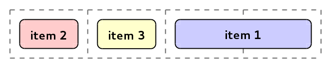
grid-auto-flow: dense column;Let’s use an example to explain this better. Imagine the following 3x3 grid:
<div style="grid-template-rows: 50px 50px 50px; grid-template-columns: 100px 100px 100px;">
    <div style="grid-row: span 2; grid-column: 2;">item 1</div>
    <div style="grid-column: span 2;">item 2</div>
    <div>item 3</div>
    <div>item 4</div>
</div>
Depending on the value of grid-auto-flow property, the grid items
will be placed in different positions as you can see in the next picture.
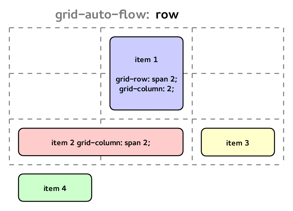
grid-auto-flow values example
Grid item placement algorithm #
I’ve been talking about this algorithm for a while already. It describes how the items should be placed into the grid. Let’s use a new example that will help to understand better how the algorithm works:
<div style="grid-template-rows: repeat(4, 50px); grid-template-columns: repeat(5, 50px);">
    <div style="grid-row: 1; grid-column: 2;">i1</div>
    <div style="grid-row: 2; grid-column: 1;">i2</div>
    <div style="grid-row: 1; grid-column: span 2;">i3</div>
    <div style="grid-row: 1;">i4</div>
    <div style="grid-row: 2;">i5</div>
    <div style="grid-column: 2;">i6</div>
    <div>i7</div>
    <div style="grid-column: 3;">i8</div>
    <div>i9</div>
</div>
For items with definite positions (i1 and i2), you don’t need to calculate anything, simply place them in the positions defined by the grid placement properties and that’s all. However, for auto-placed items this is the algorithm explaining how to convert the automatic positions into actual ones.
Grid items location is determined by the row and column coordinates and the number of tracks it spans in each position. So you might have 3 types of auto-placed items:
- Both coordinates are auto: i7 and i9.
- Major axis position is auto: i6 and i8.
- Minor axis position is auto: i3, i4 and i5.
Note: Major axis refers to the direction determined by
grid-auto-flowproperty, and minor axis to the opposite one. For example in “grid-auto-flow: column;” the major axis is column and the minor axis is row.
Let’s describe briefly the main steps of the algorithm (considering that the
direction determined by grid-auto-flow is row):
-
First all the non auto-positioned items (the ones with definite position) should be placed in the grid.
Example:
- i1 (
grid-row: 1; grid-column: 2;): 1st row and 2nd column. - i2 (
grid-row: 2; grid-column: 1;): 2nd row and 1st column.
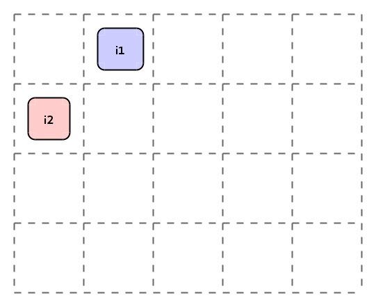 Grid item placement algorithm: Step 1
 - i1 (
-
Next step is to place the auto-positioned items where the major axis direction is not auto, so they’re locked to a given row.
Here we have different behaviors depending on the packing mode.
-
sparse: Look for the first empty grid area in this row where the item fits and it’s past any item previously placed by this step in the same row.
Example:
- i3 (
grid-row: 1; grid-column: span 2;): 1st row and 3rd-4th columns. - i4 (
grid-row: 1;): 1st row and 5th column. - i5 (
grid-row: 2;): 2nd row and 2nd column.
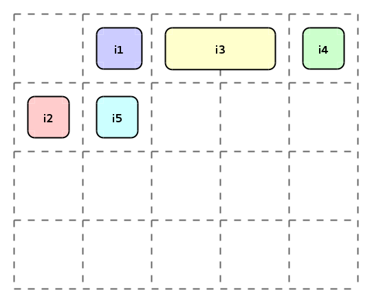 Grid item placement algorithm: Step 2 (sparse)
 - i3 (
-
dense: Look for the first empty grid area in this row where the item fits (without caring about the previous items).Example:
- i3 (
grid-row: 1; grid-column: span 2;): 1st row and 3rd-4th columns. - i4 (
grid-row: 1;): 1st row and 1st column. - i5 (
grid-row: 2;): 2nd row and 2nd column.
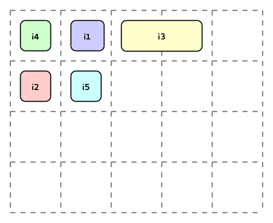 Grid item placement algorithm: Step 2 (
dense) - i3 (
-
-
Finally the rest of auto-placed items are positioned.
Again the behavior depends on the packing mode. And the description is pretty similar to the one in the previous step, but without having the row constraint.
-
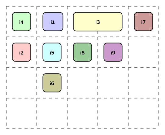
sparse: Look for the first empty area where the item fits and it’s past any item previously placed by this step. This means that we start looking for the empty area from the position of the last item placed.
Example:
- i6 (
grid-column: 2;): 3rd row and 2nd column. - i7: 3rd row and 3rd column.
- i8 (
grid-column: 3;): 4th row and 3rd column. - i9: 4th row and 4th column.
 Grid item placement algorithm: Step 3 (sparse)
 - i6 (
-
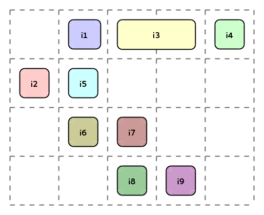
dense: Look for the first empty area where the item fits. Starting always to look from the beginning of the grid.Example:
- i6 (
grid-column: 2;): 3rd row and 2nd column. - i7: 1st row and 5th column.
- i8 (
grid-column: 3;): 2nd row and 3rd column. - i9: 2nd row and 4th column.
 Grid item placement algorithm: Step 3 (
dense) - i6 (
-
Implementation details #
Probably most of you won’t be interested in the details related to the implementation of this feature in Blink and WebKit. So, feel free to skip this point and move to the next one.
You can check the meta-bugs in Blink and WebKit to see all the patches involved in this feature. The code is almost the same in both projects and the main methods involved in the grid auto-placement are:
-
RenderGrid::placeItemsOnGrid()(Blink & WebKit): Which is in charge of placing the non auto-positioned items, covering step 1 explained before. And then it calls the next 2 methods with the auto-positioned items depending on its type. -
RenderGrid::placeSpecifiedMajorAxisItemsOnGrid()(Blink & WebKit): This method will process the auto-placed items where only minor axis position is auto. So, they’re locked to a given row/column, which corresponds to step 2.Note that in the sparse packing mode we need to keep a cursor for each row/column to fulfill the condition related to have items placed after previous ones.
-
RenderGrid::placeAutoMajorAxisItemsOnGrid()(Blink & WebKit): And this last method is the one placing the auto-positioned items where the major axis position or both coordinates are auto.In this case, it uses the auto-placement cursor in order to implement the sparse behavior.
It’s also important to mention the class RenderGrid::GridIterator
(Blink
& WebKit)
which has the responsibility to find the empty grid areas that are big enough to
fit the auto-placed grid items.
Note:
RenderGridhas just been renamed toLayoutGridin Blink.
Peculiarities #
On one side, the sparse packing mode is intended to preserve the DOM order of the grid items. However, this is only true if for all the items the major axis coordinate or both are auto. Otherwise, the DOM order cannot be guaranteed.
This is very easy to understand, as if you have some fixed elements, they’re going to be placed in their given positions, and the algorithm cannot maintain the ordering.
Let’s use a very simple example to show it:
<div style="display: grid;">
    <div style="grid-row: 1; grid-column: span 2;">item 1</div>
    <div>item 2</div>
    <div style="grid-row: 1; grid-column: 2;">item 3</div>
</div>
Where the elements will be positioned in:
- item 1: 1st row and 3rd-4th columns.
- item 2: 1st row and 1st column.
- item 3: 1st row and 2nd column.
 Grid item placement algorithm ordering
On the other hand, there is another issue regarding sparse again, but this time in the second step of the algorithm (the one related to items locked to a given row/column). Where the items are placed after any other item previously positioned in that step in the same row/column.
Let’s take a look to the following example:
<div style="display: grid;">
    <div style="grid-row: 1; grid-column: 1;">item 1</div>
    <div style="grid-row: 1 / span 2;">item 2</div>
    <div style="grid-row: 2">item 3</div>
</div>
According to the algorithm these items will be placed at:
- item 1: 1st row and 1st column.
- item 2: 1st-2nd row and 2nd column.
- item 3: 2nd row and 1st column.
 Grid item placement algorithm sparse fixed row/column
However, for the case of item 3 we could think that it should be placed in the 2nd row and the 3rd column. Because of item 2 is actually placed in the 1st and 2nd rows. But, for the sake of simplicity, this isn’t the behavior described in the spec.
Use cases #
So far this has been too abstract, so let’s try to think in some real cases where the auto-placement feature might be handy.
The canonical example is the one about how to format a form. You can check the example in my previous post which puts labels in the first column and inputs in the second one. Or, the example in the spec with a little bit more complex form.
Another example could be how to format a definition list. Imagine that we’ve the following list:
<dl>
    <dt>Cat</dt>
    <dd>A carnivorous mammal (Felis catus) long domesticated as a pet and for catching rats and mice.</dd>
    <dt>Crocodile</dt>
    <dd>Any of several large carnivorous thick-skinned long-bodied aquatic reptiles (family Crocodylidae) of tropical and subtropical waters; broadly: crocodilian.</dd>
    <dt>Donkey</dt>
    <dd>The domestic ass (Equus asinus).</dd>
</dl>
In order to show it using a grid layout you would just need the next CSS lines:
dl {
    display: grid;
    grid-template-columns: 10px auto 10px 1fr 10px;
}

dt {
    grid-column: 2;
    width: max-content;
    align-self: center;
    justify-self: end;
}

dd {
    grid-column: 4;
    margin: 0px;
}
The result will be a 2-columns layout, where the terms go in the first column right aligned and vertically centered; and the definitions in the second column. With a 10px gutter wrapping the columns.
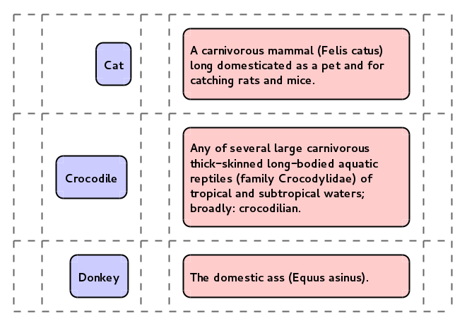 Definition list formatted using grid auto-placement feature
Conclusion #
Grid automatic placement has just been finished and you can start to play with it already in Chrome Canary (enabling the flag “Enable experimental Web Platform features”) or WebKit Nightly Builds. We think that it’s a nice and pretty powerful feature, and we encourage front-end web developers to test it (like the rest of CSS Grid Layout). The best part is that the spec is still having its last changes, and you’ll have the chance to provide feedback to the CSS Working Group if you miss something.
In order to make things easier to test I’ve adapted the demo to test the grid
item placement algorithm, adding the option to specify the
grid-auto-flow property too:
http://igalia.github.io/css-grid-layout/autoplacement.html
All this work has been done as part of the collaboration between Igalia and Bloomberg. We’ll be happy to receive your feedback about this feature. Stay tuned to get the latest news regarding CSS Grid Layout development!
- Previous: Short 2015-01-21
- Next: Short 2015-03-10