CSS Grid Layout 2014 Recap: Specification Evolution
Year 2014 is coming to an end, so it’s the perfect timing to review what has happened regarding the CSS Grid Layout spec, which Igalia has been implementing in both Blink and WebKit engines, as part of our collaboration with Bloomberg. I was wondering what would be the best approach to write this post, and finally I’m going to split it in 2 different posts. This one covering the changes in the spec during the whole year and another one talking about the implementation details.
Two Working Drafts (WD) of the CSS Grid Layout Module have been published during 2014. In addition, during the last month of the year, somehow related with the work previously done at TPAC in the CSS Working Group (WG) face to face (F2F) meeting, several changes have been done in the spec (I guess that they’ll end up in a new WD in early 2015). So, let’s review the most important changes introduced in each version.
Working Draft: 23 Jan 2014 #
Subgrids #
This is the first WD where subgrids feature appears marked as at-risk. This means that it might end up out of Level 1 of the specification.
A subgrid is a grid inside another grid, but keeping a relationship between the rows/columns of the subgrid and the parent grid container. It shares the track sizing definitions with the parent. Just for the record, current implementations haven’t support for this feature yet.
However, nested grids are already available and will be part of Level 1. Basically nested grids have their own track sizing definitions completely independent of their parents. Of course, they’re not the same than subgrids.
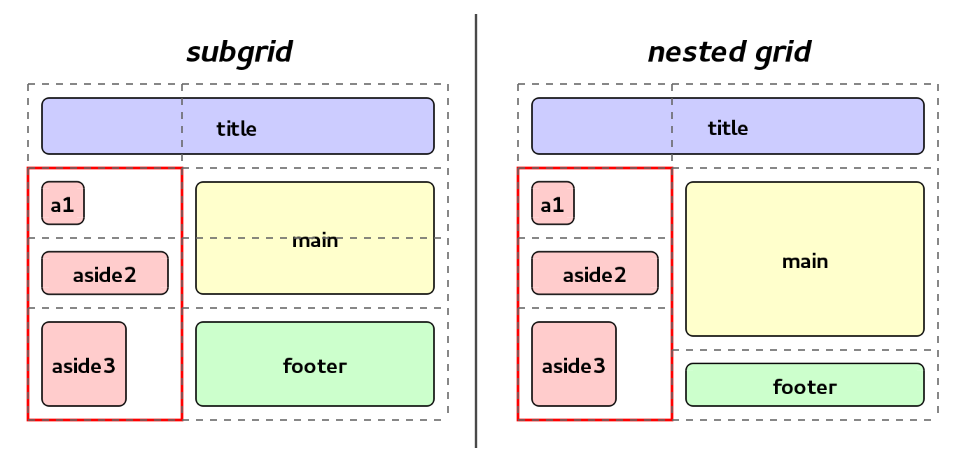 Subgrid vs nested grid example
Implicit named areas #
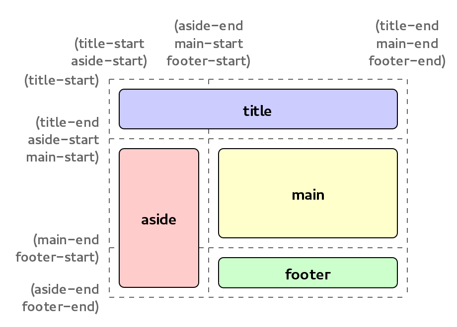
This is related with the concept of the named grid areas. Briefly, in a grid you can name the different areas (group of adjacent cells), for example: menu, main, aside and/or footer, using the grid-template-areas property.
Each area will define 4 implicit named lines: 2 called foo-start (marking the row and column start) and 2 called foo-end (row and column end), where foo would be the name of the area.
This WD introduces the possibility to create implicit named areas, by defining named grid lines using the previous pattern. That way if you explicitly create lines called foo-start and foo-end, you’ll be defining an implicit area called foo that could be used to place items in the grid.
 Example of implicit named grid areas
Aligning the grid #
In this version the justify-content and align-content properties are added, which allow to align the whole grid within the grid container.
Other #
In this WD appears a new informative section explaining the basic examples for the grid placement options. It’s an informative section but very useful to get an overview of the different possibilities.
In addition, it includes an explanatory example for the absolutely-positioned grid items behavior.
Working Draft: 13 May 2014 #
Track sizing algorithm #
Probably the most important change in this version is the complete rewrite of the track sizing algorithm. Anyway, despite of the new wording, the algorithm keeps the very same behavior.
This is the main algorithm for grids, it defines how the track breaths should be calculated taking into account all the multiple available options that define the track sizes.
An appendix with a “translation” between the old algorithm and the new one is included too, mostly to serve as reference and help to detect possible mistakes.
Auto-placement changes #
The grid-auto-flow property is modified in this WD:
noneis substituted by a newstackpacking mode.- As a consequence, property
grid-auto-position(tied tonone) is dropped.
Before this change, the default value for grid-auto-flow was none and, in that case, all the auto-placed items were positioned using the value determined by grid-auto-position (by default in 1×1).
With this change, the default value is row. But, you can specify stack and the grid’ll look for the first empty cell and use it to place there all the auto-positioned items.
Other #
Implementations have now the possibility to clamp the maximum number of repetitions in a grid.
Besides, it brings up a new section related to sizing grid containers where it’s defined how they behave under max-content and min-content constraints.
Editor’s Draft: Last changes #
Note: These changes are not yet in a WD version and might suffer some modifications before a new WD is published.
Automatic number of tracks #
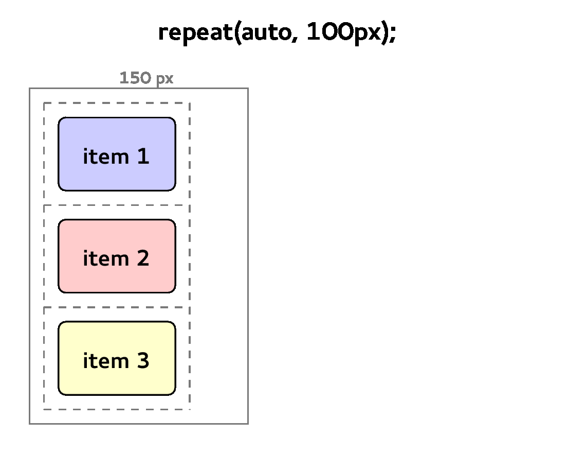
A new auto keyword has been added to repeat() function.
This will allow to repeat the track list specified as many times as needed, depending on the grid container size. Which used together with the auto-placement feature might be really nice combo.
For example, if the grid container is 350px width and it uses repeat(auto, 100px); to define the columns, you’ll end up having 3 columns.
 Example of new
 auto keyword for repeat() function
Auto-placement stack removed #
Finally, after some issues with the stack mode, it’s been decided to remove it from the spec. This means that grid-auto-flow property gets simplified, allowing you to determine the direction: row (by default) or column; and the packing algorithm: dense or “sparse” (if omitted).
On top of that, the grid item placement algorithm has now a more explicit wording regarding the different packing modes.
Fragmentation #
This section has been missing since a lot of time ago, and it finally has got some content.
Anyway, this is still an initial proposal and more work is needed to settle it down.
Other #
Reviewed the scope of align-content and justify-content, now they apply to the grid tracks rather than to the grid as a single unit.
As a side note, there’s an ongoing discussion regarding the symbol used to determine the named grid lines. Currently it’s a parenthesis, e.g.:
grid-template-columns: (first) 100px (mid central) 200px (last);However these parenthesis have some issues for Sass preprocessor. The proposal of using square brackets was not accepted in the last CSS WG F2F meeting, though it’ll be revisited again in the future.
Conclusion #
Of course this list is not complete, and I can be missing some changes. At least, these’re the most important ones from the implementor perspective.
As you can see, despite of not having big behavioral changes during this year, the spec has been evolving and becoming more and more mature. A bunch of glitches have been fixed, and some features have been adapted thanks to the feedback from users and implementors.
Thanks to the spec editors: Tab, fantasai and Rossen (and the rest of the CSS WG), for all their work and patience in the mailing list answering lots of doubts and questions.
Next year CSS Grid Layout will be hitting your browsers, but you’re still on time to provide feedback and propose changes in the spec. The editors will be more than happy to listen your suggestions for improvements and know what things are you missing.
If you want to have first-hand information regarding the evolution of the spec, you should follow the CSS WG blog and check the minutes of the meetings where they discuss about grid. On top of that, if you want all the information, you should subscribe yourself to the CSS WG mailing list and read the mails with “[css-grid]” in the subject.
Last, in the next post I’ll talk about the work we’ve been doing during 2014 regarding the implementation in Blink and WebKit and our plans for 2015. Stay tuned!