Welcome CSS Grid Layout
Igalia has been working in the implementation of CSS Grid Layout since past year (more below). This year I’ve had the chance to join the team and help to move forward this great spec. State of the Art
Maybe, you’ve never heard before about CSS Grid Layout, but for sure you know part of the history of design in the web platform.
- In the beginning people tried to make cool designs using
tag. Which completely breaks the separation between content (HTML) and presentation (CSS), apart from the ugly code and poor results achieved with this approach.
- Then people started to use for everything, floating blocks here and there. This might cause a terrible mess when trying to do flexible layouts that will adapt themselves to the screen size.
- Now lots of CSS frameworks are emerging (960 Grid, Blueprint, Bootstrap, Foundation, Skeleton, …). They allow to create responsive designs (very useful in the mobile era) most of them based on the grid concept. The problem is that each framework has its own syntax and lots of CSS code in order to provide the expected behavior.
To solve all these issues W3C has defined a new powerful and flexible spec that will make web designer’s life happier.
CSS Grid Layout
“allows authors to easily define complex, responsive 2-dimensional layouts”
By Tab Atkins Jr. (Google) at CSS WG Blog.
CSS Grid Layout provides a mechanism to divide the available space in rows and columns with a set of predictable sizing behaviors. It defines a set of grid areas where designers can precisely place the elements of a web page.
 CSS Grid Layout example
The Grid Layout spec can be used to intelligently reflow elements within a web page optimizing locations and sizes, depending on the device where the page is rendered in, creating responsive designs.
Example
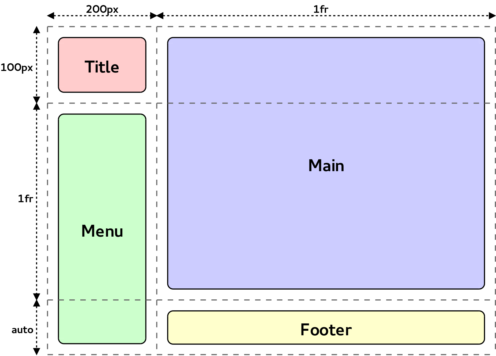
So, let’s imagine that you have the following HTML and you want to layout it like in the picture above:
<div class="grid">
    <div class="title">Title</div>
    <div class="menu">Menu</div>
    <div class="main">Main</div>
    <div class="footer">Footer</div>
</div>
This will be the CSS syntax required to do the magic:
.grid {
    display: grid;
    grid-template-columns: 200px 1fr;
    grid-template-rows: 100px 1fr auto;
}
.title  { grid-column: 1; grid-row: 1;          }
.menu   { grid-column: 1; grid-row: 2 / span 2; }
.main   { grid-column: 2; grid-row: 1 / span 2; }
.footer { grid-column: 2; grid-row: 3;          }
Where:
- display: grid: Defines a grid container.
- grid-template-columns and grid-template-rows: Specify the track breadths.
- grid-column and grid-row: Determine a grid item’s size and location within the grid.
Flexible tracks (the ones defined with 1fr in the previous example) will grow or shrink and automatically adapt themselves to the viewport size. This allows to create very customized grids, defining flexible breadths depending on the contents or the available space.
We’ve created a repository with some examples and demos, feel free to play with them to get a better understanding of the spec capabilities:
http://igalia.github.io/css-grid-layout/
Implementation status
Despite of being a Working Draft (WD) spec, implementations are appearing in the main web engines:
- IE/Trident first shipped an implementation in IE10.
- Google started an implementation in WebKit by the end of 2011. Igalia has been working on this implementation since mid-2013, collaborating with Google in Chromium/Blink and maintaining an up-to-date implementation in Safari/WebKit.
- Mozilla started working on an implementation in Firefox/Gecko this year.
Acknowledgements
Finally, we’d like to thank Bloomberg for sponsoring our work around CSS Grid Layout on Blink and Webkit, together with the implementation of ECMAScript 6 (ES6) features in V8 and SpiderMonkey JavaScript engines.
As a related note, my mates Juanjo and Xavi were talking about CSS Grid Layout and CSS Regions in the last Mobile World Congress at Barcelona as part of the W3C booth. Check the slides in case you missed it (demos and videos of this post are extracted from them).
Igalia will keep working hard to evolve the implementation of CSS Grid Layout spec both in Blink and WebKit. We’ll try to keep you informed about our progress, stay tuned!
Comments
On 14/03/13 18:37, **[Tanty](http://www.andresgomez.org/)** wrote:
Awesome work!
- Previous: Short 2014-02-03
- Next: Short 2014-04-02