The last version of Vagalume was released more than a month ago. And although it was dead for some weeks because I had many other things to do, here comes Vagalume 0.5, back from the dead!
 |
As I said before, I’ve been busy lately so the list of changes is not as big as it might be, but thanks to the help of my colleagues Mario and Felipe we have some new things. The list of changes include:
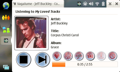
- New buttons and other minor UI improvements
- New plugin for the Maemo status bar (IT OS2008 only) (*)
- Fixed a bug that made scrobbling fail under certain conditions
- A window to see the progress of downloads (and cancel them)
- A new setting to select the download directory
Here’s the new look of Vagalume under IT OS2008:
 |
And for those interested, now we have a new vagalume-users mailing list.
(*) Mario has written a detailed post about the status bar plugin, including a screenshot. Check it out!
Go here to download Vagalume.
And that’s all. Enjoy!
First of all, thanks for making Vagalume for the Nokia tablet devices. I’ve enjoyed using it on my N800. It’s a really nice app.
…but… I don’t really care for these new icons at all (no offense to whoever made them) — they’re hard to distinguish, difficult to see, look smudgy, and the red/black/blue color scheme isn’t really all that great.
Might you possibly consider using some Tango-ish icons instead? (Many of these would probably be covered already — there would probably only have to be a few custom ones made.)
Thanks for the rest of the new features though. (:
garrett, thank you very much for your sincere and kind opinion 🙂
Vagalume is still work in progress and we need very much the feedback of you users to create a better application. You can be sure that it’ll be taken into account. We believe that constructive criticism is much better than silence.
Thanks! 🙂
I don’t like the icons either.
I agree that the Tango-ish icons would look better, but even better than that; use the icons from the theme. I do use Tango icons, but some people might prefer other icons 🙂
Just ditto what Garret said really – big fan of your app (use it just about every day at work!), but to be honest I think I’ll be skipping a version as I like the current look much better.
Like Felipe said, I too would vote for using buttons from the theme to keep as integrated a look as possible throughout all the different maemo apps we use – think iPhone vs. some non-smartphone (e.g. my LG Viewty) running a variety of Java and built-in apps with all their totally different buttons and interfaces… And then of course if someone designs a really great theme for maemo (haven’t seen one that beats the default yet, and that’s no more than ‘quite ok’ IMHO), all our apps would benefit from it +stay looking consistent 🙂
Thanks for the great work. It loads faster now and seems to begin streaming faster as well.
This is my favorite Maemo program.
Agh, 2nd post attempt, I must be experiencing “difficulties” adding at 5 in the morning… |-)
Nice improvement guys! I only just upgraded from 0.2, didn’t realise you’d be updating so often. Added RSS feed and joined mailing list to avoid that happening again! 😉
My sincerest thanks and appreciation to all involved; Berto, Mario and Felipe! Hmm, I’m still not seeing any donate option. Have you hidden this on your website somewhere?
I notice the application menu is now showing your own cool icon yet the same generic (maemo?) one is showing in the tray. Surely an oversight?
Keep up the good work guys, and please allow us to donate towards future dev. (e.g. for hardware, tablets, beers, nachos etc). 🙂
Keep up the great work on Vagalume. This is easily one of the absolute must-have applications for the Internet Tablets, I use it constantly.
Faz, your support is appreciated but we already have the tablets, so I don’t think that we need more hardware 🙂
But I you really want to send us a gift then send us a postcard or something to our Coruña/Agrela office:
http://www.igalia.com/igalia/contact/
BTW: doesn’t the icon appear in the tray even after rebooting?
Pingback: Rescaldo do carnaval | Pinguins Móveis
Pingback: A dorfunteca » Quick News Flagged Articles
Reboot did indeed update the icon. Kicking myself for not trying, but hey, it’s not as if it effected the functionality, so wasn’t a priority. 🙂
Re gift, I think I’ll have to post a little something. Just need to think what! 😉