It’s been a while since Igalia and Bloomberg started to implement the Box Alignment specification for the CSS Grid Layout model. Some weeks ago we accomplished an important milestone of our roadmap landing in Blink trunk the last patches implementing the Content Distribution properties: align-content and justify-content.
Quoting the CSS Box Alignment document, the content distribution properties are defined as follows:
Aligns the contents of the box as a whole along the box’s inline/row/main axis.
The alignment container is the grid container’s content box. The alignment subjects are the grid tracks.
The CSS syntax of these recently added properties gives an idea of how powerful and flexible they are for grid layout definitions, allowing every possible alignment values combination:
auto | <baseline-position> | <content-distribution> || [ <overflow-position>? && <content-position> ]
It’s worth mentioning that Baseline Alignment is still not implemented, as well as the <content-distribution> values for Distribution Alignment. However, in the latter case I’ve got already a quite promising draft implementation which, eventually, has been very useful to activate a discussion inside the W3C community to allow these alignment values for grid. In previous versions of the specification it was stated that all <content-distribution> values should use their <content-position> fallback values for grid containers. I’m glad that such decision was finally made, because I think that <content-distribution> values are really useful for defining fancier grid layouts. I’ll talk about this soon in a new post, as I consider it deserves a detailed description with the proper examples.
Last, but not least, as it happens with Self Alignment it allows using overflow keywords to define how we want to handle grid’s content overflow. It works in the same way for Content Distribution as we’ll see later with some examples.
Aligning the grid
When there is available space in the grid container block, it’s always useful to have a way to control how we want to use such space and how we want our grid to behave on it. It might happen that container’s size changes (fullscreen mode) or we could have to deal with a content sized grid modifying its content’s size. There are quite many possibilities, so I’ll leave this issue for user/designer’s imagination and I’ll focus on very simple examples to illustrate the concept.
For now, let’s consider this case to understand what you can do with the different <content-alignment> values in a grid layout.
.grid { grid: 50px 50px / 100px 100px; position: relative; width: 200px; height: 300px; } .fixedSize { width: 20px; height: 40px; } <div class="grid"> <div class="fixedSize" style="grid-column: 1; grid-row: 1; background: violet;"></div> <div style="grid-column: 1; grid-row: 2; background: yellow;"></div> <div style="grid-column: 2; grid-row: 1; background: green;"></div> <div class="fixedSize" style="grid-column: 2; grid-row: 2; background: red;"></div> </div> |
We are defining a 2×2 grid with 50×100 pixels cells where we are going to place 4 items, one in each cell. Notice that items at (1,1) and (2,2) have a fixed size of 20×40 pixels, while the other 2 are auto-sized so they will be stretched to fill their corresponding grid cell (if you don’t know why, a reading of previous post might help). Also, bear in mind that both align-content and justify-content properties have start as the initial value for grids.
Controlling the grid overflow
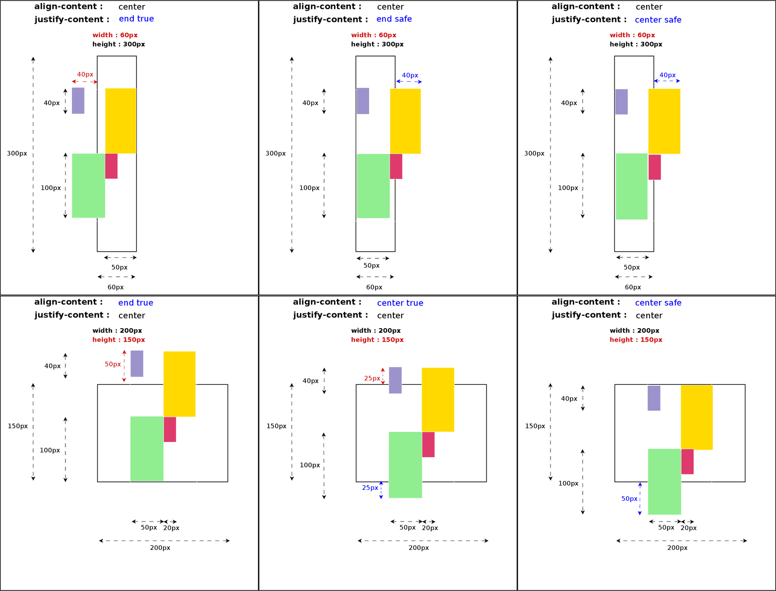
When grid content’s size exceeds its container dimensions there is the risk of data loss. Some examples of this scenario are center or end alignment from the viewport’s edges; all the content overflowing the viewport’s area can’t be reached, hence we lose such data. In order to prevent this issue Box Alignment specification defines the safe overflow mode, which basically forces a start alignment value for the property handling the dimension where the overflow is detected.
Using the same CSS and HTML code in the example above, we can easily define cases where this data loss issue (red colored arrows) is clearly noticeable just modifying the height or width to cause top or left overflow respectively.
There are other situations where Content Alignment and Overflow interact in a different way, using margins, padding or/and borders and even combining different writing-modes and flow directions. The effect of the alignment values varies considerably depending on those factors but I think you have now a clear idea of how to use these new properties in a grid layout.
Current status and next steps
With the grid support for the align-content and justify-content CSS properties in Blink we’ve got most of the Box Alignment specification covered. As it was commented before, just Base Alignment is still pending to be implemented in Chromium browsers. I have to admit that there are also some bugs and wrong behavior using certain CSS combinations, specially regarding orthogonal flows, but we are working on it right now and I hope to integrate the patches soon in trunk.
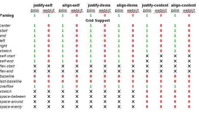
For the time being, let’s consider the following table as the current implementation status of the Box Alignment specification for the Grid Layout model in WebKit (Safari/Epiphany) and Blink (Chrome/Chromium/Opera) based browsers:
The lack of progress in the implementation of the Box Alignment specification in the WebKit web engine is disappointing. I’ve been stuck for quite a lot of time trying to upgrade the CSS properties to the last version of the spec, mainly due design and performance issues. I’ll discuss with the WebKit hackers the best approach to solve this issue so I can put the Grid Layout implementation at the same level than in Blink web engine.
Igalia and Bloomberg will continue working on the implementation of the CSS Grid Layout specification and among my short/mid term challenges are completing the Box Alignment support. These goals include the following tasks:
- Fixing bugs and completing the orthogonal flows support.
- Implementing the Base Alignment features
- Completing the Content Distribution Alignment with the <content-distribution> values
- Implementing the Box Alignment spec in WebKit

Igalia and Bloomberg working to build a better web platform


