Artwork ideas for Vagalume
Since my workmate Berto released Vagalume, here at Igalia we have adopted the application and giving him suggestions about how to improve it. The N800 makes a nice little Last.fm player, ideal to keep around while you’re working, and therefore the latest version, that displays album covers within a nicer interface, is a great improvement.
Besides creating the icon for the latest release, I have done some other work on the graphical part of Vagalume in my spare time that I would like to share today. First, here we have the (beta) icon shipped with today’s release in a bigger size.
It looks nice when it’s big, but on the device I think that it doesn’t scale well enough, and the three fireflies look more like comets. That’s why I created recently an alternative one, with only one flying light path:
 |
Representing a firefly (that’s what vagalume means) in an icon isn’t an easy thing, for fireflies are small and not quite pretty under daylight, so showing their light paths was the best choice IMHO.
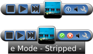
Now that the functionality is there, we’ll devote some time to the UI, to give Vagalume the mojo it deserves. And finally. to end our world domination plan, one of the next things to do should be a desktop applet. Here are my humble suggestions:
 |
 |
I hope that this post motivated you to try Vagalume and take active part in its growing community. Let the ideas come!
Nice work! I love them!