Archive for October, 2011

First ideas for a better GNOME browser

Posted in Design, Free Software, Gnome, Igalia, Planet GNOME, Planet Igalia, Web browsing on October 31st, 2011 by femorandeira – 2 Comments

Following up on my last post, I want to share a few ideas that could improve the use of the Web from GNOME. Many of these come from other people and I am trying to combine them into one coherent package.

The first goal would be to offer better support for common Web browsing patterns, revisitation and exploration. Specifically, this means supporting web applications, a more convenient and agile presentation for favourites, better history and bookmarks management, better tab management within the browser window for pages that are related to the same tasks, and better tab management from the Shell to help the user align the different sets of tabs with his current activities and interests.

The second goal would be to do so in a way that is not cumbersome and complex, but light and consistent.

Web apps

Most of the next million apps written will be web applications. The browser should acknowledge this, allowing the user to turn a Web site into an application that can be accessed like any other.

Launcher for GMail app in Gnome Shell

Launcher for a GMail app.

Revisitation: Home and History

As noted in my previous post, there are different kinds of Web revisitation; one of them comprises sites that we visit often because they lead to new information, which is not exactly the same as storing a linking to a page because of the information that it contains at the moment of reading (e.g. an article). In a manner similar to what Firefox does, I propose to have a Home tab as the starting point for browsing. This tab could include a search field, links to recent pages and groups of pages, favourites and Reading List. Being able to define a page as “favourite” and “pin” it to the Home page would ease mid- and long-term revisitation, which makes up for a large percentage of our activity in the Web.

The Home tab would be a way to get to new content, but what about returning to sites that were visited some time ago? Next to the Home tab, we could place a History&Bookmarks tab that offered a rich search interface to retrieve pages that have already been seen.

Home and History tabs

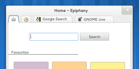
Tabs on top, with Home and History on the top left.

Fine-grain tab management

Modern browsers are placing their tabs on top with good reason. The main advantage is that this helps establish a visual hierarchy inside the browser window that reinforces the proper mental model, so that controls that operate on the same scope are grouped together. To decide which controls should be given priority in the interface, we could use usage data from Firefox as a guide, always keeping in mind that we cannot assume that everybody will know how to use all the available shortcuts (e.g. a similar study found that over 80% of users never used Ctrl+F to search). Browser-level functionality (New Window, Preferences, Quit…) could be moved to the application menu.

Tabs provide a number of benefits that make them a convenient way to organise your Web browsing. However, one of their problems is that as their number grows, it can become difficult to go back to a certain tab; a way to improve this situation could be to show a thumbnail of the tab’s content on mouse-over, allowing for a quick scan of open tabs without having to open them one by one.

Tab thumbnail on mouse-over

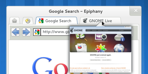
Tab thumbnail on mouse-over.

There is a difference between following a link and opening it in a new tab. In the first case, the original page is still visible and readily accessible; in the second, it has disappeared from the UI and has to be kept in the user’s memory, to be accessed again via the Back button. These two different actions can allow the user to create a curated version of their trail through the Web, one that does not contain all the pages that they have visited but just those that have been deemed important. These tab trees are an important feature but tab-focused interfaces (e.g. tree-style tabs, other ideas) might be far too complex. A compromise could be to include a visual hint at the existence of different tab groups, but without making it the main point of the interface.

Tab groups

Without text, can you tell which of these tabs are related?

Coarse-grain tab management

Tabs are a good way of structuring your browsing when their number is low enough (research shows that an usual number of open tabs is around 6). When their number grows, you can have trouble because there are simply too many unrelated tabs in one window. So we have a problem with the organisation of a lot of content that is related to different activities: well, the GNOME Shell is a solution for that. I propose to allow high-level management of Web tabs directly from the Shell Overview (not too different from Panorama with a bit of this), providing an overview of the open tabs and supporting their movement between different browser windows and workspaces.

Epiphany in Shell overview

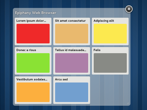
Epiphany window in the Shell overview, displaying the open tabs.

Wrap-up

I have tried to describe a situation where Web browsing is more tightly integrated with the desktop. There is still a lot of work to do: detailed functionality needs to be refined, assumptions need to be verified, mockups and prototypes need to be created and evaluated…

A browser is a very complex application to design, but luckily there is a lot of knowledge already available that should help us generate ideas and make informed decisions.

First readings on web browsing

Posted in Design, Free Software, Gnome, Igalia, Literature, Planet GNOME, Planet Igalia, Web browsing on October 14th, 2011 by femorandeira – 4 Comments

Earlier this week I began to look at some of the many available works on the field of Web browsers for the desktop, with the goal of improving the design of the Epiphany browser and taking advantage of the fact that Igalia is one of the main maintainers of WebKitGTK+. The first task, of course, is to correctly understand the problem: in a field as big and complex as this, this means a lot of reading and synthesising. Today I will explore two particular aspects: revisitation and tabbed browsing. In the future I will expand on this and begin to share some design ideas.

Revisitation

Revisitation means to access web sites that have been already seen previously. Although there are discrepancies on how to measure it, for the sake of design we can say that we have already seen roughly half of the pages that we visit. The article by Obendorf et al. mentions three kinds of revisitation:

  • short-term revisits (within the hour): these are the most common, often performed by following links, or using the Back button;
  • mid-term revisits (within the day): the most usual way is to use bookmarks or write the URL (often helped by autocomplete);
  • long-term revisits: this is related to the rediscovery of information that has already been seen; people re-access these pages mainly through links because they need to re-search (enter the same search terms) and/or re-trace (follow the same steps); history and bookmarks are also employed to some extent, but the current interfaces might not be easy or convenient to use.

Previously-unseen pages are usually visited by directly entering a URL or by following links from search pages (e.g. Google) or other information hubs (e.g. reddit, news sites).

A wider research was carried out by Adar, Teevan and Dumais. Their findings are consistent to those above, as they found that Web page revisitations could be clustered in the same three groups plus another one, which they called hybrid and which contained sites that were popular but infrequently used. They went further in trying to analyse the kind of web sites that typically fell on each group. The fast revisitation pattern often corresponded to “hub&spoke” behaviour, where users move back and forth between a set of promising results and each individual item. The mid-term one tended to refer to pages that act as starting points where the user can carry out a task (e.g. communication, banking) or access new information (e.g. news, forums). The infrequently-accessed group comprised pages that provide specialised search (e.g. travel) or related to weekend activities; as in the previous paper, the researchers also note that external search engines are often used for revisitation. There was a fourth, hybrid group of pages that caused “hub&spoke” movement but that were infrequently accessed, such as craigslist, eBay, shopping, games, etc.

With these results, the researches mention a number of implications for design. The most interesting for me is that “there may be value in providing awareness of, and grouping by, a broader range of revisitation patterns. For example, users may want to quickly sort previously visited pages into groups corresponding to a working stack (recently accessed fast pages), a frequent stack (medium and hybrid pages), and a searchable stack (slow pages).”

Research on tabs

During the last years the usage of tabs has made the Back button less prevalent. For instance, a common behaviour is to perform a search and then open different results in their own tabs, attempting to find the desired information through exploration of the candidates without losing track of the result set for further refinement. This often causes problems because the Back button does not work as expected (local history only applies to the current tab) and it might be complicated to find the originating document in the case of large tab trees. Problems with the Back button also arise when entering information through web forms and when using web applications.

A study of tab usage on Firefox showed that tabs are mostly used for immediate revisitation and task-switching. They serve as reminders or short-term bookmarks, they allow users to open links in the background and are a convenient way to keep frequently-accessed pages open. Visually, they are cleaner, less cluttered and easier to access that separate browser windows.

Many participants used tabs for revisitation more often than the back button, up to the point where, for frequent tabs users, tab switching was the second most frequent thing they did in the browser (after following links). The reasons reported were that tabs were more efficient, more convenient and more predictable (you can see the target right away). Another factor that helps to ease multitasking is that tabs leave the page in the same state, which is not always true with the back button.

The study found marked differences between regular and power tab users. The median number of open tabs was reported at around 6, but the maximum number of open tabs at one point in time could get much higher than that, past 20 and beyond for some users. As the participants were using regular Firefox, it could be that for some a limiting factor to the number of open tabs might simply be lack of space.

A bit of personal experience

As a user of the Tree-style Tabs extension for Firefox, I often find myself creating long trees of tabs where the tree itself marks a trail that is coherent and useful. I do not use the Back button often, and I think that the reason might be that opening a new branch in the tree somehow makes that part of the trail useful, clear and important, whereas pages that can only be accessed by going back soon fade out of memory. For a given task, it might well be that there is value in having a clear structure of related sites: the combination of tree-style tabs and the Back button helps create and navigate this structure.

Opening a link in a new tab actually marks the previous one as interesting and worth keeping around for a while, whereas closing a tab or following a link signals that the previous page was not that interesting after all (and it will fade from memory soon). This way of looking for information is probably related to orienteering, an information seeking strategy in which users take small steps towards their target using partial information and contextual knowledge as a guide. Making said set of steps visible and semi-permanent also acts as a very convenient reminder: my tab structure is kept between sessions, which makes it very easy to resume work or reading (for instance, there is a small subtree hanging from my RSS reader tab with articles that I will read later, and another one hanging from Bugzilla with bugs that I am working on).

Longer-term revisits

Regarding mid- and long-term revisits, I propose to contemplate three kinds of sites: web applications, information hubs and the personal archive. Web applications are self-contained and focused mainly on one task; their goal is in most cases to replace local applications for e.g. email, calendar, project planning, music, etc.

It might make sense to separate frequently visited websites that periodically provide new content from concrete and interesting information items; you can think about as the difference between reading the newspaper everyday and cutting out a news item that mentions your amateur football team. Information hubs are pages that are visited often because they lead to the discovery of new information, either on the same site (e.g. guardian.co.uk) or on others (e.g. reddit.com). On the other hand, the personal archive is a collection of information items that are relevant for the user because of the information that they already contain. There are many motivations behind the construction of personal archives: not just simply storing things for later retrieval, but also creating a legacy, making it easier to share resources, reducing fear of loss, self-expression and self-identity.

References

“Web Page Revisitation Revisited: Implications of a Long-term Click-stream Study of Browser Usage”, Obendorf et al., CHI 2007 Proceedings [PDF]

“A Study of Tabbed Browsing Among Mozilla Firefox Users”, Dubroy et al., CHI 2010 [PDF] [Presentation]

“Large Scale Analysis of Web Revisitation Patterns”, Adar et al., CHI 2008 [PDF]

“To have and to hold: exploring the personal archive”, Kaye et al., CHI 2006 [PDF]

“The Perfect Search Engine Is Not Enough:A Study of Orienteering Behavior in Directed Search”, Teevan et al., CHI 2004 [PDF]

Alex Faabor’s blog

Mozilla’s blog of metrics

Design proposals for Epiphany: EpiphanyRedux, hbon’s mockups