Posts Tagged ‘Design’

Sketching interactions (talk at GUADEC 2012)

Posted in Design, Free Software, Gnome, GUADEC, Igalia, Planet GNOME, Planet Igalia, Web browsing on July 31st, 2012 by femorandeira – 2 Comments

This is a small summary of my talk at GUADEC 2012 in A Coruña, Spain.

I got the talk started with a quote from Bill Buxton‘s book “Sketching User Experiences”:

“Getting the design right, and the right design”

“Getting the design right” refers to the things that concern us when refining a design: usability, accessibility, visual appearance, performance, etc.

However, what exactly is “the right design”?

Here are photos of three objects to help us start thinking about this.

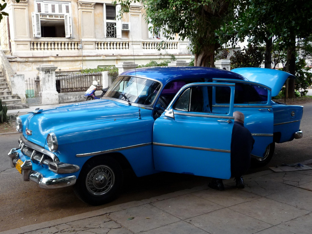
“Cars in Cuba - 57”, by patrick_nouhailler

The first one is an old car in Cuba, carefully kept and maintained. Terribly attractive at a first look. After this first impression, questions begin to come up. Is it easy to handle? Expensive to maintain? Ecological?

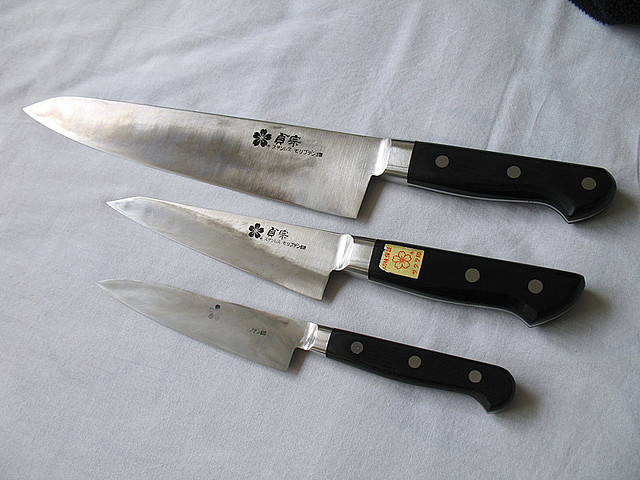
“My Armory: Chef's, Boning, Utility Knives”, by osakajon

The second photo shows a set of Japanese knives. Are they beautiful? Kind of, as far as knives go. They feel great in the hand, though, and are sharp and sturdy. And what do they tell about their owner? What would it say about yourself to own a set like this?

“La petite tour”, by esm723

The third photo is a small figurine of the Eiffel Tower. It is not particularly attractive. It is absolutely, perfectly useless. And yet, it has value for its owner. But that value does not come from its looks of its usage. The value of this object is not in the object itself: it comes from how it makes its owner think (in this case, of a past trip to Paris).

There have been different attempts at defining the characteristics that make things attractive and valuable for us. In his book “Emotional Design”, Donald Norman details three levels of processing:

  • Visceral: related to the sensory properties of a product
  • Behavioural: how it feels when used
  • Reflective: how it makes us think differently about ourselves, and how it changes the perception of others

A more recent approach has been carried out by Karen Holtzblatt (InContext). She and her team identified a set of characteristics that make a product “cool”:

  • Allows you to accomplish your intent anywhere, on your time
  • Goes direct into action without hassle
  • Provides connection with the people that matter to you
  • Helps you build your own identity
  • Has nice aesthetics and sensation
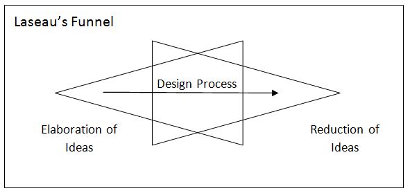
Laseau's funnel

Laseau’s funnel describes design as a combination of ideation and reduction. There are many different solutions to explore at the beginning of a project, and we need to be able to go through all those ideas quickly, evaluating and rejecting them. Making questions upon questions in order to start getting the right answers.

Requirements-driven development is not enough to provide the characteristics that people really value. A much better approach is to be able to quickly try out design ideas, using those sketches to help us elicit the real user requirements and refine the designs.

These sketches need to be fast and cheap, so that they can be plentiful. And because they are plentiful and cheap and fast, they can be disposed of, to leave room for more and better ideas.

As it is often said, design is about saying “no”: design is a negative craft.

Besides its benefits for ideation, this approach also helps improving the communication of design ideas among designers, and  between them and other stakeholders (i.e. the GNOME community at large, in our case).

The Wizard of Oz

One (surprisingly) influential film for the field of UX design has been “The Wizard of Oz”. You are probably familiar with the story: Dorothy’s house is carried away by a tornado, all of a sudden she is not in Kansas any more, she meets a cast of wacky characters and runs into several adventures until she and her friends finally meet the famous Wizard of Oz.

Large, loud and surrounded by fire, the Wizard is a terrible and dreadful sight. Dorothy and her friends are appropriately afraid and have no choice but to do as he commands. Until the little dog Toto gets so scared that he runs and pulls at a curtain: behind it there is a small old man, pulling levers.

So the terrible Wizard was actually just an old man using smoke and mirrors. But what’s interesting is that, up until the point of this revelation, Dorothy’s and her friend’s reactions were governed by the belief that he was real. The Wizard was fake, but their experiences of him weren’t.

The Wizard of Oz is actually the name of a specific technique for sketching interactions where part of the behaviour of a computer system that would be too expensive to build is replaced by a hidden human operator. It has been successfully used to, for instance, simulate the experience of using a perfectly accurate speech-to-text system way before those systems were as common as they are beginning to get today.

Palm Pilot wooden prototype (1995)

The talk continued with descriptions of a number of examples and different techniques to quickly sketch the behaviour and experience of using a product way before that product is a reality. Several tangible prototypes were discussed, from simple paper-based sketches to full living rooms.

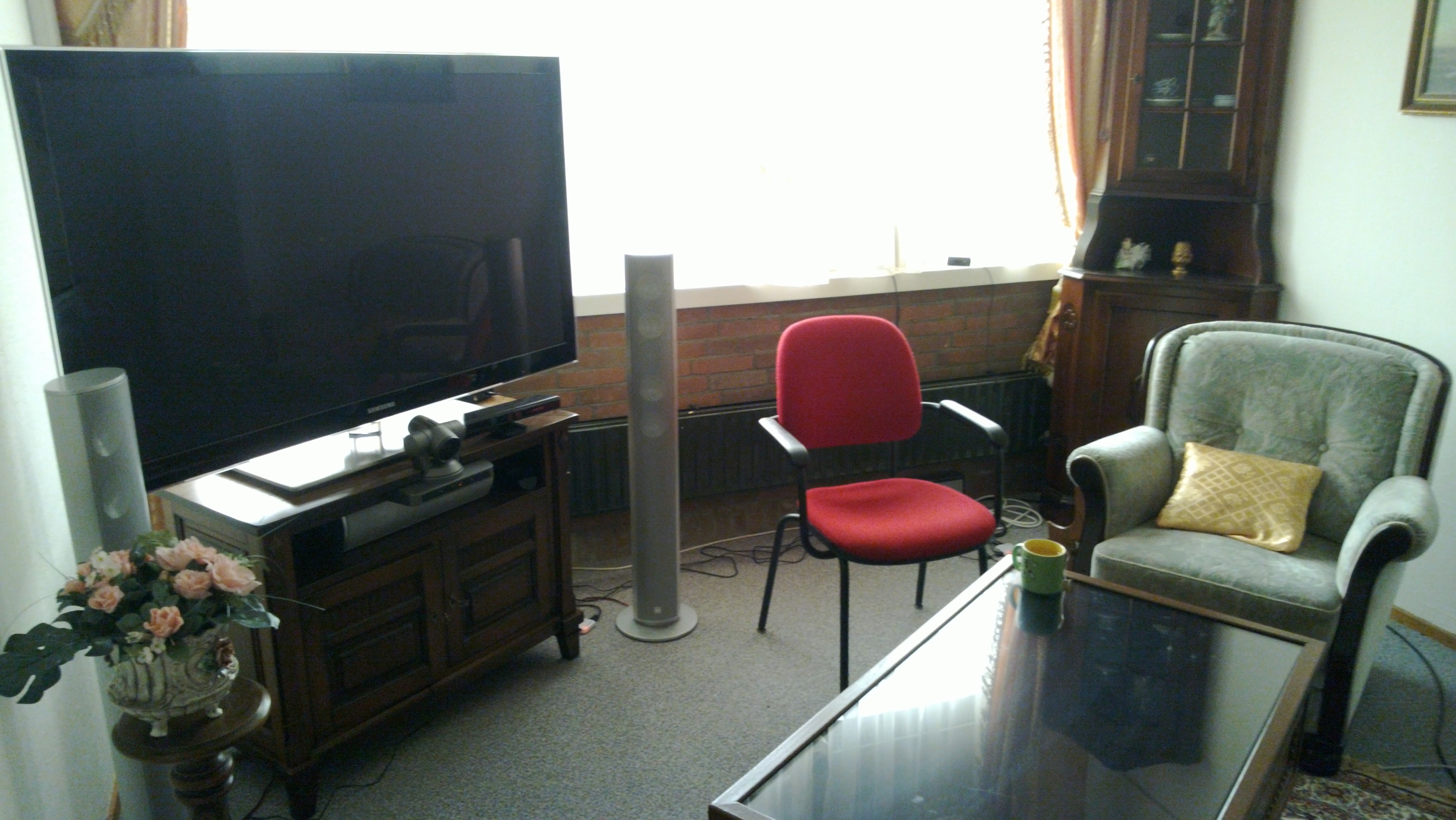
Living room at CWI Amsterdam, used to conduct experiments on different TV and teleconferencing technologies.

Some of the examples relied on storytelling engage the audience’s empathy to help them experience the proposed interaction through the protagonists of the story. The cases discussed ranged from written stories to the acting up of interaction flows and even professional theatre performances.

Theatre used to elicit requirements from elderly users, University of Dundee

In GNOME, we often use wireframes and visual mockups. A couple of interactive examples that were discussed in the talk were:

  • This demo of multiple selection by Jakub Steiner (link)
  • And my own experiments with the navigation on Epiphany (code, videos)

Communication of design decisions is a problem in GNOME. We are a project composed of small teams working on different and remote organisations, but with a lot of potential stakeholders (a whole community of them!). It is important to develop and practice techniques that would allow us to refine and communicate ideas more fluently.

To end with a bit of advice: just turn your computer off from time to time, grab some pen & paper, and try things out 🙂

GUADEC 2012

Images:

First readings on web browsing

Posted in Design, Free Software, Gnome, Igalia, Literature, Planet GNOME, Planet Igalia, Web browsing on October 14th, 2011 by femorandeira – 4 Comments

Earlier this week I began to look at some of the many available works on the field of Web browsers for the desktop, with the goal of improving the design of the Epiphany browser and taking advantage of the fact that Igalia is one of the main maintainers of WebKitGTK+. The first task, of course, is to correctly understand the problem: in a field as big and complex as this, this means a lot of reading and synthesising. Today I will explore two particular aspects: revisitation and tabbed browsing. In the future I will expand on this and begin to share some design ideas.

Revisitation

Revisitation means to access web sites that have been already seen previously. Although there are discrepancies on how to measure it, for the sake of design we can say that we have already seen roughly half of the pages that we visit. The article by Obendorf et al. mentions three kinds of revisitation:

  • short-term revisits (within the hour): these are the most common, often performed by following links, or using the Back button;
  • mid-term revisits (within the day): the most usual way is to use bookmarks or write the URL (often helped by autocomplete);
  • long-term revisits: this is related to the rediscovery of information that has already been seen; people re-access these pages mainly through links because they need to re-search (enter the same search terms) and/or re-trace (follow the same steps); history and bookmarks are also employed to some extent, but the current interfaces might not be easy or convenient to use.

Previously-unseen pages are usually visited by directly entering a URL or by following links from search pages (e.g. Google) or other information hubs (e.g. reddit, news sites).

A wider research was carried out by Adar, Teevan and Dumais. Their findings are consistent to those above, as they found that Web page revisitations could be clustered in the same three groups plus another one, which they called hybrid and which contained sites that were popular but infrequently used. They went further in trying to analyse the kind of web sites that typically fell on each group. The fast revisitation pattern often corresponded to “hub&spoke” behaviour, where users move back and forth between a set of promising results and each individual item. The mid-term one tended to refer to pages that act as starting points where the user can carry out a task (e.g. communication, banking) or access new information (e.g. news, forums). The infrequently-accessed group comprised pages that provide specialised search (e.g. travel) or related to weekend activities; as in the previous paper, the researchers also note that external search engines are often used for revisitation. There was a fourth, hybrid group of pages that caused “hub&spoke” movement but that were infrequently accessed, such as craigslist, eBay, shopping, games, etc.

With these results, the researches mention a number of implications for design. The most interesting for me is that “there may be value in providing awareness of, and grouping by, a broader range of revisitation patterns. For example, users may want to quickly sort previously visited pages into groups corresponding to a working stack (recently accessed fast pages), a frequent stack (medium and hybrid pages), and a searchable stack (slow pages).”

Research on tabs

During the last years the usage of tabs has made the Back button less prevalent. For instance, a common behaviour is to perform a search and then open different results in their own tabs, attempting to find the desired information through exploration of the candidates without losing track of the result set for further refinement. This often causes problems because the Back button does not work as expected (local history only applies to the current tab) and it might be complicated to find the originating document in the case of large tab trees. Problems with the Back button also arise when entering information through web forms and when using web applications.

A study of tab usage on Firefox showed that tabs are mostly used for immediate revisitation and task-switching. They serve as reminders or short-term bookmarks, they allow users to open links in the background and are a convenient way to keep frequently-accessed pages open. Visually, they are cleaner, less cluttered and easier to access that separate browser windows.

Many participants used tabs for revisitation more often than the back button, up to the point where, for frequent tabs users, tab switching was the second most frequent thing they did in the browser (after following links). The reasons reported were that tabs were more efficient, more convenient and more predictable (you can see the target right away). Another factor that helps to ease multitasking is that tabs leave the page in the same state, which is not always true with the back button.

The study found marked differences between regular and power tab users. The median number of open tabs was reported at around 6, but the maximum number of open tabs at one point in time could get much higher than that, past 20 and beyond for some users. As the participants were using regular Firefox, it could be that for some a limiting factor to the number of open tabs might simply be lack of space.

A bit of personal experience

As a user of the Tree-style Tabs extension for Firefox, I often find myself creating long trees of tabs where the tree itself marks a trail that is coherent and useful. I do not use the Back button often, and I think that the reason might be that opening a new branch in the tree somehow makes that part of the trail useful, clear and important, whereas pages that can only be accessed by going back soon fade out of memory. For a given task, it might well be that there is value in having a clear structure of related sites: the combination of tree-style tabs and the Back button helps create and navigate this structure.

Opening a link in a new tab actually marks the previous one as interesting and worth keeping around for a while, whereas closing a tab or following a link signals that the previous page was not that interesting after all (and it will fade from memory soon). This way of looking for information is probably related to orienteering, an information seeking strategy in which users take small steps towards their target using partial information and contextual knowledge as a guide. Making said set of steps visible and semi-permanent also acts as a very convenient reminder: my tab structure is kept between sessions, which makes it very easy to resume work or reading (for instance, there is a small subtree hanging from my RSS reader tab with articles that I will read later, and another one hanging from Bugzilla with bugs that I am working on).

Longer-term revisits

Regarding mid- and long-term revisits, I propose to contemplate three kinds of sites: web applications, information hubs and the personal archive. Web applications are self-contained and focused mainly on one task; their goal is in most cases to replace local applications for e.g. email, calendar, project planning, music, etc.

It might make sense to separate frequently visited websites that periodically provide new content from concrete and interesting information items; you can think about as the difference between reading the newspaper everyday and cutting out a news item that mentions your amateur football team. Information hubs are pages that are visited often because they lead to the discovery of new information, either on the same site (e.g. guardian.co.uk) or on others (e.g. reddit.com). On the other hand, the personal archive is a collection of information items that are relevant for the user because of the information that they already contain. There are many motivations behind the construction of personal archives: not just simply storing things for later retrieval, but also creating a legacy, making it easier to share resources, reducing fear of loss, self-expression and self-identity.

References

“Web Page Revisitation Revisited: Implications of a Long-term Click-stream Study of Browser Usage”, Obendorf et al., CHI 2007 Proceedings [PDF]

“A Study of Tabbed Browsing Among Mozilla Firefox Users”, Dubroy et al., CHI 2010 [PDF] [Presentation]

“Large Scale Analysis of Web Revisitation Patterns”, Adar et al., CHI 2008 [PDF]

“To have and to hold: exploring the personal archive”, Kaye et al., CHI 2006 [PDF]

“The Perfect Search Engine Is Not Enough:A Study of Orienteering Behavior in Directed Search”, Teevan et al., CHI 2004 [PDF]

Alex Faabor’s blog

Mozilla’s blog of metrics

Design proposals for Epiphany: EpiphanyRedux, hbon’s mockups