A few more ideas for Web navigation – and a talk at FOSDEM
I will be in Brussels next weekend to attend FOSDEM and give an updated version of the “Sketching Interactions” talk that I delivered at GUADEC (summary).
In order to have some more material to talk about, I have revisited my interactive sketch for navigating among open pages in Epiphany.
To recap: the problem that we are looking into is how to manage open pages in your Web browser. This is commonly done with tabs, but these have some problems: they display very little information, are hard to use in touch screens, and scale badly.
To illustrate this last point, here is how 15 open pages would look in Epiphany right now:
Hardly ideal.
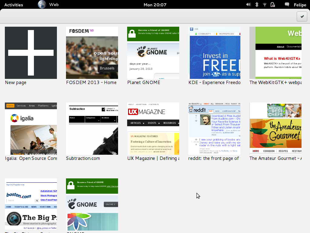
This work looks into alternative in-app navigation among open pages that would (hopefully!) improve Web browsing. I started by prototyping the current proposal in the GNOME wiki and have continued from there. From the previous iteration, it seemed that a grid view might be a good solution for choosing among open pages:
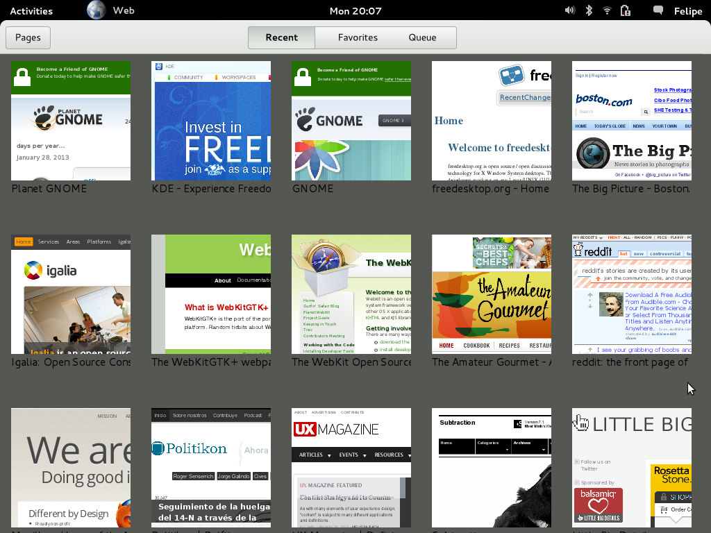
I have extended that idea with a “New Page” view that would allow the user to review and search among his bookmarks, recently visited pages, reading list, etc. For now, this view just offers a fixed list of sites to illustrate how navigation would work, but it wouldn’t be hard to extend it to try more complex behaviour:
You can get the code here.
And this is how it looks in action:
Part of the reason for working on this was to offer some ideas to my Igalia colleagues and other members of the GNOME community who are working on Epiphany and WebKitGTK+. The other part was to encourage people to try out ideas, not just argue about them. Too much time is lost arguing when we could be showing.
This can be done quickly and inexpensively: in this particular example, in 300+ lines of QML. The key is to focus on doing just the bare minimum to portray the experience that we are interested in. Because these sketches are quickly and cheap, they enable us to explore and discard many ideas easily.
Communication of design ideas and decisions is specially complex in a distributed community like GNOME. Interactive sketches like the one here could help improve this situation.
See you in Brussels!


Both Chrome and Firefox feature plugins/extensions that lets you search for substrings in the title and url to jump to some tab. This is insanely useful when you’re on a laptop working on some specific task over a long period of time and only restart the web browser if there’s some security update. It’s too bad no browser has a polished version of this feature by default. It wouldn’t even have to be that exposed in the ui, but just like you can type in a GtkTreeView, you would be able to type in your screenshots above to filter down the number of potential pages. This helps a lot when you’re lost somewhere in those 70-110 open pages. 🙂
That is a general pattern in GNOME. I can see that working well here: start typing on the overview and open pages are filtered to show only the potential matches.
I like it. Chrome for Android has something similar to the Pages button alternative to tabs.
I think it’s an awesome idea.
Drop a hotkey for access and typeahead search into the mix and you get an awesome alternative browser 🙂
I’m a german. So I will start directly! Your warned! Don’t take this personal, especially because I appreciate your work and every improvement to Epiphany.
This workflow adds new unneeded actions to change from one page to another. It doesn’t solve problems with many open pages. It will add a more easily usable interface for users on touch-devices.
The current situation on every common application with tabs:
Alt+Tab/Shift-Tab = immediate change of tab
Alt+PGUP/PGDN = immediate change of tab
MouseClick = immediate change of tab
Tabs = show you (as much as possible) tabs permanently
Tabs are the killer-feature of the last decade! The reason why Nautilus and Doplhin/Konqueror are superior over “Explorer” is merely the possibility to use Tabs. Tabs increased usability of every heavy working application, from text-editors, file-browsers, internet-browsers to terminal-emulators.
Tabs existed in the 90, too. But especially Microsoft failed with tabs. Even nowadays the typically settings-dialog on windows shows this misuse, they stacked the tabs and reorder them always in a weird way. But that is not our problem.
So what is about your design?
Your screen doesn’t show open tabs permanently. // bad
-> So it is necessary to call the overview every time // extra work
-> Need to select a tab // badly possible with keyboard, wide ways with the mouse
-> Screen is full of thumbnails, after 15 tabs // where is the win? and making the thumbnails smaller will the only fix to some degree on laptops/desktops, not on touch-devices
Conclusion:
Don’t remove tabs! Don’t deprecated tabs! Don’t move them to dconf! GNOME can’t afford loosing, again, a major feature. There are currently no users on touch-devices. Hard but true, but there are users on laptops and desktops. But this could change and this (new) design has proven to work for Android based devices (similiar on HTC with its own adaption). So and second alternative approach to handle tabs on touch based devices could be a good investment for the future!
Add this as a new option and you could win users in the future for Epiphany. Yes add this as OPTION! Don’t deprecated tabs or hide them by default. I can just advise you and the other developers of Epiphany not to make tabs to a second class-citizen*.
Thank you!
*Instead Alt+Tab/Shift+Tab should be enabled by default also.
Tabs may have been nice in the previous decade but now they are an impediment for better document switching models. Sure, let the keyboard shortcuts exist but the tabs MDI, especially the GtkNotebook implementation, is fundamentally flawed. I am looking forward to the day tabs are removed and replaced by something better.
When will you GNOME devs realize that nobody wants to drag the mouse like a maniac? No approach that makes you drag the mouse and click twice as much to perform the same action can be better.
No carpal tunnel syndrome after extended use > Context-switching and filling the entire screen with stuff. It should be a sin to translate tablet designs to a desktop.
There isn’t one perfect solution, all have to make compromises.
Traditional tabs make a lot of compromises: they are small, only show a little amount of text, don’t scale well, etc. This proposal improves legibility, offers bigger targets for touch use, shows a thumbnail for each page, and scales better. It does have drawbacks, true, and you should not mistake it for a final decision in any way.
Tabs, as most desktop Web browsers use them (one single thin line on top), are very cumbersome for power users. If you are like me, and like having a few dozen pages open at any time, I suggest you try the Tree-Style Tabs extension for Firefox. It might change your mind about the need for specific UIs for specific cases, rather than sticking to one suboptimal solution for everything.
Forgot something! It would be a nice idea to put thumbnails of the open tabs on a sidebar. Saw this in firefox for android some time ago. That would a mix of usual tabs with your approach!
I like the concept, but please don’t replace ‘Bookmarks’ by ‘Favorites’. People often have to visit web pages that are not exactly their favorites but they have to go there anyway.
To be honest, doesn’t this belong in the Shell?
GNOME already supports single-window mode for Web applications.
In the general case, a dedicated browsing UI has the potential to leverage a lot more information than the Shell can; e.g. which tabs have been open together, which ones belong to the same domain, which ones have been accessed recently, etc.
Some people tend to keep a lot of tabs open and it would not be practical to have all of them in individual windows in the Shell, specially since several of those are meant to be used together for a certain task. Having said that, it would be great if the Shell was aware of open tabs/documents somehow. At least, it would make the overview mode more informative.
Hello friends,
I am impressed by read all that great information…This work looks into alternative in-app navigation among open pages that would improve Web browsing…I appreciate that your work..Thanks for sharing all that great information..Please visit on this site about that great topic Rug Distribution:
unitexint.com