Sketching Butaca: IMDB on a tablet
Butaca is an application for the N9 developed by Simon Pena, hacker at Igalia. It is meant to be a companion to film lovers, providing information about movies, actors, directors… and even showtimes near you. It uses The Movie Database and Google Showtimes as backends.
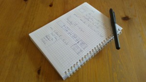
As a design exercise, I started thinking some time ago about how we could port Butaca to a tablet form factor. As usual, this was the tool selected to help my thinking and get started in the design:
My basic idea was to keep the current presentation in pages, replacing the Back button with a horizontal navigation that would let you move back and forth along your history. The pages that you have seen are on your left; the “forward” ones are to the right, along with shortcuts to launch each of the main sections of the application.
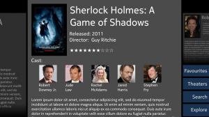
To illustrate this, I drew a few mockups with Inkscape. This is one of them:
This helped in visualizing the solution, but important questions had not been quite answered yet. Would this idea really work on a tablet? Would it look nice? Does it really make sense to structure navigation history in this way? I might have tried to build a functional prototype, but prototypes are used to confirm decisions rather than raise questions. It is important to avoid committing too soon to a particular design, before the space of possible solutions has been fully explored. What was needed at this stage was something else, something tentative and exploratory. What was needed was a sketch.
Sketches are cheap, disposable, quick. So, I took a bunch of screenshots of the N9 application and joined them together with just ~160 lines of QML, in a sort of interactive collage. This method would work just as well with nice ad-hoc mockups, but those take more time and the point was to keep it quick. Igalia had provided me with a WeTab running GNOME 3, so I just had to load my little application on it and take the following video:
(direct link to video in Vimeo; sorry for the quality, the WeTab’s screen is terribly reflective)
Now, that is a better way to get the point across, isn’t it?
The take-home lesson here is that trying out ideas is important. There are techniques that assist us in creating interactive sketches quickly, which can be very useful when we need to explore ideas and build on them to generate new ones. Furthermore, a sketch can be a great communication tool, as I hope to have shown with the preceeding video.


Nice!
Answering these questions:
Would this idea really work on a tablet? Would it look nice?
Yes, I think so. Although I might try to use the screen size even more: I don’t
think the menu has to be always visible (for example, a gesture like tapping on
the bottom-right corner could bring it up), and maybe you don’t need to show
the history all the time. For example, the current view could take all the
available space, and if you do a gesture (pulling it a bit from top to bottom
or something like that) the current view shrinks a bit and the history shows.
Does it really make sense to structure navigation history in this way?
Totally, although maybe some of the actions wouldn’t push new views to the
stack, but rather would move to the existing ones. But those would be
implementation details 🙂
Please, add a director and cinematographer information to top right corner so viewer can quickly see who’s vision of story and whos visual vision movie is.