Today I want to think about a possible mobile application to fulfil the goal of getting “a varied stream of my music that suits a general theme and that requires little interaction from my side”. For the particular case of mobile music:
- Music can be in the background, allowing the user’s attention to be directed elsewhere.
- Portable music devices are often pocketed away. Direct interaction and user input are therefore sparse.
- Mobile music has usually only one listener.
- Fine management of the specific songs being played and their sequence might not be required.
These are all assumptions, but I will go with them for now. Bear in mind that this is just a bit of exploratory design and so far hasn’t been validated.
The main idea is that the user should be able to just select the musical “theme” and get music along it. Since both tags and genres have a subjective component, I thought that using music artists as the “seed” for the radio stream might work well. If this sounds similar to Last.fm‘s radios, yes, it is similar.
Last.fm uses streamed content and relies on crowdsourcing to generate the relationships between artists, tags, songs, etc… One of the constraints that I had in mind when I thought about this application was that the music should come from the user’s personal collection and not depend on having an Internet connection. More importantly, Last.fm’s radios offer a wide range of choices and therefore require complex UIs, ; one of the questions that I am wondering here is if one could strike a compromise between providing music that satisfies the user’s needs and doing so with an interface that is simple, quick and pleasant to use.
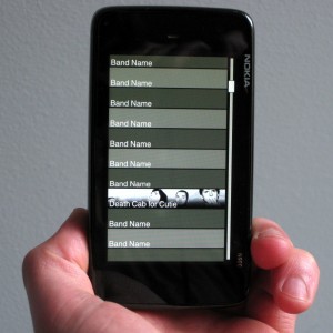
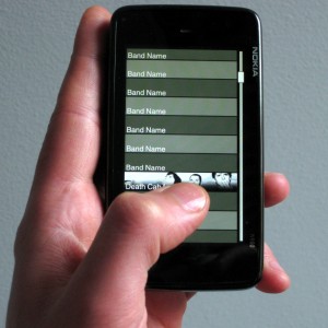
This is a quick sketch. In this hypothetical app., the user is presented with a list of the artists and bands in their collection.

An image of the band could be used to make the application more visually attractive and easier to recognize. It is worth noting that the list layout shown in the image is not necessarily the best one for this particular case. The proper thing to do if we were serious about developing this would be to prototype, test and evaluate different possible list layouts in a systematic way: one column, two columns, images, no images… This might make a good starting point for a future post about testing.
It is worth repeating that this is supposed to work on the user’s music collection on a mobile device, which on average [citation needed] would be limited to dozens/hundreds of artists, most of which the user can recall or at least recognize [citation needed]. A different problem altogether would be to explore a vast collection that has been compiled by somebody else, as would be the case with e.g. Jamendo.

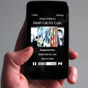
When the user selects one of the items, the application begins to play a stream of music that is related to the artist selected. The definition and calculation of similarity in music is a complex engineering topic that I will cover in future posts. Determining the “suitability” of the algorithm selected would not be trivial since what we are looking for is to provide the selection of music that better fits subjective desires and expectations, which change from person to person.

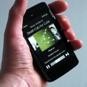
The “now playing” screen is intentionally simple: you can pause the current song, skip to the next one or go back to the list in order to select a new band. I am not even fully convinced that the “settings” item makes sense there, but it could act as a place to keep functionality that does not need to be always present (e.g. play only music from the selected band and not from related artists).

That’s all for today. Stay tuned for more stuff coming in the next days!
