First ideas for a better GNOME browser
Following up on my last post, I want to share a few ideas that could improve the use of the Web from GNOME. Many of these come from other people and I am trying to combine them into one coherent package.
The first goal would be to offer better support for common Web browsing patterns, revisitation and exploration. Specifically, this means supporting web applications, a more convenient and agile presentation for favourites, better history and bookmarks management, better tab management within the browser window for pages that are related to the same tasks, and better tab management from the Shell to help the user align the different sets of tabs with his current activities and interests.
The second goal would be to do so in a way that is not cumbersome and complex, but light and consistent.
Web apps
Most of the next million apps written will be web applications. The browser should acknowledge this, allowing the user to turn a Web site into an application that can be accessed like any other.
Revisitation: Home and History
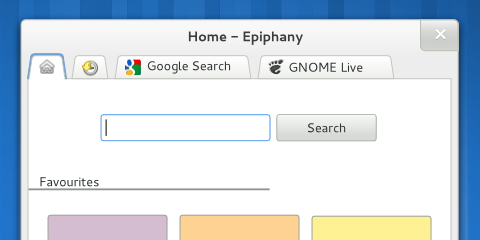
As noted in my previous post, there are different kinds of Web revisitation; one of them comprises sites that we visit often because they lead to new information, which is not exactly the same as storing a linking to a page because of the information that it contains at the moment of reading (e.g. an article). In a manner similar to what Firefox does, I propose to have a Home tab as the starting point for browsing. This tab could include a search field, links to recent pages and groups of pages, favourites and Reading List. Being able to define a page as “favourite” and “pin” it to the Home page would ease mid- and long-term revisitation, which makes up for a large percentage of our activity in the Web.
The Home tab would be a way to get to new content, but what about returning to sites that were visited some time ago? Next to the Home tab, we could place a History&Bookmarks tab that offered a rich search interface to retrieve pages that have already been seen.
Fine-grain tab management
Modern browsers are placing their tabs on top with good reason. The main advantage is that this helps establish a visual hierarchy inside the browser window that reinforces the proper mental model, so that controls that operate on the same scope are grouped together. To decide which controls should be given priority in the interface, we could use usage data from Firefox as a guide, always keeping in mind that we cannot assume that everybody will know how to use all the available shortcuts (e.g. a similar study found that over 80% of users never used Ctrl+F to search). Browser-level functionality (New Window, Preferences, Quit…) could be moved to the application menu.
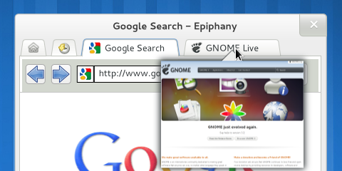
Tabs provide a number of benefits that make them a convenient way to organise your Web browsing. However, one of their problems is that as their number grows, it can become difficult to go back to a certain tab; a way to improve this situation could be to show a thumbnail of the tab’s content on mouse-over, allowing for a quick scan of open tabs without having to open them one by one.
There is a difference between following a link and opening it in a new tab. In the first case, the original page is still visible and readily accessible; in the second, it has disappeared from the UI and has to be kept in the user’s memory, to be accessed again via the Back button. These two different actions can allow the user to create a curated version of their trail through the Web, one that does not contain all the pages that they have visited but just those that have been deemed important. These tab trees are an important feature but tab-focused interfaces (e.g. tree-style tabs, other ideas) might be far too complex. A compromise could be to include a visual hint at the existence of different tab groups, but without making it the main point of the interface.
Coarse-grain tab management
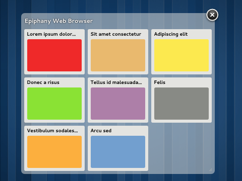
Tabs are a good way of structuring your browsing when their number is low enough (research shows that an usual number of open tabs is around 6). When their number grows, you can have trouble because there are simply too many unrelated tabs in one window. So we have a problem with the organisation of a lot of content that is related to different activities: well, the GNOME Shell is a solution for that. I propose to allow high-level management of Web tabs directly from the Shell Overview (not too different from Panorama with a bit of this), providing an overview of the open tabs and supporting their movement between different browser windows and workspaces.
Wrap-up
I have tried to describe a situation where Web browsing is more tightly integrated with the desktop. There is still a lot of work to do: detailed functionality needs to be refined, assumptions need to be verified, mockups and prototypes need to be created and evaluated…
A browser is a very complex application to design, but luckily there is a lot of knowledge already available that should help us generate ideas and make informed decisions.


This looks quite promising!