The CSS Images Module Level 4 introduced a new type of gradient: conic-gradient. Until then, there were only two other type of gradients available on the Web: linear-gradient and radial-gradient.
The first browser to ship conic-gradient support was Google Chrome, around March 2018. A few months after, September 2018, the feature was available in Safari. Firefox have been missing support until now, although an implementation is on the way and will ship soon. In the case of WebKitGTK (Epiphany) and WPE (Web Platform for Embedded), support landed in October 2019 which I implemented as part of my work at Igalia. The feature has been officially available in WebKitGTK and WPE since version 2.28 (March 2020).
Before native browser support, conic-gradient was available as a JavaScript polyfill created by Lea Verou.
Gradients in the Web
Generally speaking, a gradient is a smooth transition of colors defined by two or more stop-colors. In the case of a linear gradient, this transition is defined by a straight line (which might have and angle or not).
div.linear-gradient {
  width: 400px;
  height: 100px;
  background: linear-gradient(to right, red, yellow, lime, aqua, blue, magenta, red);
}
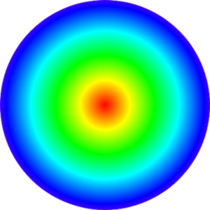
In the case of a radial gradient, the transition is defined by a center and a radius. Colors expand evenly in all directions from the center of the circle to outside.
div.radial-gradient {
  width: 300px;
  height: 300px;
  border-radius: 50%;
  background: radial-gradient(red, yellow, lime, aqua, blue, magenta, red);
}
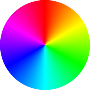
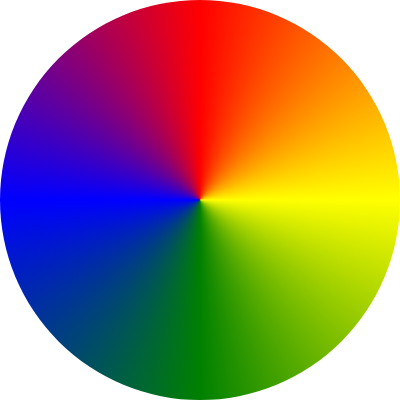
A conical gradient, although also defined by a center and a radius, isn’t the same as a radial gradient. In a conical gradient colors spin around the circle.
div.conic-gradient {
  width: 300px;
  height: 300px;
  border-radius: 50%;
  background: conic-gradient(red, yellow, lime, aqua, blue, magenta, red);
}
Implementation in WebKitGTK and WPE
At the time of implementing support in WebKitGTK and WPE, the feature had already shipped in Safari. That meant WebKit already had support for parsing the conic-gradient specification as defined in CSS Images Module Level 4 and the data structures to store relevant information were already created. The only piece missing in WebKitGTK and WPE was painting.
Safari leverages many of its graphical painting operations on CoreGraphics library, which counts with a primitive for conic gradient painting (CGContextDrawConicGradient). Something similar happens in Google Chrome, although in this case the graphics library underneath is Skia (CreateTwoPointConicalGradient). WebKitGTK and WPE use Cairo for many of their graphical operations. In the case of linear and radial gradients, there’s native support in Cairo. However, there isn’t a function for conical gradient painting. This doesn’t mean Cairo cannot be used to paint conical gradients, it just means that is a little bit more complicated.
Mesh gradients
Cairo documentation states is possible to paint a conical gradient using a mesh gradient. A mesh gradient is defined by a set of colors and control points. The most basic type of mesh gradient is a Gouraud-shading triangle mesh.
cairo_mesh_pattern_begin_patch (pattern)

cairo_mesh_pattern_move_to (pattern, 100, 100);
cairo_mesh_pattern_line_to (pattern, 130, 130);
cairo_mesh_pattern_line_to (pattern, 130,  70);

cairo_mesh_pattern_set_corner_color_rgb (pattern, 0, 1, 0, 0);
cairo_mesh_pattern_set_corner_color_rgb (pattern, 1, 0, 1, 0);
cairo_mesh_pattern_set_corner_color_rgb (pattern, 2, 0, 0, 1);

cairo_mesh_pattern_end_patch (pattern)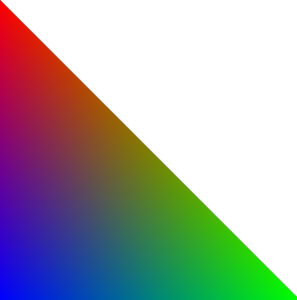
A more sophisticated patch of mesh gradient is a Coons patch. A Coons patch is a quadrilateral defined by 4 cubic Bézier curve and 4 colors, one for each vertex. A Bézier curve is defined by 4 points, so we have a total of 12 control points (and 4 colors) in a Coons patch.
cairo_mesh_pattern_begin_patch (pattern);

cairo_mesh_pattern_move_to (pattern, 45, 12);
cairo_mesh_pattern_curve_to(pattern, 69, 24, 173, -15, 115, 50);
cairo_mesh_pattern_curve_to(pattern, 127, 66, 174, 47, 148, 104);
cairo_mesh_pattern_curve_to(pattern, 65, 58, 70, 69, 18, 103);
cairo_mesh_pattern_curve_to(pattern, 42, 43, 63, 45, 45, 12);

cairo_mesh_pattern_set_corner_color_rgb (pattern, 0, 1, 0, 0); // red
cairo_mesh_pattern_set_corner_color_rgb (pattern, 1, 0, 1, 0); // green
cairo_mesh_pattern_set_corner_color_rgb (pattern, 2, 0, 0, 1); // blue
cairo_mesh_pattern_set_corner_color_rgb (pattern, 3, 1, 1, 0); // yellow

cairo_mesh_pattern_end_patch (pattern);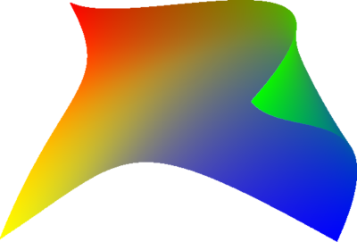
A Coons patch comes very handy to paint a conical gradient. Consider the first quadrant of a circle, such quadrant can be easily defined with a Bézier curve.
cairo_mesh_pattern_begin_patch (pattern);

cairo_mesh_pattern_move_to (pattern, 0, 200);
cairo_mesh_pattern_line_to (pattern, 0, 0);
cairo_mesh_pattern_curve_to (pattern, 133, 0, 200, 133, 200, 200);
cairo_mesh_pattern_line_to (pattern, 0, 200);

cairo_mesh_pattern_set_corner_color_rgb (pattern, 0, 1, 0, 0); // red
cairo_mesh_pattern_set_corner_color_rgb (pattern, 1, 0, 1, 0); // green
cairo_mesh_pattern_set_corner_color_rgb (pattern, 2, 0, 0, 1); // blue
cairo_mesh_pattern_set_corner_color_rgb (pattern, 3, 1, 1, 0); // yellow

cairo_mesh_pattern_end_patch(pattern);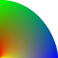
If we just simply use two colors instead, the final result resembles more to how a conical gradient looks.
cairo_mesh_pattern_set_corner_color_rgb (pattern, 0, 1, 0, 0); // red
cairo_mesh_pattern_set_corner_color_rgb (pattern, 1, 1, 0, 0); // red
cairo_mesh_pattern_set_corner_color_rgb (pattern, 2, 1, 1, 0); // yellow
cairo_mesh_pattern_set_corner_color_rgb (pattern, 3, 1, 1, 0); // yellow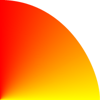
Repeat this step 3 times more, with a few more stop colors, and you have a nice conical gradient.
Bézier curve as arcs
At this point the difficulty of painting a conical gradient has been reduced to calculating the shape of the Bézier curve of each mesh patch.
Computing the starting and ending points is straight forward, however calculating the position of the other two control points of the Bézier curve is a bit much harder.
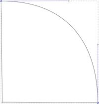
Mozillian Michiel Kamermans (pomax) has a beautifully written essay on Bézier curves. Section “Circles and cubic Bézier curves” of such essay discusses how to approximate a Bézier curve to an arc. The case of a circular quadrant is particularly interesting because it allows painting a circle with 4 Bézier curves with minimal error. In the case of the quadrant above the values for each point would be the following:
S = (0, r), CP1 = (0.552 * r, r), CP2 = (r, 0.552 * r), E = (r, 0)
Even though on its most basic form a conic gradient is defined by one starting and one ending color, painting a circle with two Bézier curves is not a good approximation to a semicircle (check the interactive examples of pomax’s Bézier curve essay). In such case, the conic gradient is split into four Coon patches with middle colors interpolated.
Also, in cases were there are more than 4 colors, each Coons patch will be smaller than a quadrant. It’s necessary a general formula that can compute the control points for each section of the circle, given an angle and a radius. After some math, the following formula can be inferred (check section “Circle and cubic Bézier curves” in pomax’s essay):
cp1 = {
   x: cx + (r * cos(angleStart) - f * (r * sin(angleStart),
   y: cy + (r * sin(angleStart)) + f * (r * cos(angleStart))
}
cp2 = {
   x: cx + (r * cos(angleEnd)) + f * (r * sin(angleEnd)),
   y: cy + (r * sin(angleEnd)) - f * (r * cos(angleEnd))
}
where f is a variable computed as:
f = 4 * tan((angleEnd - angleStart) / 4) / 3;
For a 90 degrees angle the value of f is 0.552. Thus, if the quadrant above had a radius of 100px, the values of the control points would be: CP1(155.2, 0) and CP2(200, 44.8) (considering top corner left as point 0,0).
And that’s basically all that is needed. The formula above allows us to compute a circular sector as a Bézier line, which when setup as a Coons patch creates a section of a conical gradient. Adding several Coons patches together creates the final conical gradient.
Wrapping up
It has been a long time since conic gradients for the Web were first drafted. For instance, the current bug in Firefox’s Bugzilla was created by Lea Verou five years ago. Fortunately, browsers have started shipping native support and conical gradients have been available in Chrome and Safari since two years ago. In this post I discussed the implementation, mainly rendering, of conic gradients in WebKitGTK and WPE. And since both browsers are WebKit based, they can leverage on the implementation efforts led by Apple when bringing support of this feature to Safari. With Firefox shipping conic gradient support soon this feature will be safe to use in the Web Platform.
Please drop me a line if you have any feedback. Thanks!